
Zeit
UX/UI Design, Content Design, and Branding
Role: UX/UI Designer, Content Designer
Tools: Figma | Whimsical | Adobe Illustrator | OptimalSort
Who is Zeit?
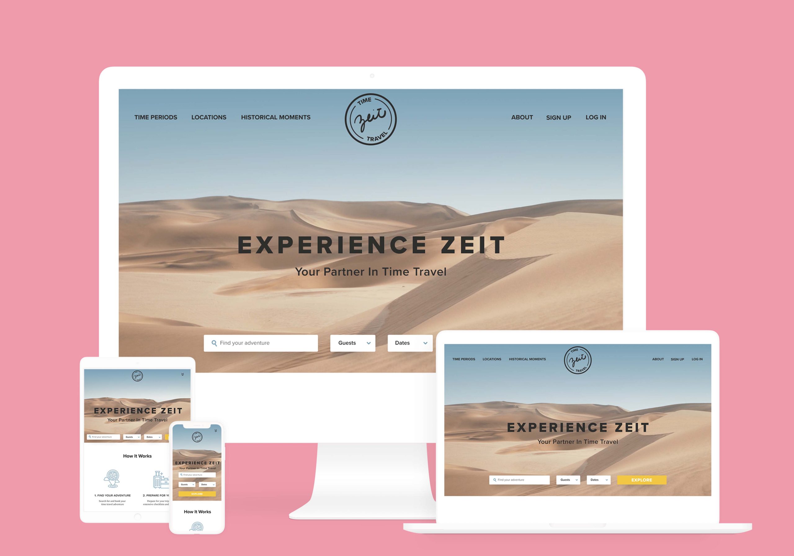
Humans have been dreaming of time travel for ages and now that dream has finally become a reality! Zeit is a new tourism company that offers travel tourism packages to almost 300 destinations from all over the world, up from prehistoric times through today. The challenge was to develop a responsive e-commerce website that would introduce and explain their innovative product and process while also allowing users to easily and effortlessly browse for and book their time travel packages.
The Challenge
Zeit needs a responsive website and branding in line with time travel themes (classic yet modern) to launch its time travel tourism service and travel packages.
The Solution
I developed a responsive site where users can search for and book a time travel vacation easily and effortlessly using research-based design methods to guide feature development, information architecture, and visual style.
The Research
Competitive Analysis | Market Research | User Interviews
I began this project by doing competitive and market research to investigate recent travel statistics and market trends to see what opportunities there were in the market space and where Zeit could begin to position themselves. Through market research, I found that with a wide variety of interests, needs, more people are engaging in adventure travel than ever before and that detailed filters and tags are essential in connecting users with tailor-made travel experiences. More upfront, detailed itinerary information and streamlined/same-site booking would also add control and while also easing user fears when making travel decisions - an important factor to consider due to the new and unknown nature of Zeit's product. Competitor analysis allowed me to consider the strengths and weaknesses of other travel companies and begin to evaluate where industry standards are in terms of features and user comfort.
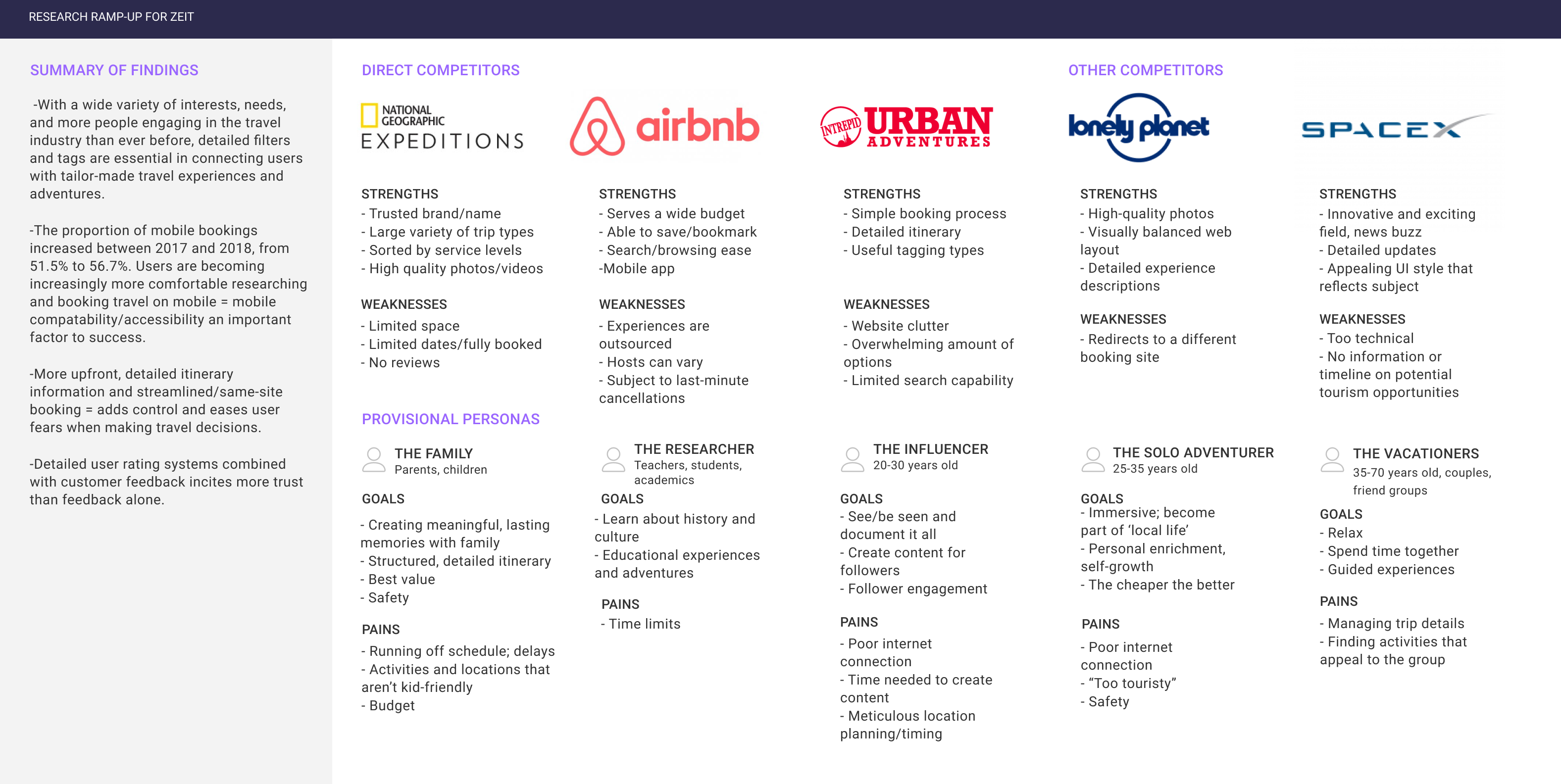
After taking a closer look at the ins-and-outs of the travel industry, I set out to interview and talk to real people to learn more about their travel experiences, behaviors, and feelings towards time travel in order to understand how to begin to design and add features to Zeit's website. I spend time talking to 5 participants about their travel experiences, needs, fears, behaviors, and overall expectations when traveling and deciding to book a trip online and looked for trends, overlap, and outliers while compiling the overall takeaways.
And they let us know that they need…
- Safety and comfort while traveling
- Access to support/emergency services
- Freedom and flexibility when browsing/selecting between travel options/packages
- A wide variety of unique and interesting activities to explore based on interest
- A variety of budget options
Transparent pricing and detailed itineraries - Clear and detailed user review systems and accompanying photos for validation
- To feel fully prepared for their trip
And that they wanted...
- To have seamless/easy/clutterless travel and booking experiences
- To be able to easily find and research travel destinations/potential trips in one place
- To have the flexibility to adjust and tailor their experiences on-the-fly
- To have a large variety of food and culture options to choose from
- Word-of-mouth recommendations/social media presence (normalizing, inspiring)
- Authentic, immersive experiences
The User
User Persona | Empathy Map | Storyboard | Sitemap | User Flows
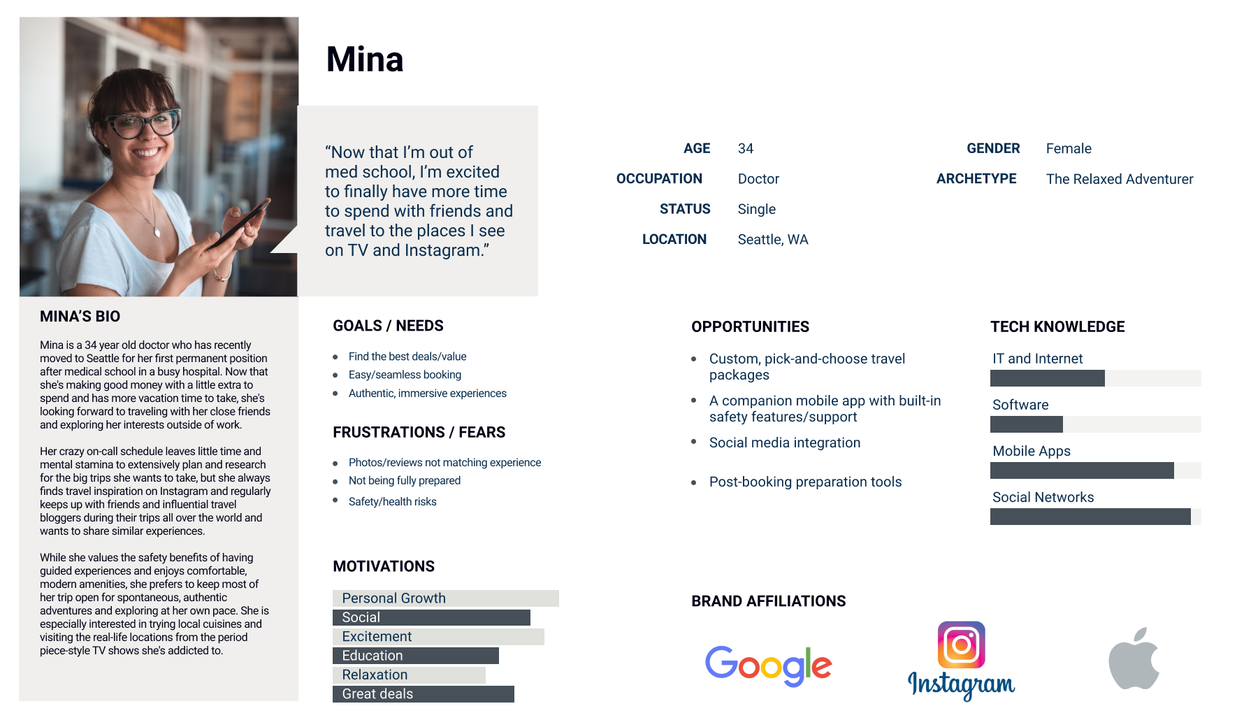
Using these interview findings and user needs/wants, I then set out to create a persona that would reflect who the ideal Zeit user could be and explore their state of mind. Mina was born out of my collective research and interview takeaways and served as a jumping-off point to begin to start brainstorming how she could come to discover Zeit and what would be the best design solutions for her. In order to dig into the user mindset, I put together a comprehensive persona profile, an empathy map focused on her daily life and triggers that could lead her to discover Zeit, and storyboard depicting her pathway to and a potential experience with Zeit.
Introducing...Mina!
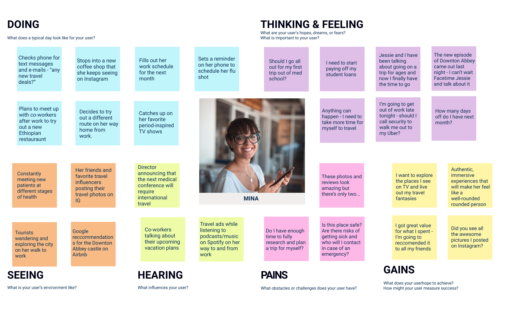
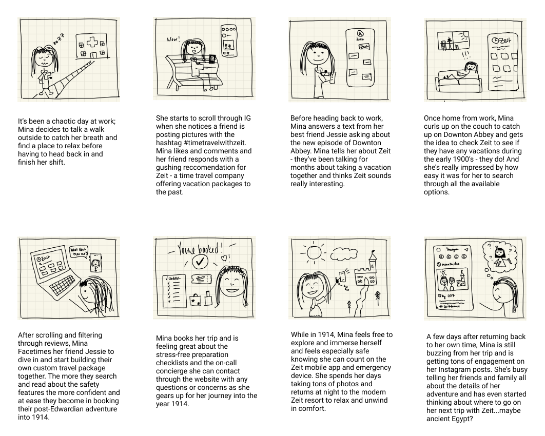
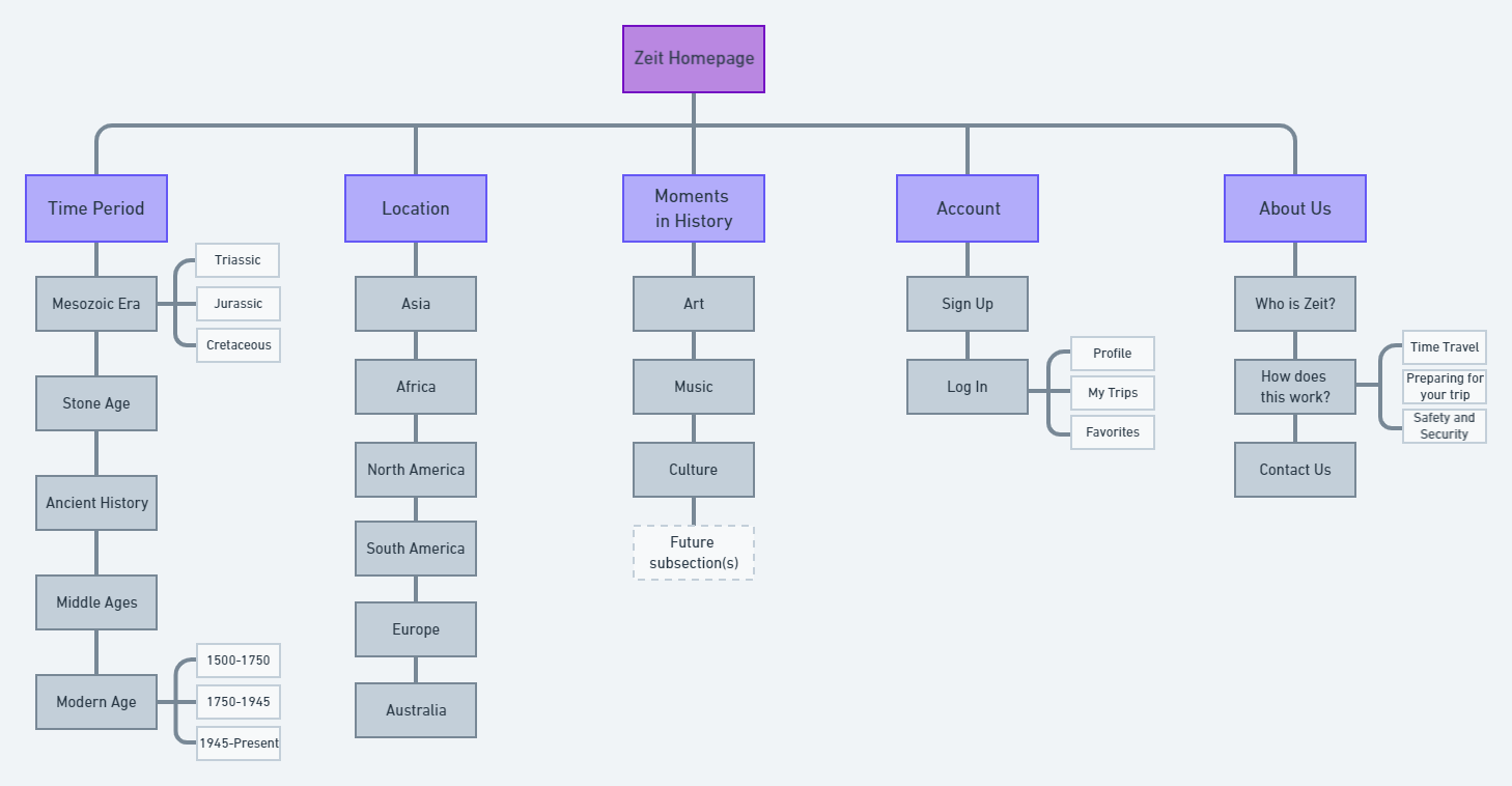
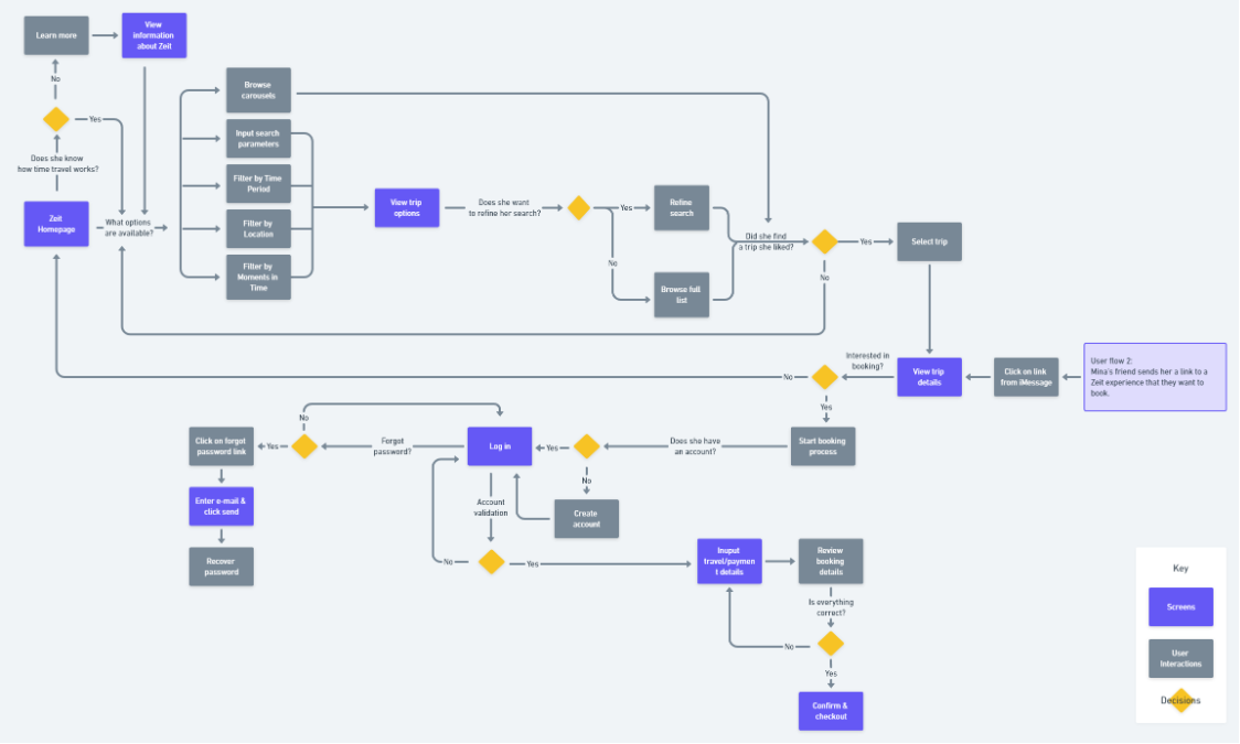
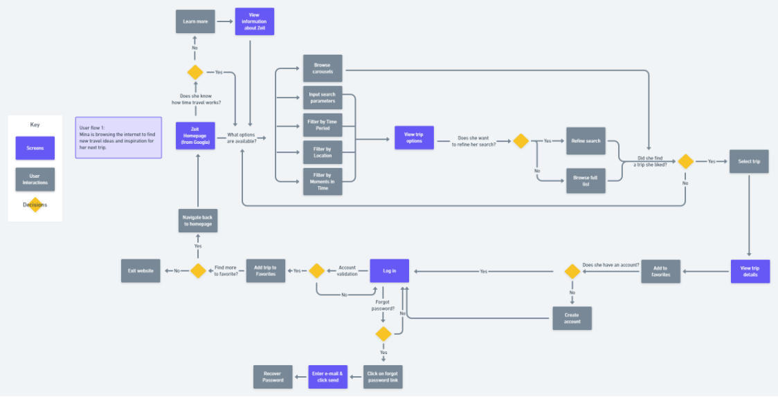
Once I was able to frame Mina's state of mind and map out her experience of discovering Zeit, I started to think about elements of information architecture for the website itself and how she would navigate through Zeit's website. In doing this, I charted out two user flows based on her persona traits and her potential points of entry in coming to know about Zeit.
Building the Product
Sketching | Mid-Fidelity Wireframes
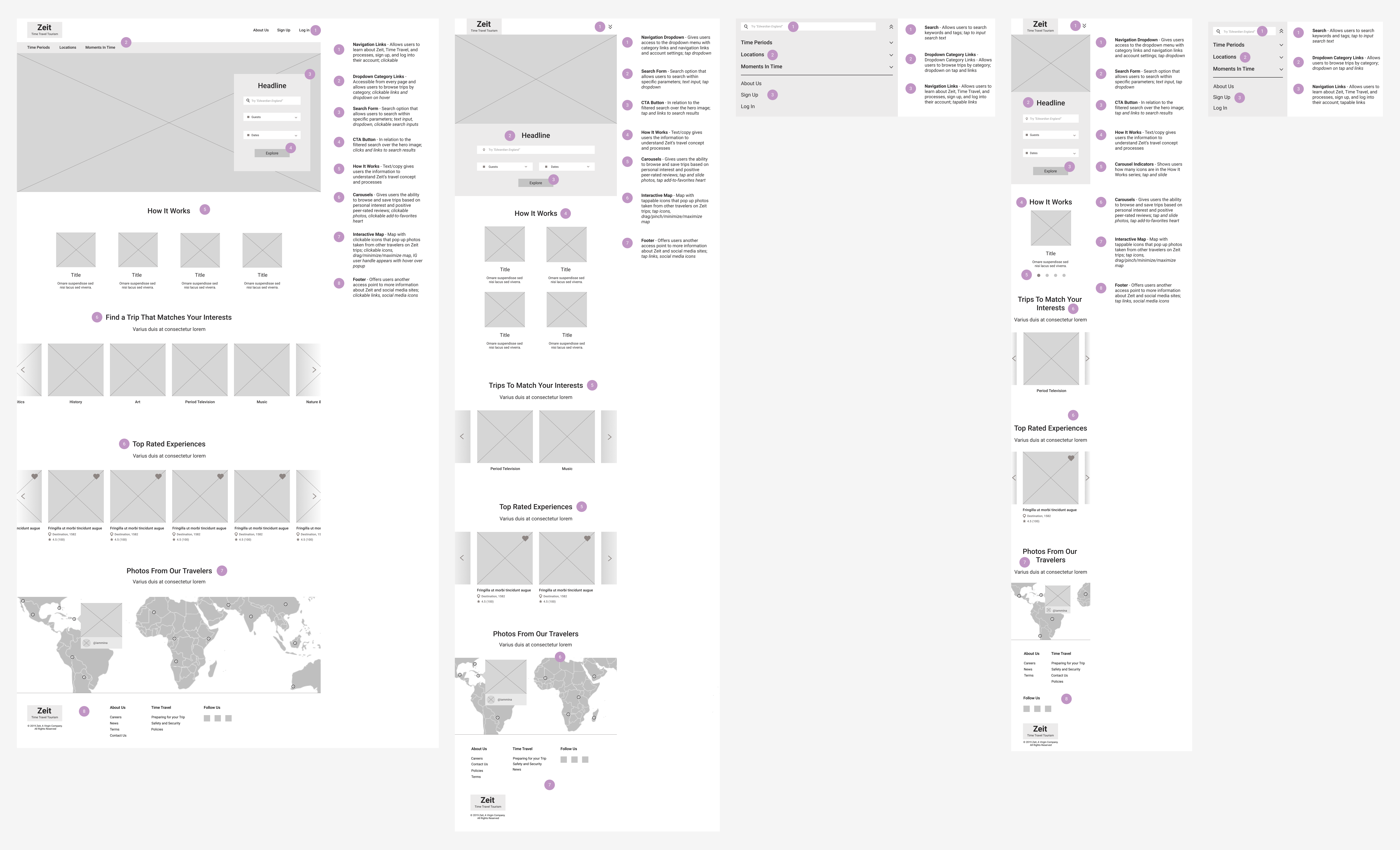
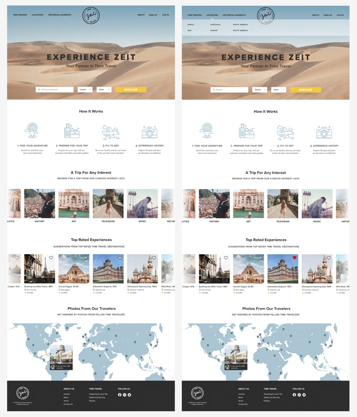
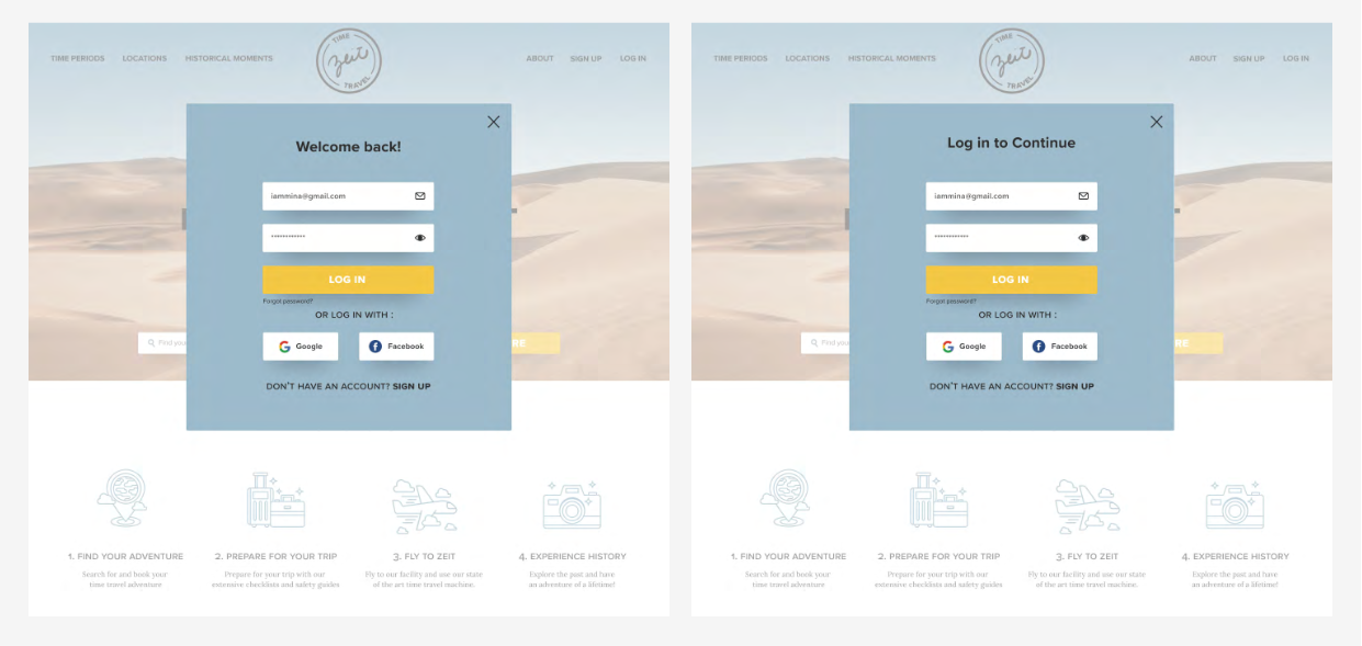
With the task flows and information architecture charted out, I was able to begin to ideate potential layouts and build out content sections of Zeit's homepage. I spent time experimenting with varying content arrangements and research-based features until I found a layout that made sense within the scope of Zeit's goals, travel industry standards, and met the needs of the project persona.
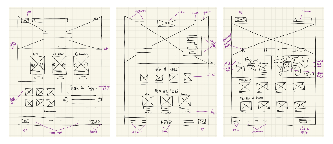
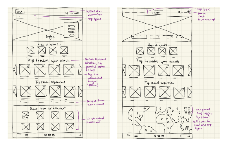
Using my sketches as a frame of reference, I then re-created them in Figma to create my mid-fidelity wireframes and annotated the content sections and features to describe their purpose and potential user interactions.
Deciding on a Visual Direction
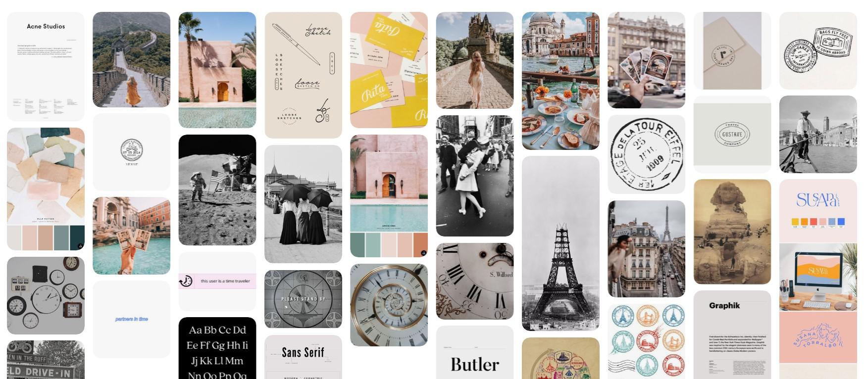
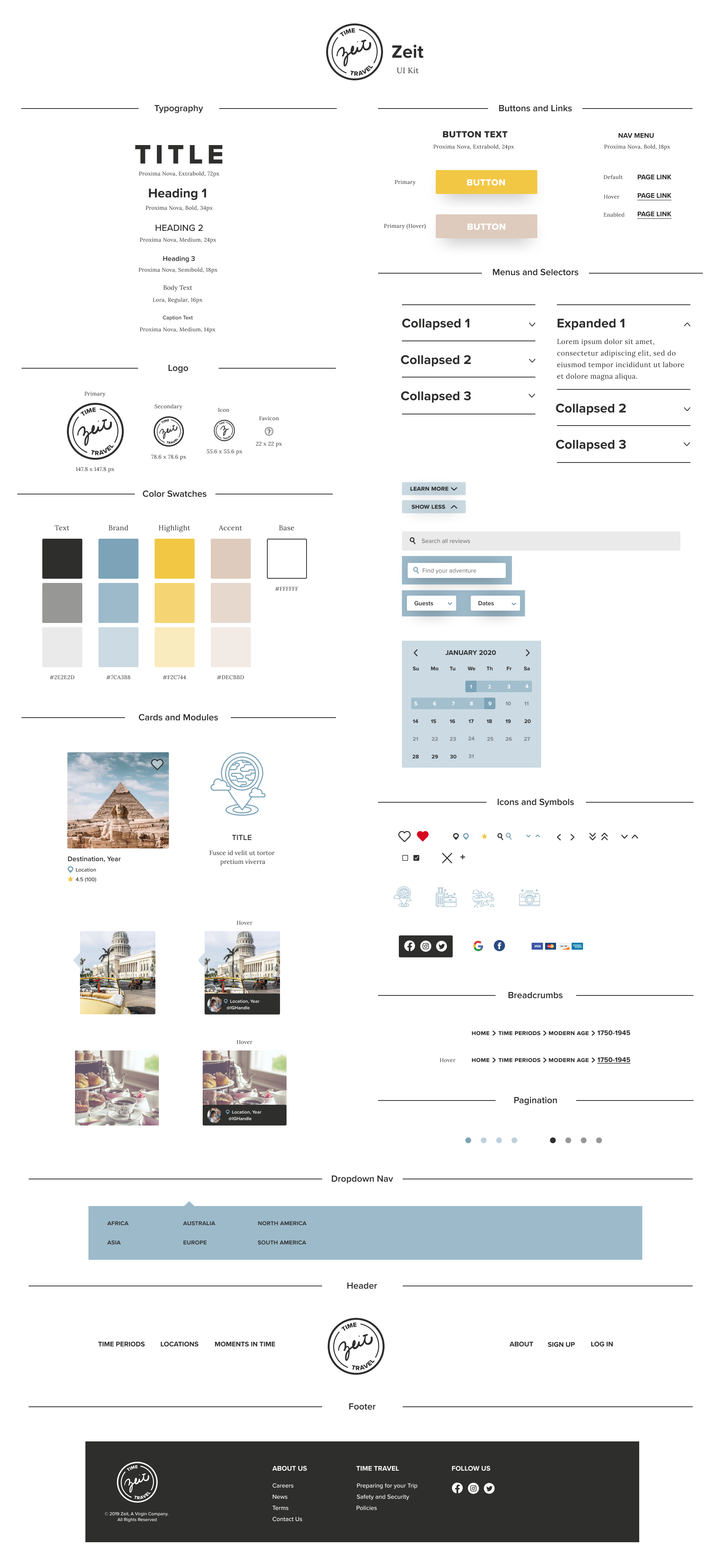
Moodboard | Logo Ideation | UI Kit
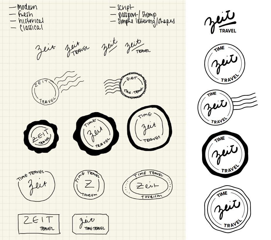
With a skeleton framework of wireframes to work with, I was able to start to think about the visual design direction of Zeit and how I could bring their brand message of classic meets modern to life in the product. I was committed to meet and marry modern and historical themes in this project and kept our research and persona needs/desires in mind when beginning to ideate logos and build out our color schemes. I began by collecting imagery, color palettes, logo references, and type options to build a mood board and curated my choices until I was left with a cohesive and clear visual style to work with. I aimed to meet modern with simplicity in type, space, and color and historical with visual details in photos featuring people, filters, and imperfect script and stamps.
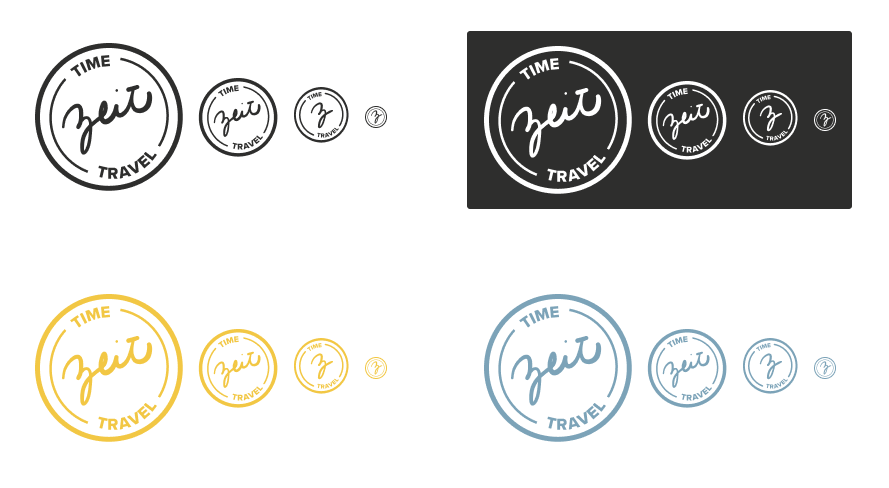
I then started building the components of the brand identity with logos, style guides, and UI kits. The Zeit logo I moved forward with was inspired by the simplicity and style of travel stamps and the contrast between script and bold sans-serif fonts.
Usability Testing
Test Synthesis | Affinity Map
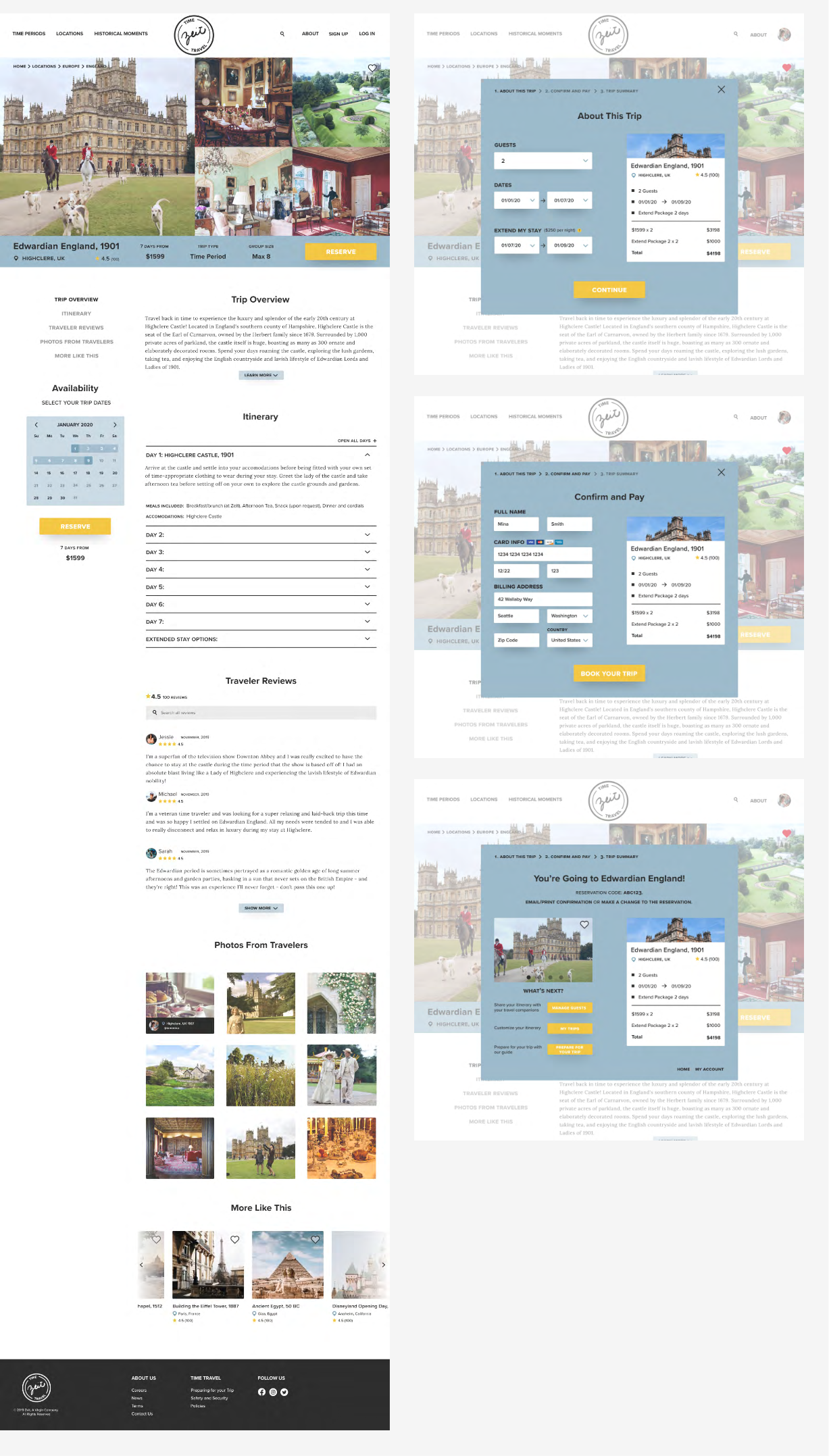
Was I on the right track? It was finally time to start testing these designs with real users and an early version of my stylized wireframes to gauge whether or not I was moving in the right design direction. I conducted a series of in-person and remote testing sessions where 5 participants talked me through and completed a series of scenarios and tasks using a high-fidelity version of the Zeit desktop website using a Figma prototype.
Before setting out to test participants, I needed to define some objectives and an overall goal for the study to really pinpoint what was working and what needed more attention moving forward...
Goal
- To examine and evaluate the overall user flow of the Zeit homepage. Specifically, find pain points and areas of opportunity in navigation flow, search, menu layout, UI, and information architecture.
Objectives
- Test how users navigate and search for a trip
- Test how users will book a trip
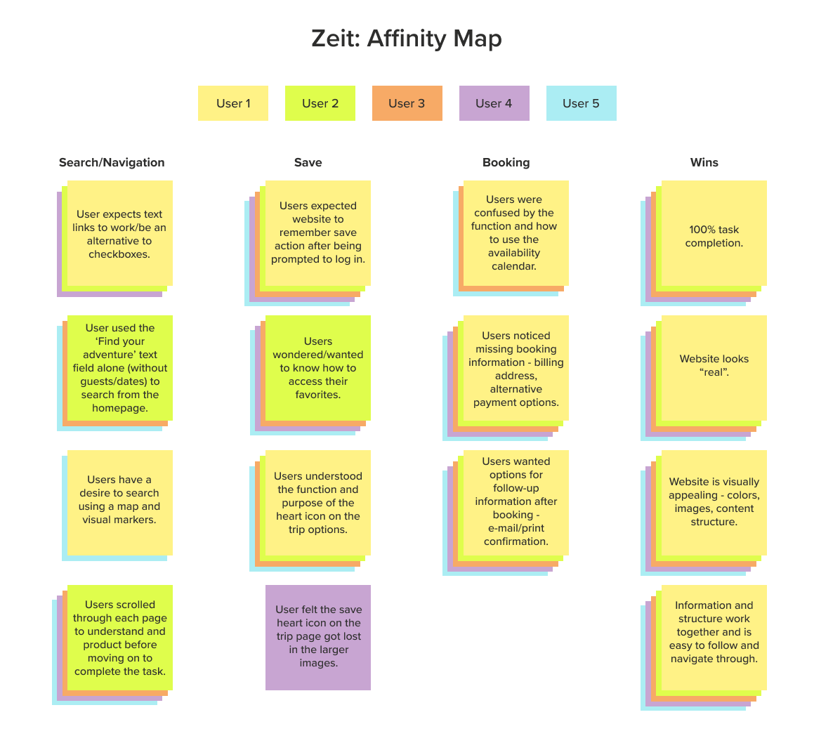
After testing, I compiled all of my notes and began to look for patterns across how the test participants interacted with and what they were saying about the prototype. I specifically honed in on what was working and what fell flat in the process and visualized these patterns and findings in an affinity map to organize trends and data into clear and digestible themes that I could begin to action.
Final Solutions
High-Fidelity Wireframes | Figma Prototype
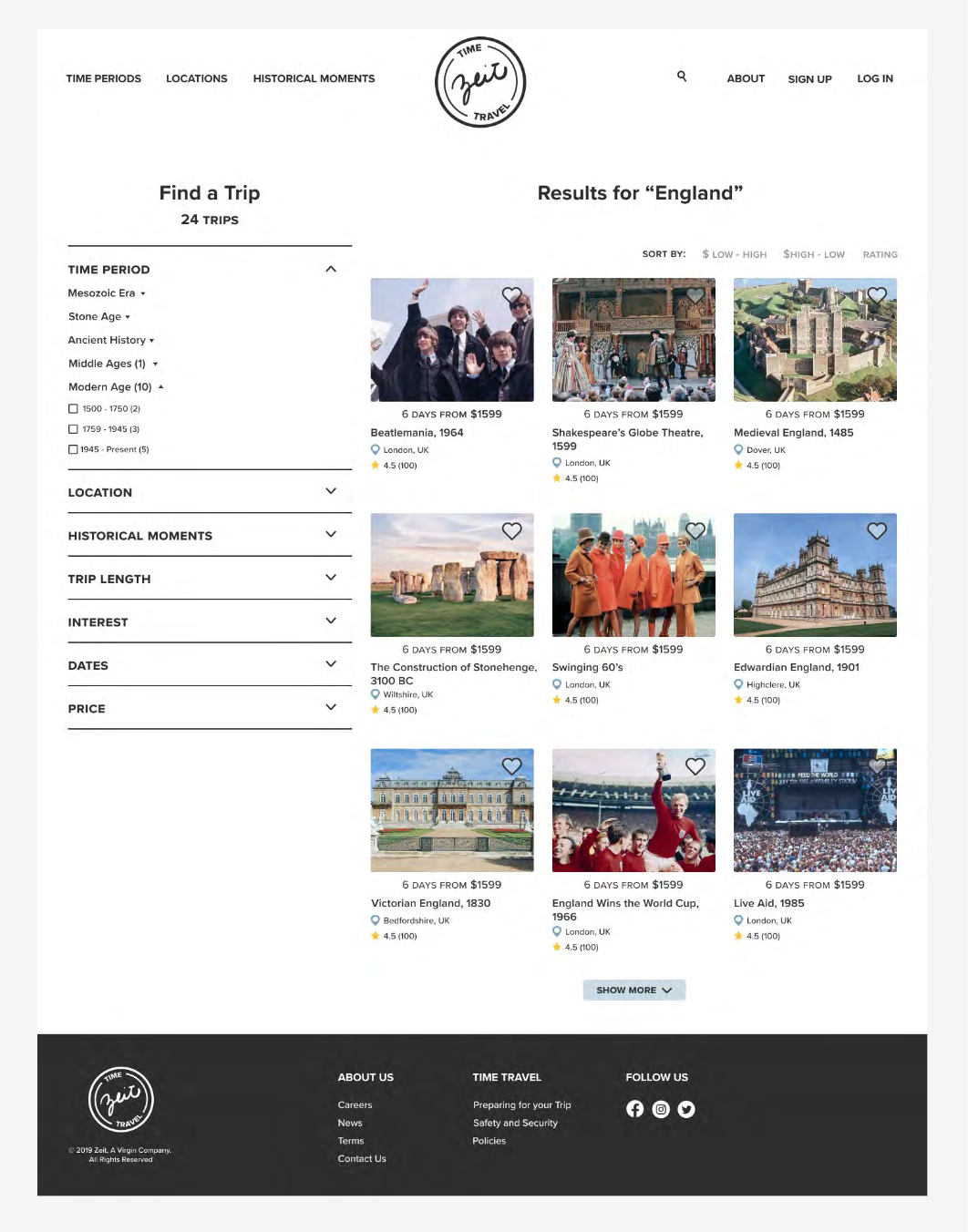
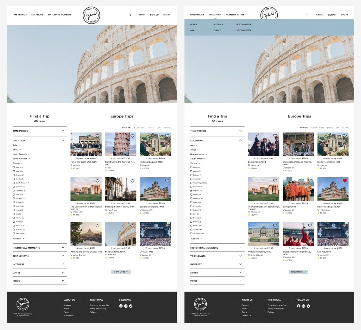
After usability testing, I was left with a list of changes and user suggestions to consider in the priority revision phase of this project for the Zeit website. I focused on adjusting the potential user interactions on the search and category page by adding clickable text and reworking the checkbox to be more accessible and easy to click. Since the availability of travel resources and information was a very important feature that users indicated they needed, I also added more post-checkout options to the last booking modal for users to interact with and inform themselves - specifically a printing/e-mail option for travel confirmations. Content clarification was also a call-out in usability testing, so I took the time to rethink the title and subtext of the interest section of the homepage to clarify and set up user expectations while browsing Zeit's catalog of trips.
Reflections and Next Steps
What's next for Zeit? In further iterations, I would hope to plan another round of usability testing to see if the changes that were made during priority revisions were effective and look to research and build out more of the features that users had asked for during the research phase - specifically more detailed filtering systems, saving and building itinerary options, and a stand-alone mobile application.
Throughout the process, I learned to consider and keep the user at the forefront of every design decision that needed to be made which at times was challenging due to the exploratory and uncharted nature of the subject of time travel. In research and interviews, time travel was a polarizing topic to breach in a way that produced actionable insights that were meaningful within the scope of designing for Zeit. If given the opportunity, I would reconsider how to frame the topic in a way that gave it a smaller scope and felt more approachable and contained. All-in-all, the visual design elements and familiarity of travel booking conventions adopted from competitors helped usability testing participants feel comfortable in understanding what they needed to do to find, learn more about, and ultimately book their time travel vacations. This proved to be a big win due to the concern and uncertainty surrounding time travel that users echoed during the interview phase.
By launching the website, I'm excited to see how users interact with the product and how Zeit evolves and innovates to serve their customer base.