Stitch Fix: Donation Initiative
UX/UI Design, Content Design
Role: UX/UI Designer, Content Designer
Tools: Figma | Whimsical | Adobe Illustrator | Photoshop
The Opportunity
Stitch Fix, a clothing subscription box service, occupies a unique space in the retail sphere in that they have innovated a new way to shop and help users find what they love, however, the environmental strain and end result of their business meets the same end as many other fashion retailers - fashion waste is currently the 2nd leading cause of pollution on earth (and growing!).
It’s Stitch Fix's mission to change the way people find clothes they love by combining technology with the personal touch of seasoned style experts. While Stitch Fix has shown that they care about the environmental and social impact their company has on the planet and are proud to feature a variety of sustainable brands, there is still room for improvement in finding ways to reduce fashion waste and their carbon footprint to become leaders in promoting sustainable fashion practices.
The Challenge
The challenge was to create a new feature that integrates seamlessly with their existing iOS app that makes it easy and effortless for their users to participate in textile recycling by donating their gently used clothes and earning credit in return to use on Stitch Fix services.
The Solution
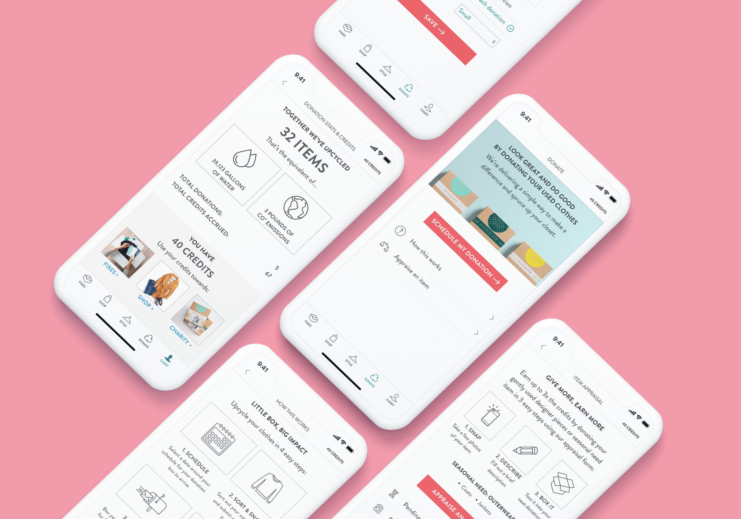
I developed a donation feature that allows users to schedule their donations, appraise high-ticket items, track accrued credit incentives, and integrated credits into the existing checkout flows that exist within the app using research-based design methods to guide feature development and information architecture.
The Research
Competitive Analysis | Market Research | User Interviews
I began this project by conducting market research and digging into as much information as I could about sustainability trends and practices in the fashion retail space and put together some highlights and my overall takeaways while mainly focusing in on the increase of sustainability habits and purchasing trends. What I found was that consumers are increasingly becoming more aware of sustainable habits and are demanding more focus on transparency and responsibility from fashion retailers and their purchasing trends are reflective of this.
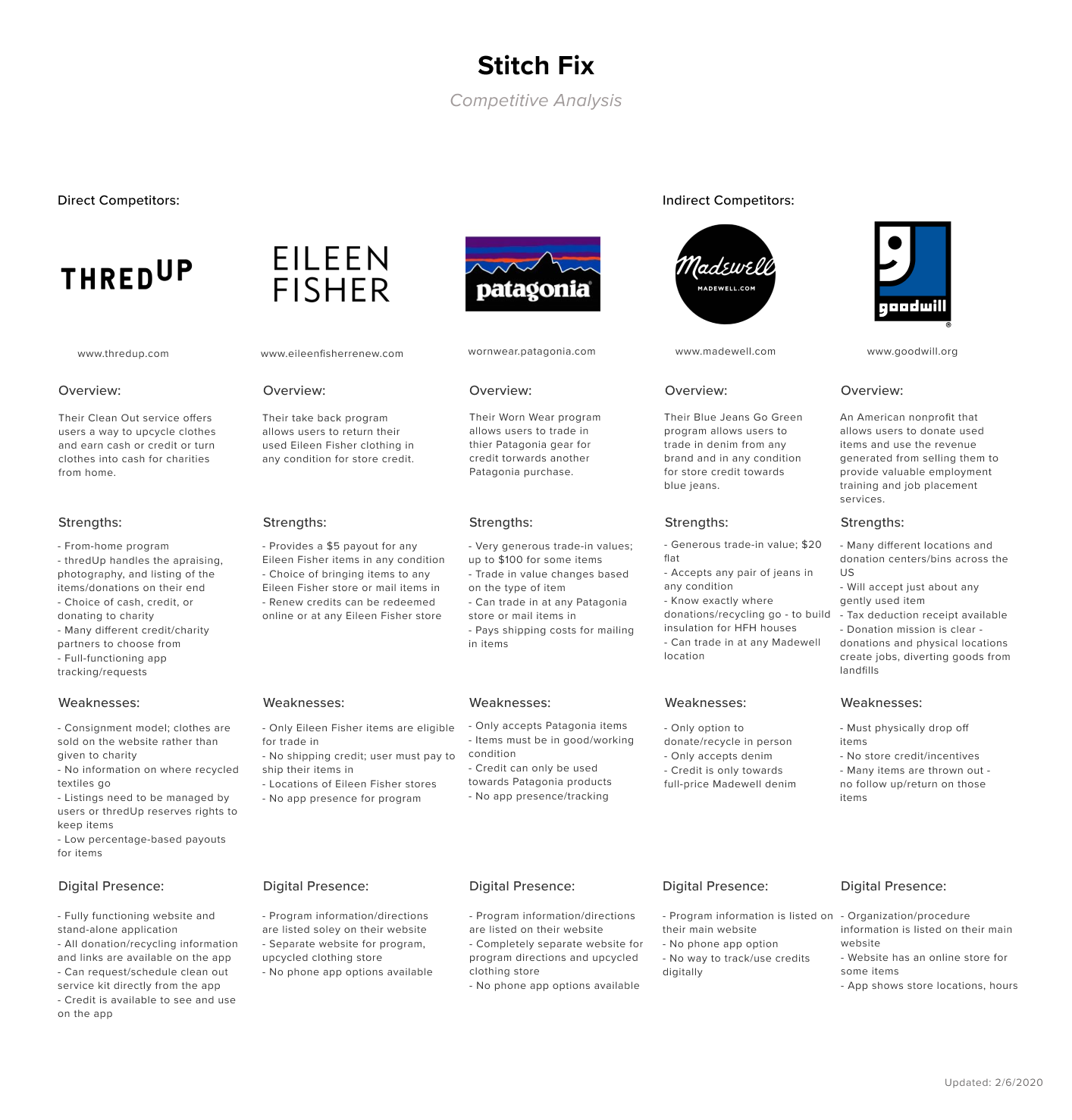
I then started to put together a list of comparable donation/recycling programs and considered their strengths/weaknesses and potential opportunities that I could think about as I begin to build out Stitch Fix's new donation feature and compiled them into a competitive analysis document specifically highlighting their digital presence and impact - a space I identified as being the main opportunity for Stitch Fix to take advantage of.
After learning more about what exists in the recycling/donation space and gauging possible user expectations and opportunities, I set out to interview and talk to real people to learn more about their behaviors, feelings, and experiences with why they do/do not donate and recycle their clothes in order to understand how to begin to design and add the donation feature to the Stitch Fix app. I spent several hours of research and observation with 7 interview participants on-site at a local consignment shop talking with participants about their donation experience - 5 with and 2 without - in order to see if there were areas of opportunity that I could leverage and design for.
Participants let me know that they needed…
- A feature that provides convenience, has a clear purpose and is easy to use
- A feature that has the ability to accommodate different donation packages/size requests
- A calendar scheduling and recurring donation option
- Space for information about the program (how it works), partners, missions, and goals to address company transparency and responsibility
- The ability to track incentives accrual
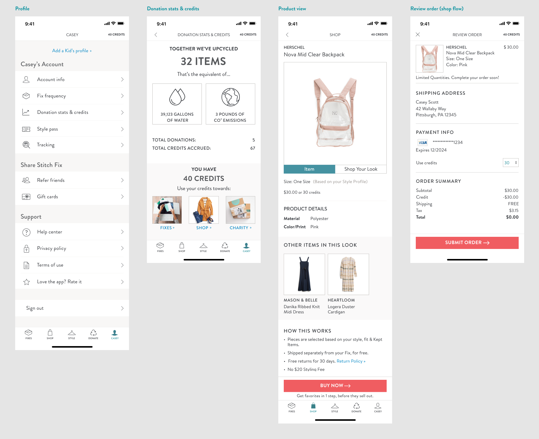
- The ability to use and apply credit incentives when purchasing in the Shop or during Fix checkout
and that they wanted...
- Space within the feature functionality for seasonal donation incentives
- The ability to use and apply incentives to a charity of their choice
- A variety of ways to donate their used clothing - ex: stand-alone box requests or a Fix add-on shipping bag
- “High ticket” Luxe donation appraisals via an integrated camera/photo roll widget and form
The User
User Persona | User Journey | Storyboard | Sitemap
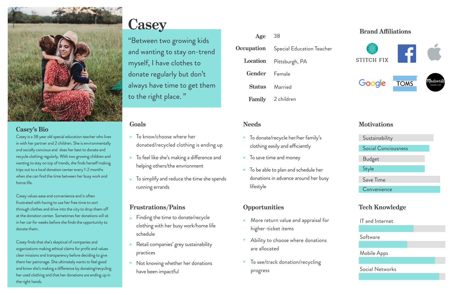
Using these interview findings and user needs/wants, I then set out to create a persona that would reflect who the ideal user could be and begin to chart out their user experience using the feature. Casey was born out of my collective research and interview takeaways and served as a jumping-off point to begin to start brainstorming how she could come to discover and use the Stitch Fix donation feature and what would be the best design solutions for her. In order to dig into the user mindset, I put together a comprehensive persona profile, charted out before/after user journeys focused on her current donation processes (based largely on user experiences that were collected during interviews) and an aspiring process while using the new Stitch Fix donation feature, and a storyboard depicting her pathway to and a potential experience with the new donation feature.
Meet Casey:
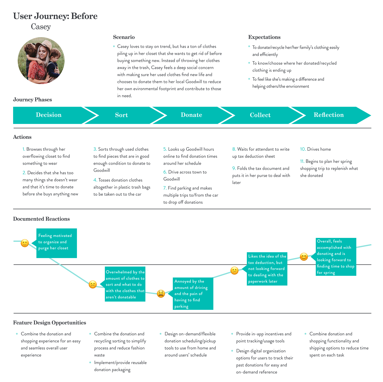
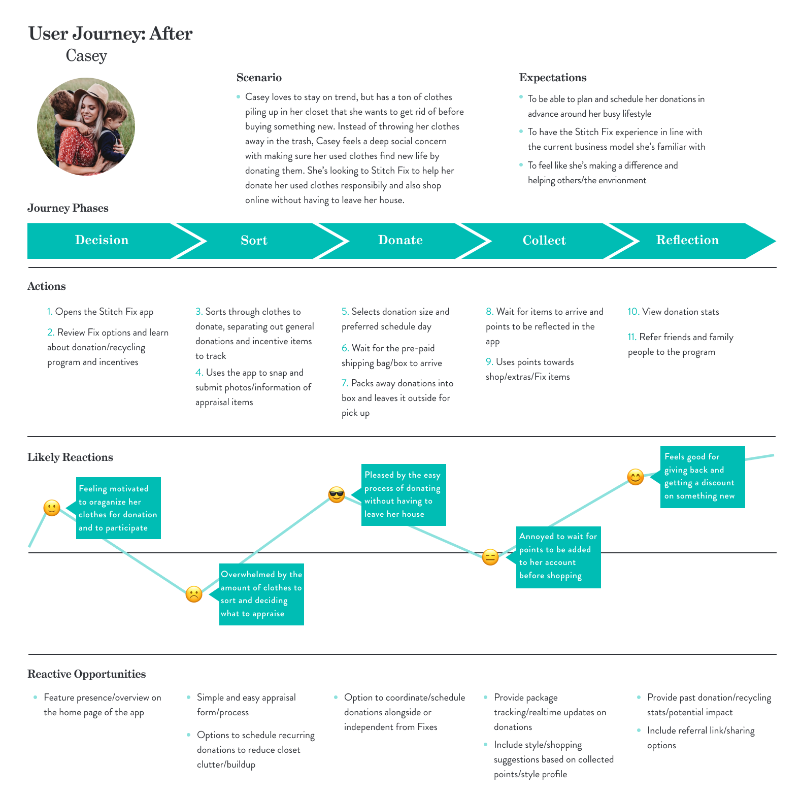
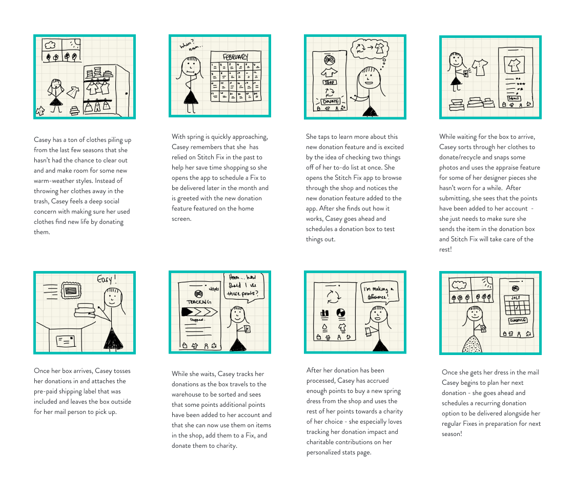
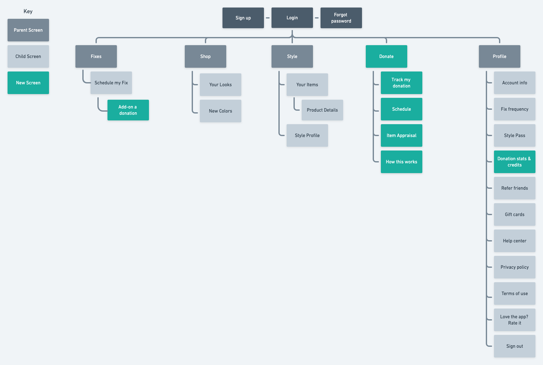
Once I was able to frame Casey's state of mind and map out her current donating experiences and a likely path using the Stitch Fix feature, I started to think about elements of information architecture for the app itself and what screens I would need to design to successfully meet her needs and expectations and visualized them into a sitemap of the existing Stitch Fix app structure.
Building the Product
Sketching | Mid-Fidelity Wireframes | Wireflows
With the sitemap and information architecture charted out, I was able to begin to ideate potential layouts and build out content sections for the feature. I spent time experimenting with varying content arrangements and research-based features until I found a layout that made sense within the scope of user needs, wants, and the existing structure and visual guidelines of the existing app.
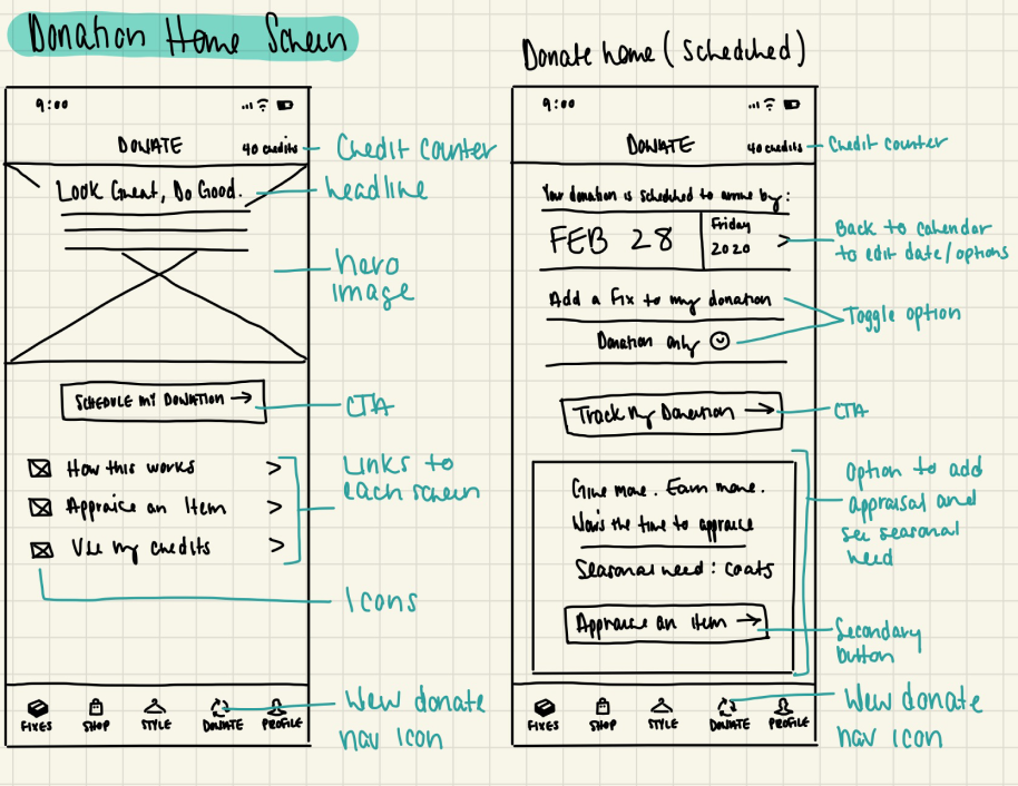
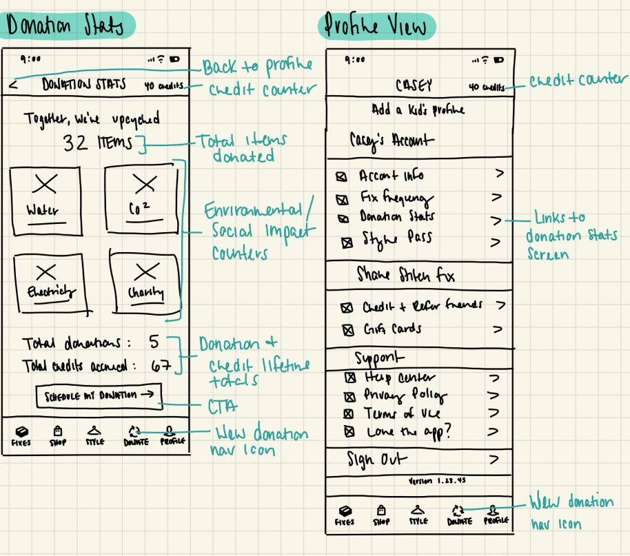
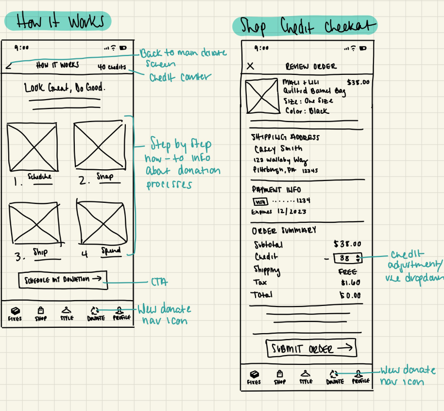
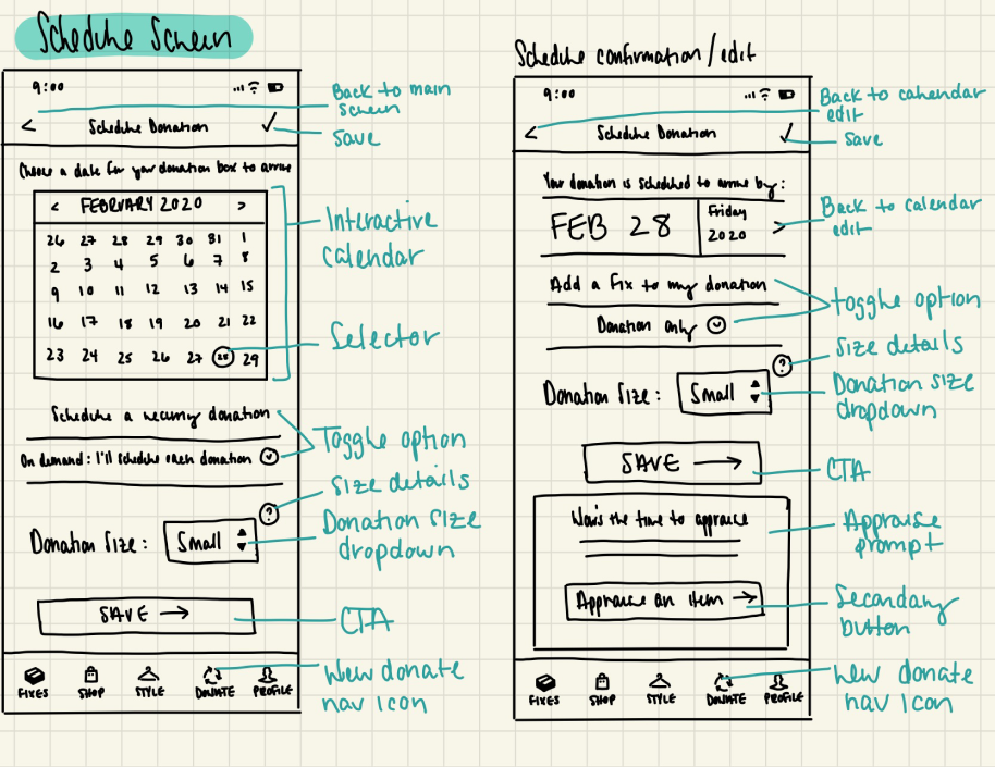
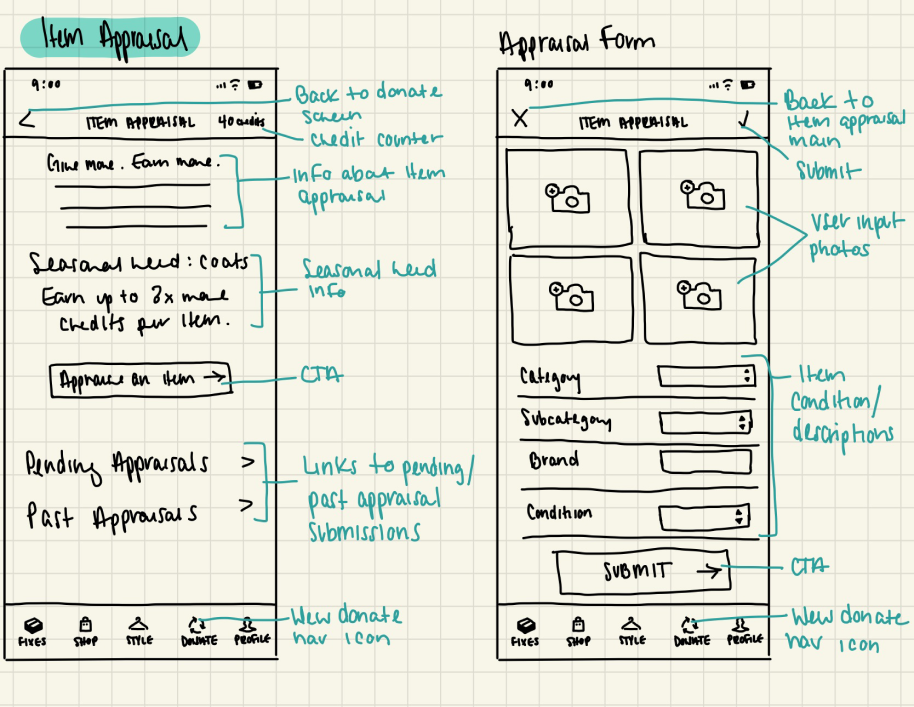
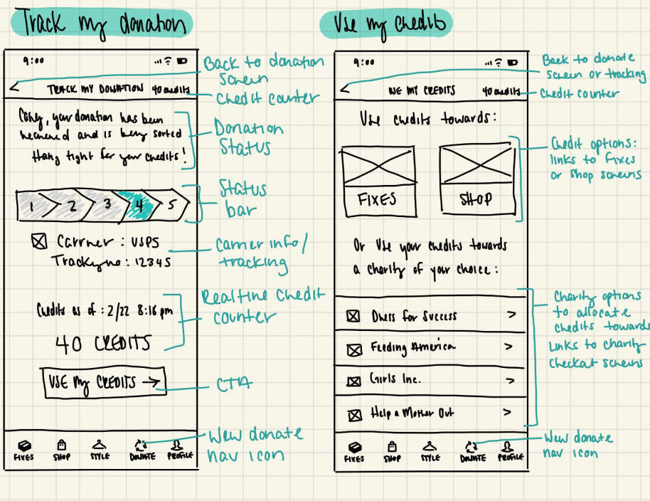
Using my sketches as a frame of reference, I then re-created them in Figma to mock up the mid-fidelity wireframes while also annotating the content sections and features to describe their purpose, potential user interactions, and animations.
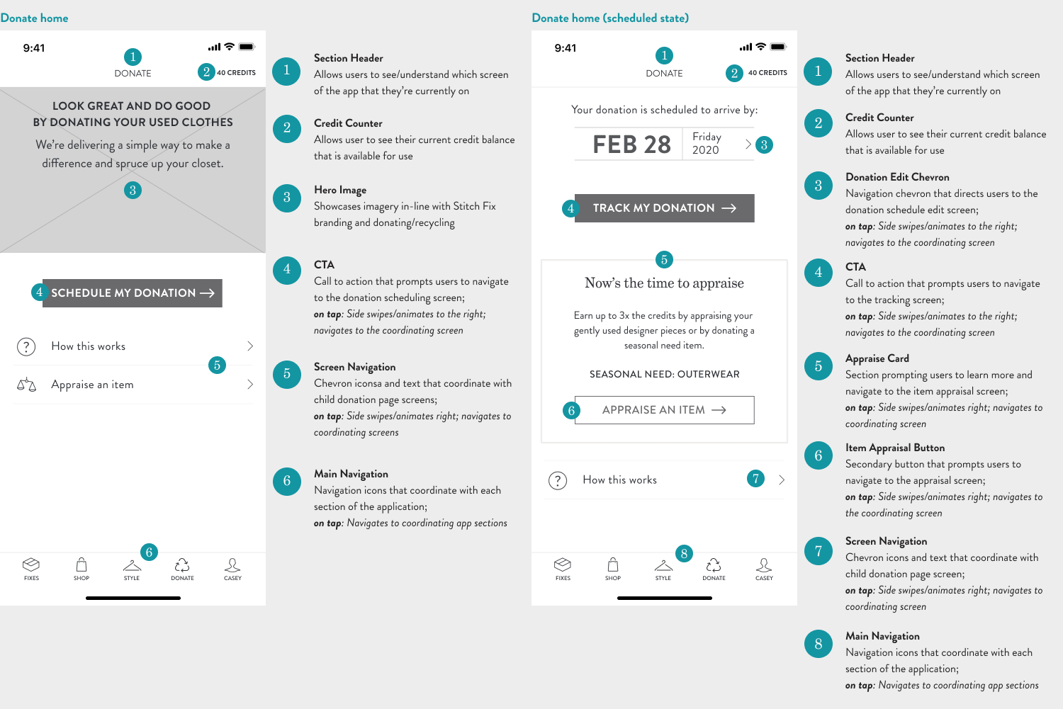
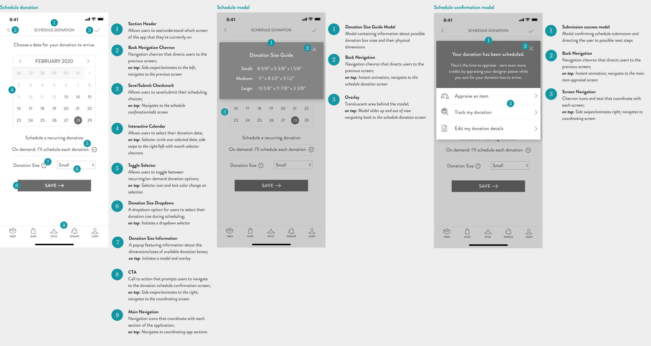
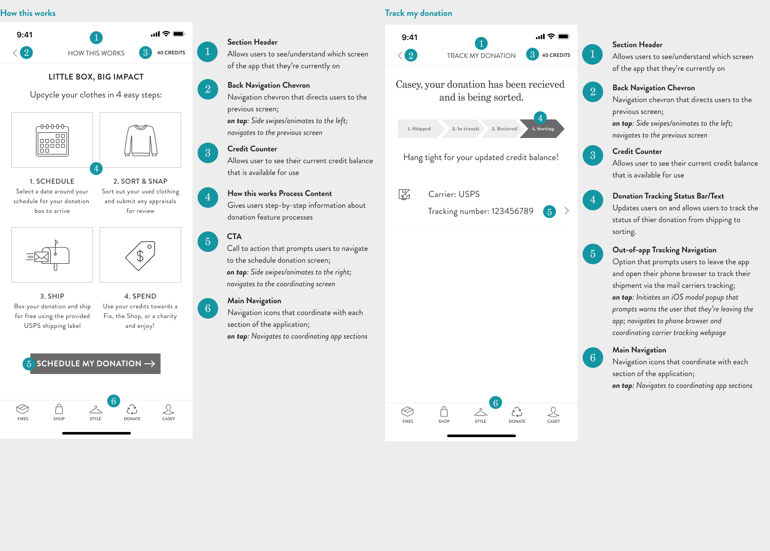
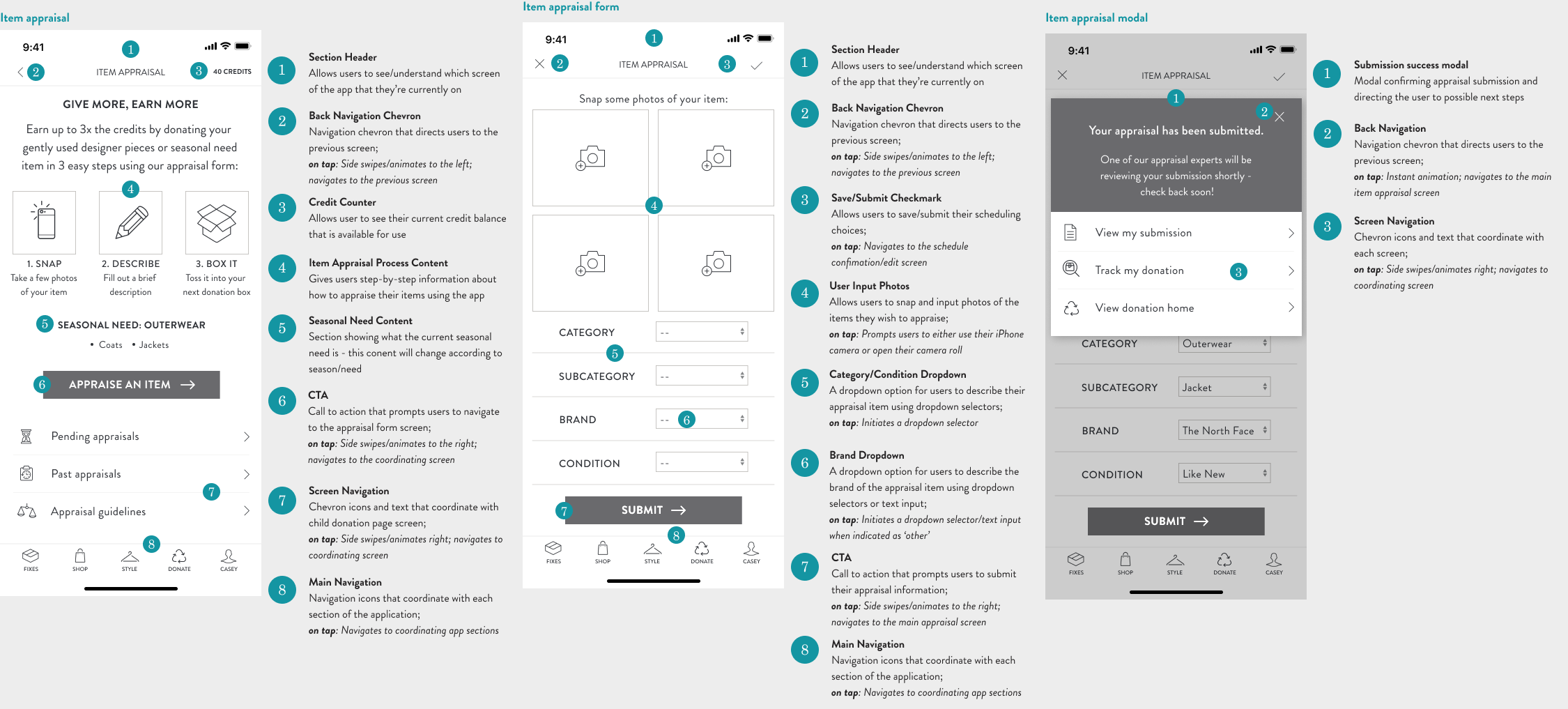
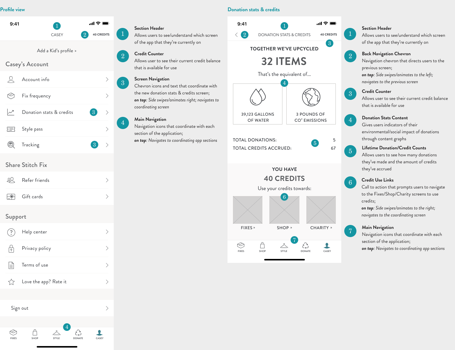
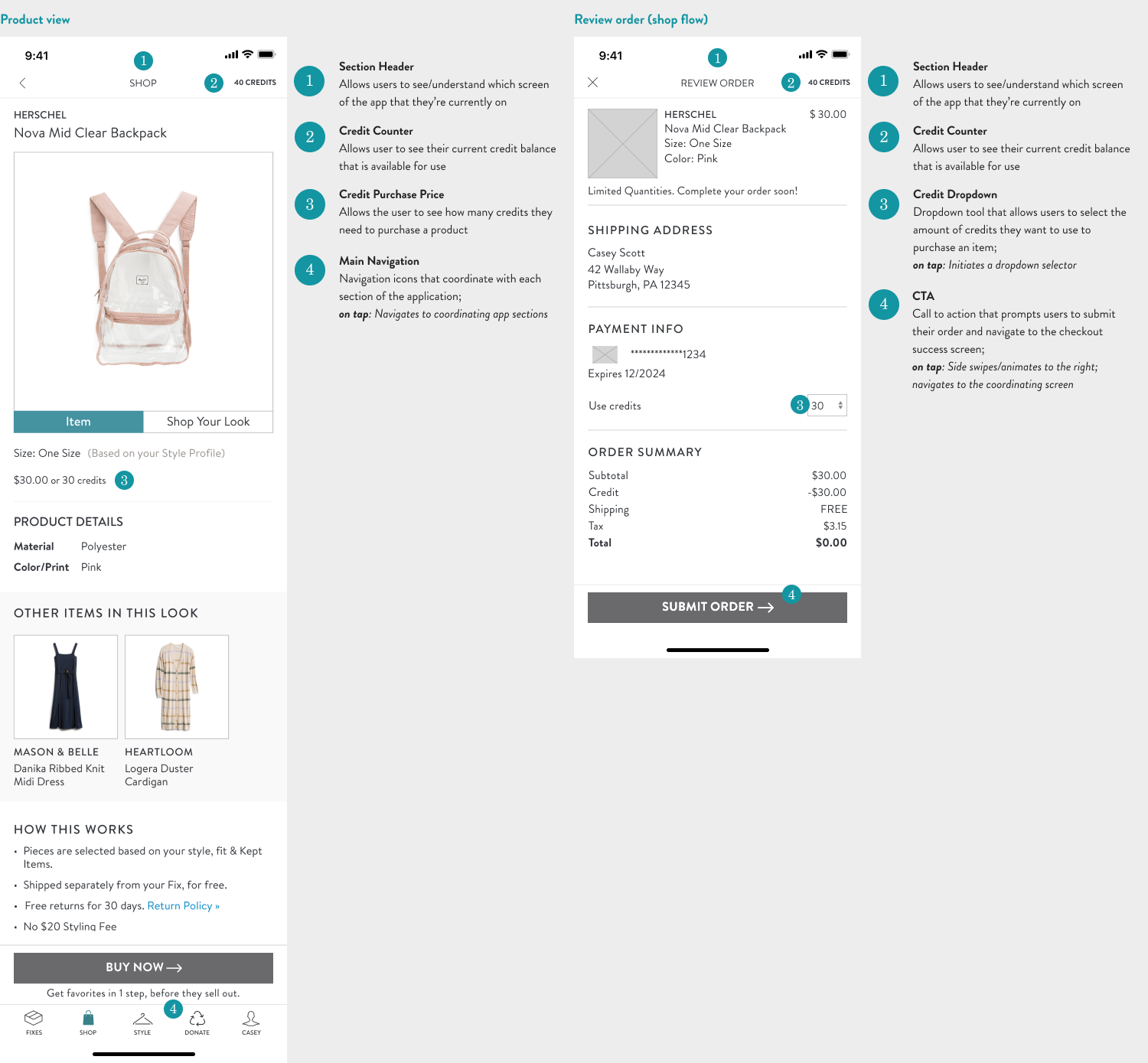
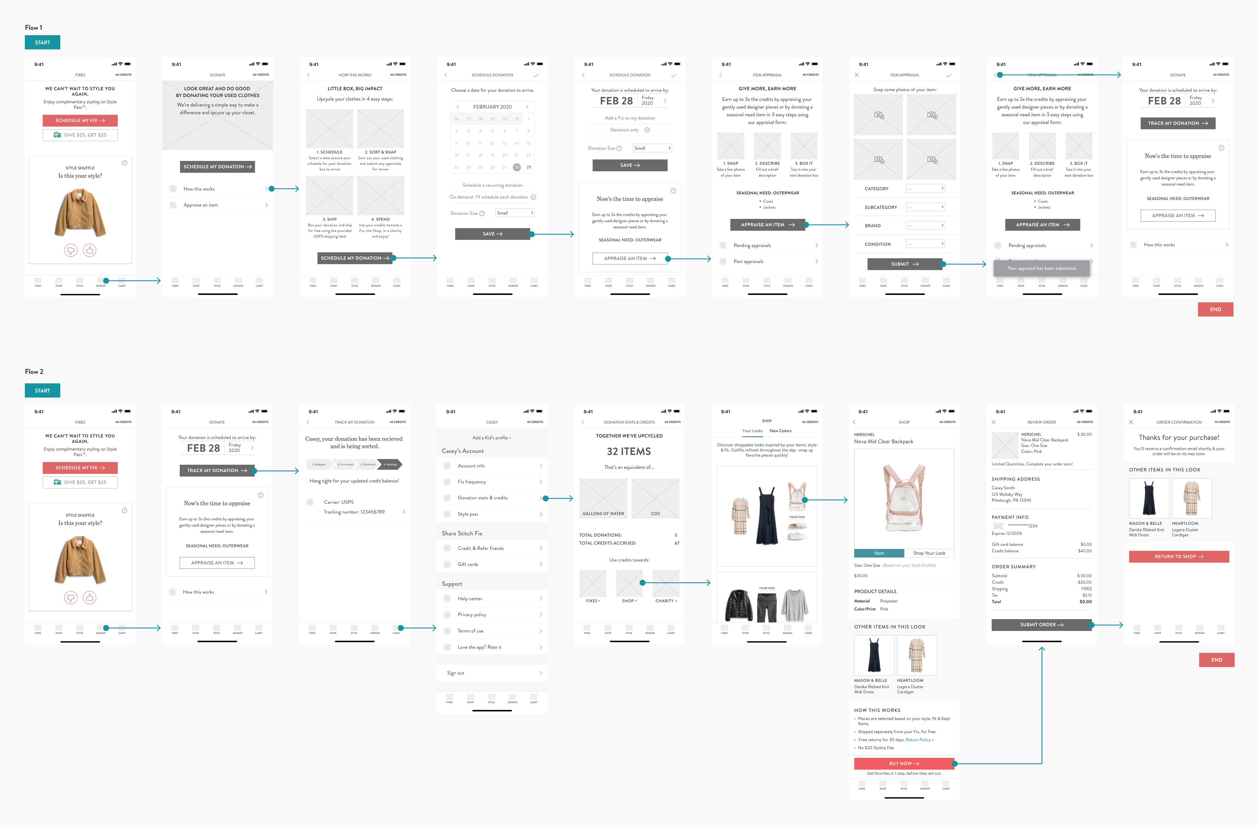
After mapping out a provisional user path and flow and creating the wireframes to showcase this, I was able to create a visual wireflow that would chart out the likely user pathways while using the app itself in preparation for usability testing. I focused on scheduling flows, appraising an item, tracking a donation package, confirming user environmental/social impact, and using credits during the checkout flow of the shop feature.
Usability Testing
Test Synthesis | Affinity Map
With a workable flow and prototype in hand, it was finally time to start testing these designs with real users to gauge whether or not I was moving in the right design direction. I conducted a series of in-person and remote testing sessions where 5 participants talked me through and completed a series of scenarios and tasks using a mid-fidelity version of the Stitch Fix donation mobile feature using a Figma prototype.
Before setting out to test participants, I needed to define some objectives and an overall goal for the study to really pinpoint what was working and what needed more attention moving forward...
Goal
- To examine and evaluate the overall user flow of the Stitch Fix mobile donation feature. Specifically, find pain points and areas of opportunity in the navigation flow and IA.
Objectives
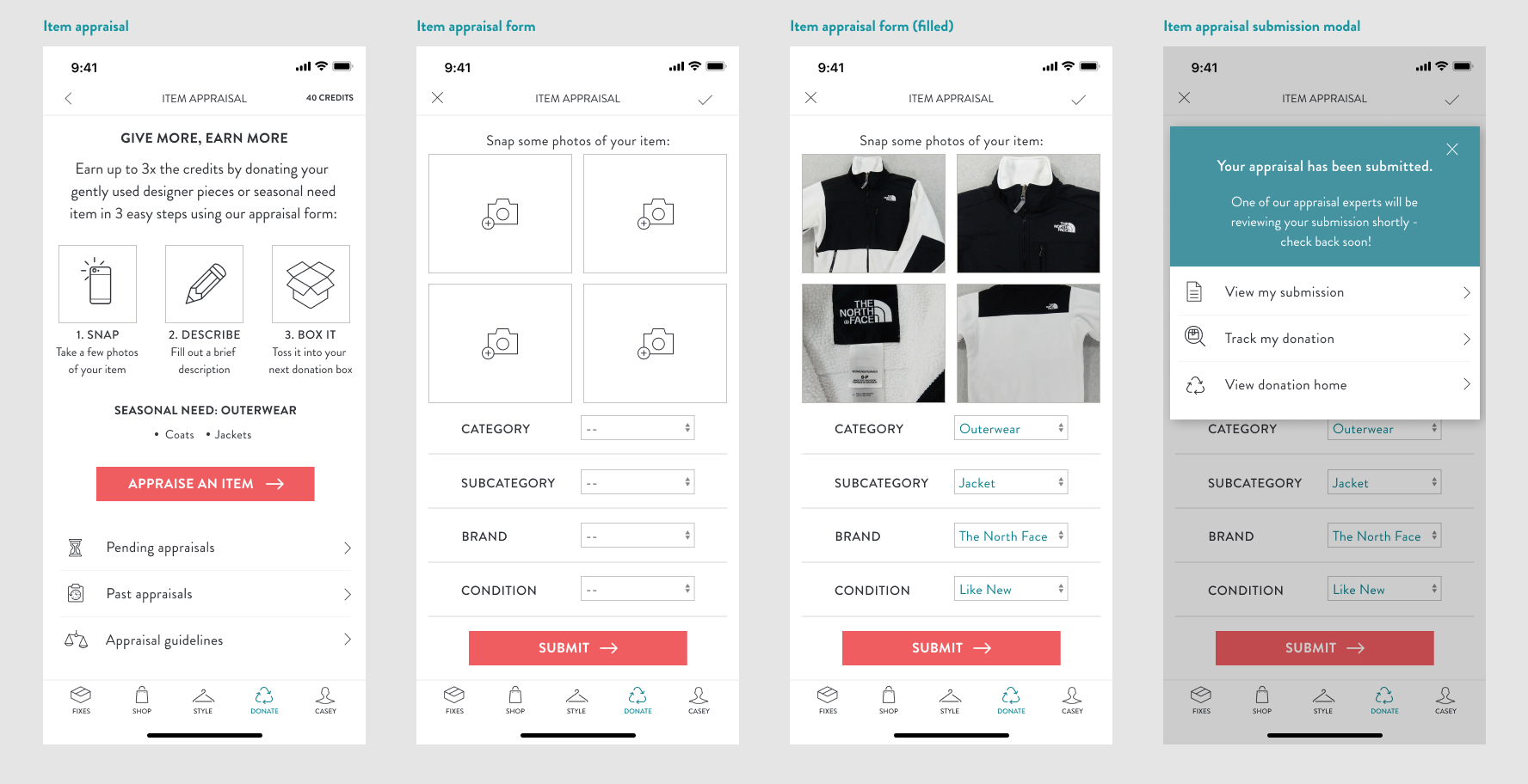
- Test how users schedule and appraise their donations
- Test how users track their donation shipments
- Test how users approach shopping/spending using a donation credit incentive system
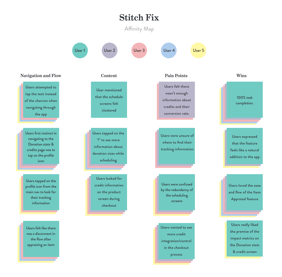
After testing, I compiled all of my notes and began to look for patterns across how the test participants interacted with and what they were saying about the prototype. I specifically honed in on what was working and what fell flat in the process and visualized these patterns and findings in an affinity map to organize trends and data into clear and digestible themes that I could begin to work through in the next iteration of priority revisions.
Final Solutions
High-Fidelity Wireframes | Figma Prototype
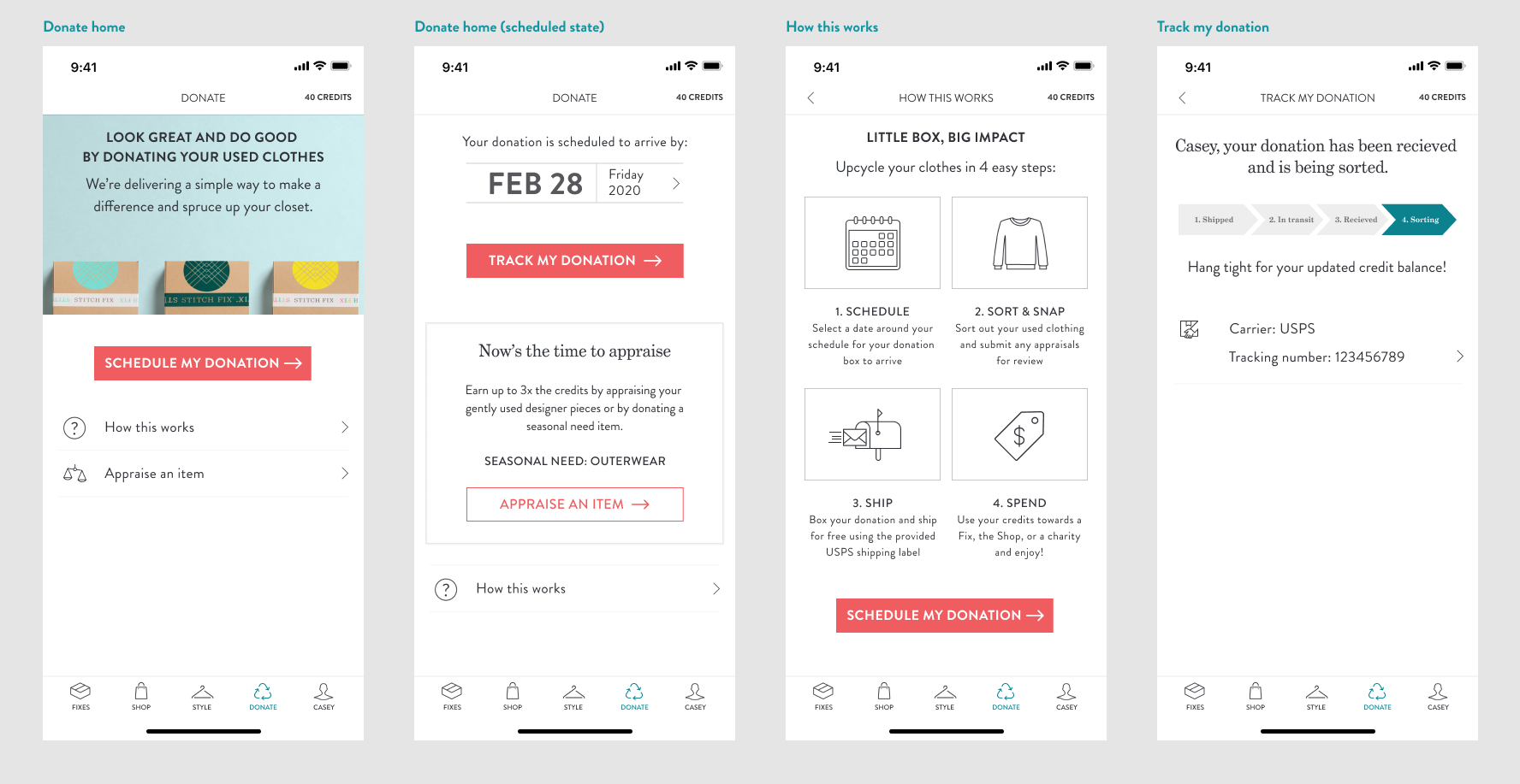
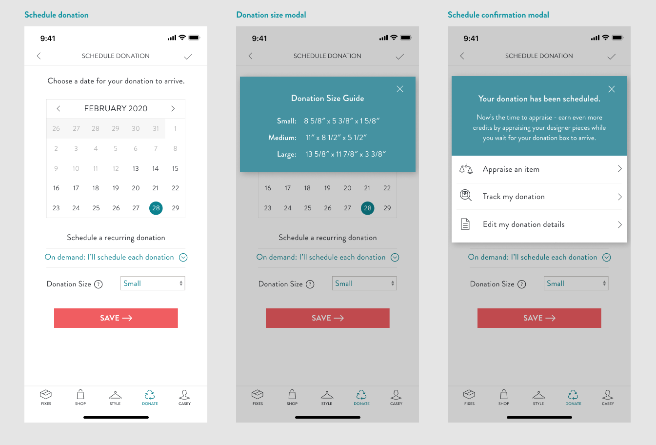
After conducting usability testing, I was left with a list of changes and user suggestions to consider in the priority revision phase of this project. I focused on adjusting some confusing CTA wording and content sizing on the scheduling screens for a clearer visual balance and to establish a visual hierarchy between content sections and to differentiate between the editing and confirmation screens. Users also called out the lack of information about the credit system and where to learn more and see credit conversion, so I included more context into credits by adding a credit content section on the Donation Stats & Credits screen and added credit information and availability to the product page for specific conversion clarification.
Reflections, Recommendations, and Next Steps
What's next for Stitch Fix's donation feature? Implementation + iteration then rinse and repeat. In further iterations, I would look to plan another round of usability testing to evaluate the changes that were made during the first set of priority revisions to test their effectiveness and look to research and build out more of the screens and integrations with the rest of the Stitch Fix service. Specifically, I would look to integrate more donation options and more personalized donation options in line with Stitch Fix's current personalization model by focusing on the actual donation experience by designing a donation quiz similar to the style quiz that currently exists.
Beyond adding a donation to a Fix shipment, I would also want to explore how to design ways to showcase the impact that Stitch Fix is making in sustainability efforts and the partnerships that they've been working to build with other sustainable retailers. With user needs trending towards transparency and corporate responsibility, I would recommend Stitch Fix to design a space for users to learn and discover how Stitch Fix is making an impact and how they as consumers could get involved and help curb fast fashion waste.
Through the process, I gained a wealth of experience with design thinking in an already existing design system and creating a seamless experience for the user. This was a fun challenge to design an experience around and know it will be an important skill to reflect and build upon for future design opportunities that I take on.