
Shoebox
UX/UI Design, Content Design, Branding
Role: UX/UI Designer, Content Designer
Tools: Figma | Adobe Illustrator | Whimsical
Who is Shoebox?
Shoebox is a new social app and tool for sneakerheads where sneaker collectors can keep track of and share their collections with one another. Inspired by the expansive sneaker catalogs of sneaker buy/sell companies like GOAT and StockX, Shoebox has built their own sneaker database and are looking to utilize it by offering a more user-centric approach to their app by adding research-based features and flows tailored to and for sneakerheads.
The Challenge
Shoebox is looking to creating a social space and collection tool where sneaker enthusiasts can track and show off their collections in an organized, comprehensive way. They're looking to take sneaker collecting beyond physical collecting by identifying and developing features that will delight and satisfy their userbase.
The Solution
I researched and designed an end-to-end mobile application for Shoebox and built a visual brand that showcases current sneaker and sneaker collecting trends using research-based design methods to guide feature development, information architecture, and visual style.
The Research
Competitive and Comparative Analysis | User Interviews
Before I could start designing, I needed to map out the research goals and questions I would need to ask and answer in order to determine the methods I would be using to begin to build-out a design plan. Along with assessing what other sneaker apps are doing and what the trends currently are in sneaker collecting and the industry as a whole, I knew that I would need to talk directly to sneakerheads and learn more about sneaker subculture and trends to determine and design for their needs and behaviors.
I decided on two main forms of research that I felt would point me in the right direction and answer the questions I had about sneaker culture and industry trends: my primary form of research being user interviews in order to directly talk to users who collect sneakers in order to understand and empathize with their processes, needs, and frustrations and the secondary being competitive and comparative analysis of Shoebox’s competitors to gauge overall user expectations and discover trends and opportunities in the sneaker app space.
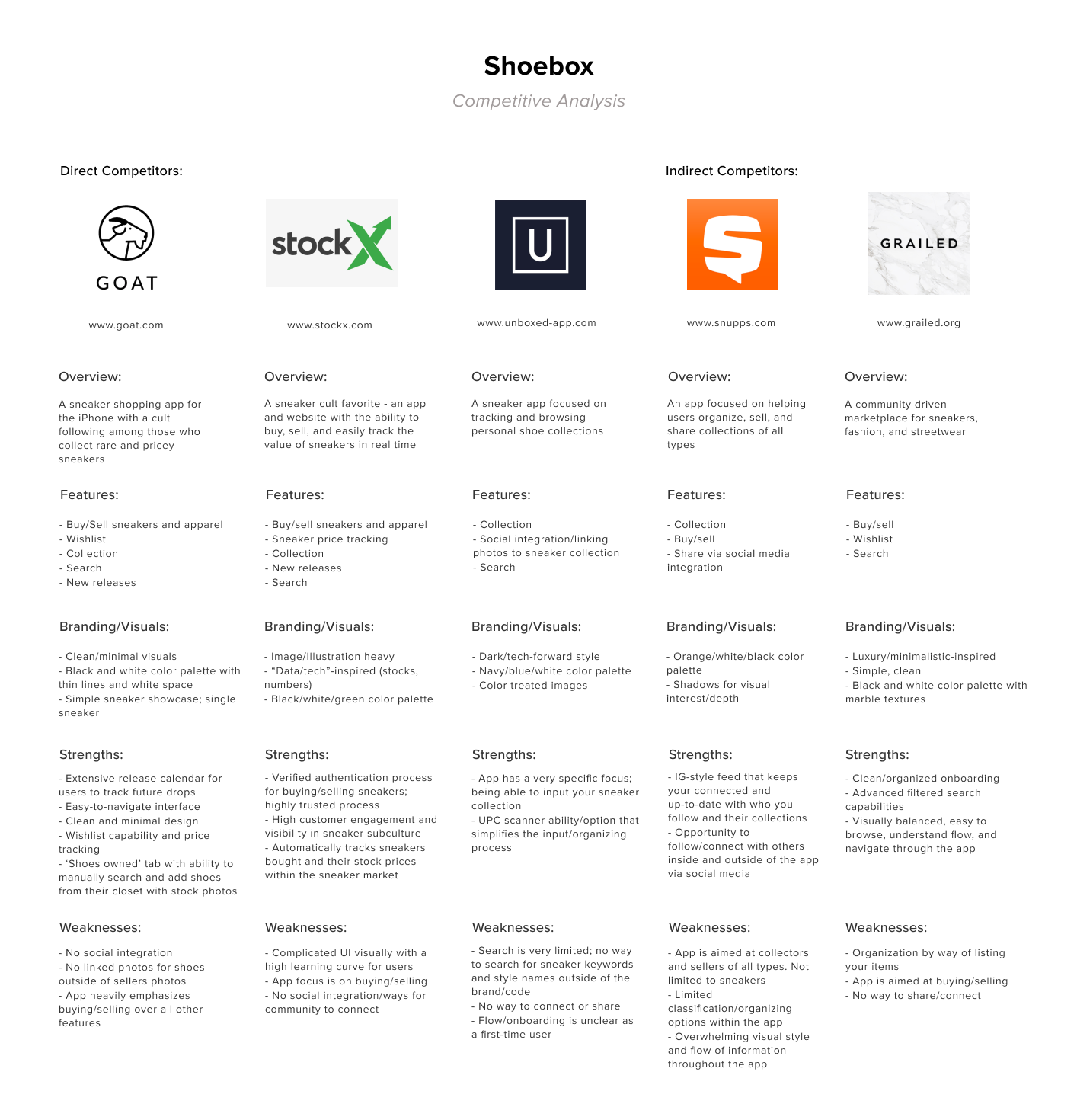
After analyzing Shoebox's competitors, I found some similarities in that there was a big focus visually on clean, minimalistic layouts with a high-fashion feel with one or two bright pops of color and bold logo-types. In identifying opportunities amongst Shoebox's competitors, I found that the sneaker apps I evaluated were overwhelmingly catered to males and felt more masculine in terms of visual style and lacked the social features which connected their communities. This indicated to me that there was an opportunity to design for a more inclusive sneaker community and expand further into developing social features for the app.
With these findings in mind, I then set out to talk to real sneaker collectors and conducted a set of one-on-one interviews with 5 participants that were recruited from a sneaker Discord server to dig further into how and why they collect sneakers, what tools they use, and to better understand their needs, wants, and behaviors overall. All interviewees considered themselves sneakerheads, actively collected sneakers, are participating members of a social community of sneaker enthusiasts online, and have experience using sneaker apps and web resources. After jotting down notes and analyzing their behaviors and insights, I was able to boil down a list of takeaways that outlined what these users needed and wanted from a sneaker collection app:
Participants let me know that they needed…
- A collection feature that provides convenience and makes sneaker information input easy and fast
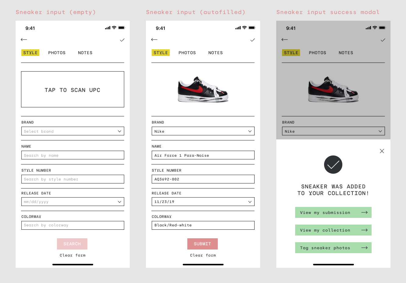
- A search feature with a variety of ways to connect users with the sneaker styles that they want to add to their collection or want to add to their wishlist (ex: search by brand, style, color, code, keyword, or scan UPC code)
- A wishlist that can help users plan/organize their next sneaker purchase based on a ranking system or remind them of a release date
- Ability to share sneaker profile/collection easily (ex: QR code - Snapchat-inspired/Share link)
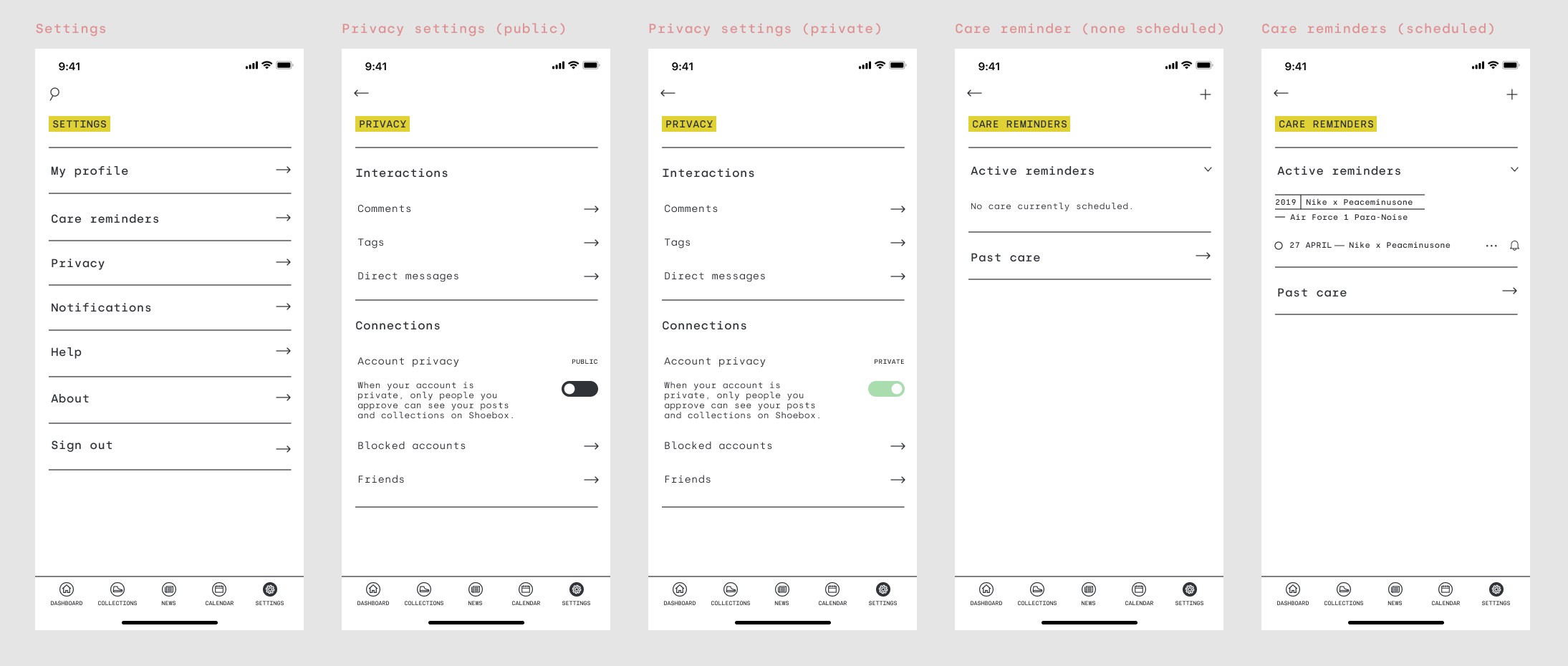
- Privacy preferences/settings
and that they wanted...
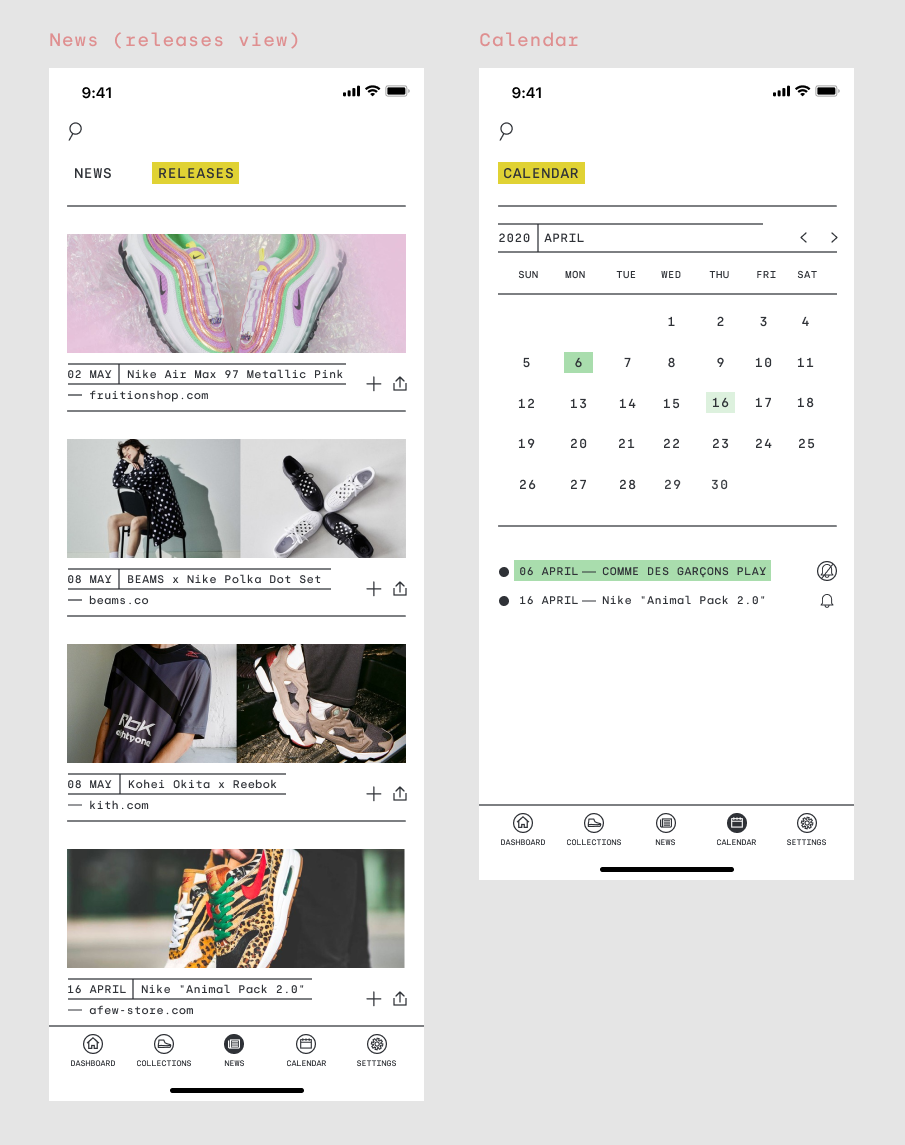
- Ability to condense preferred sneaker news sources into one, streamlined news feed
- A customizable release calendar and integrated phone alarm options
- Photo feed/linked photos where users can take fit/outfit/sneaker photos and tag their sneakers from their collection
- Ability to connect/post collections and photos with/on other social media outlets
- Ability to add friends and see/like their photo feeds
The User
User Personas | User Journeys
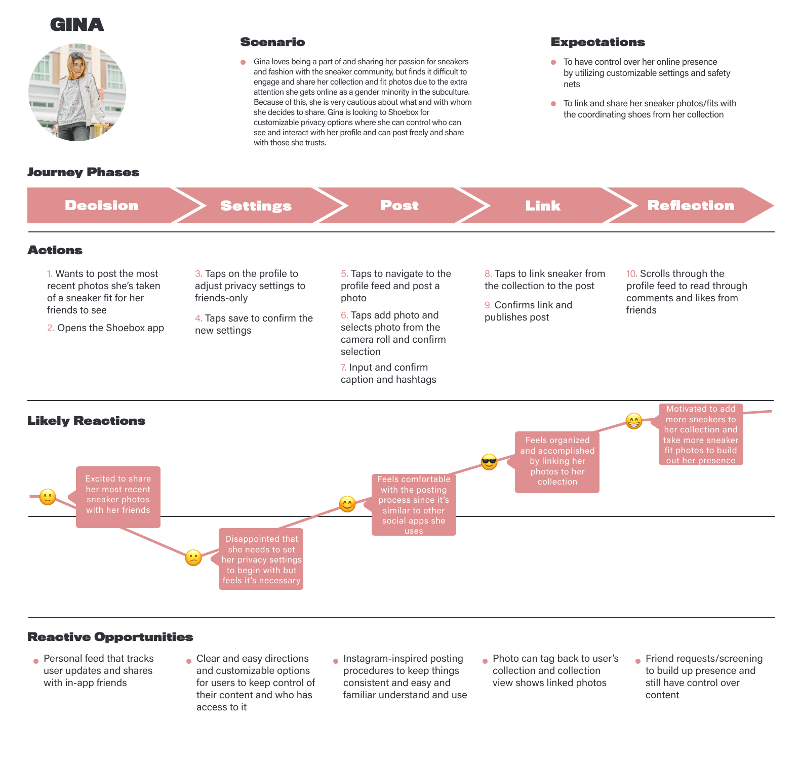
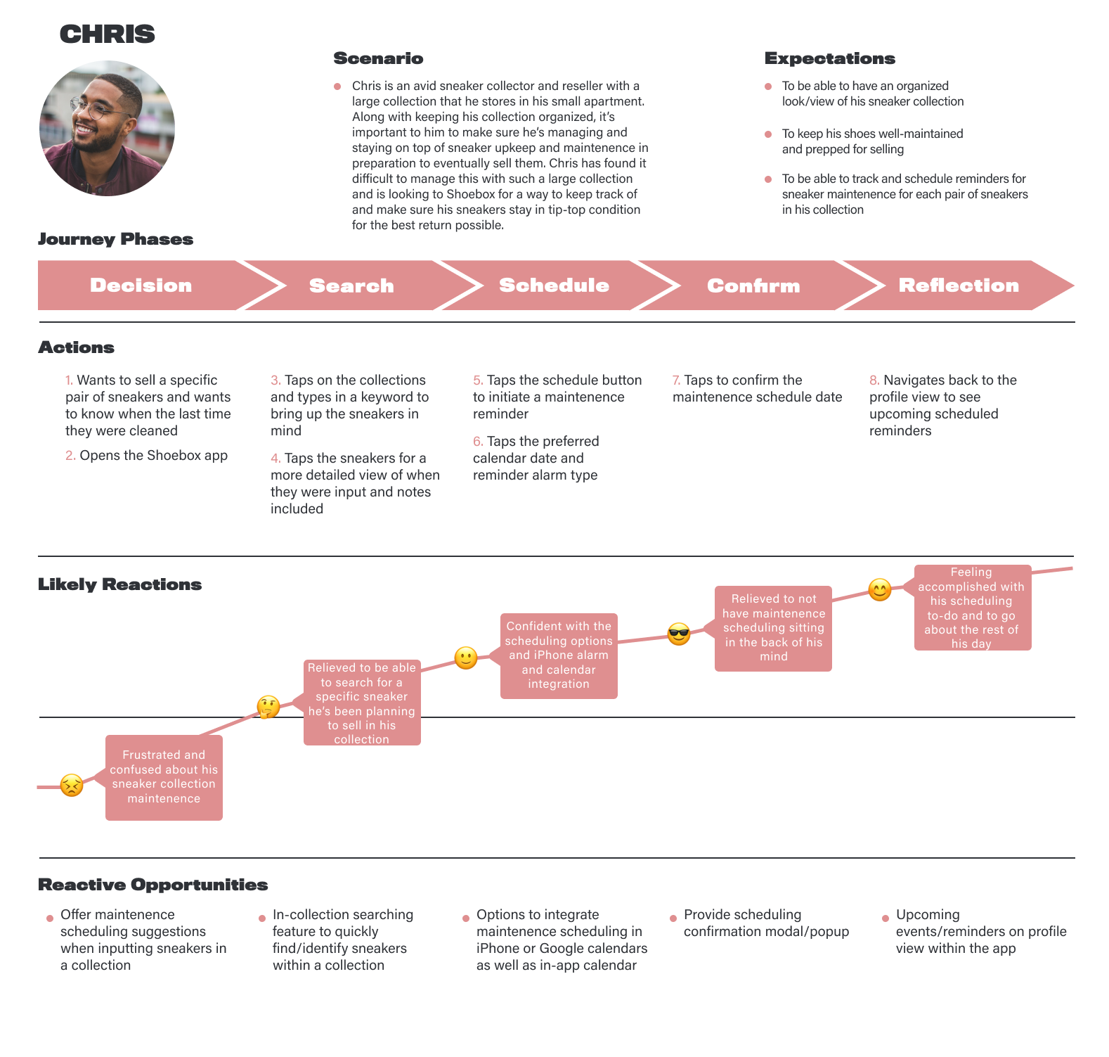
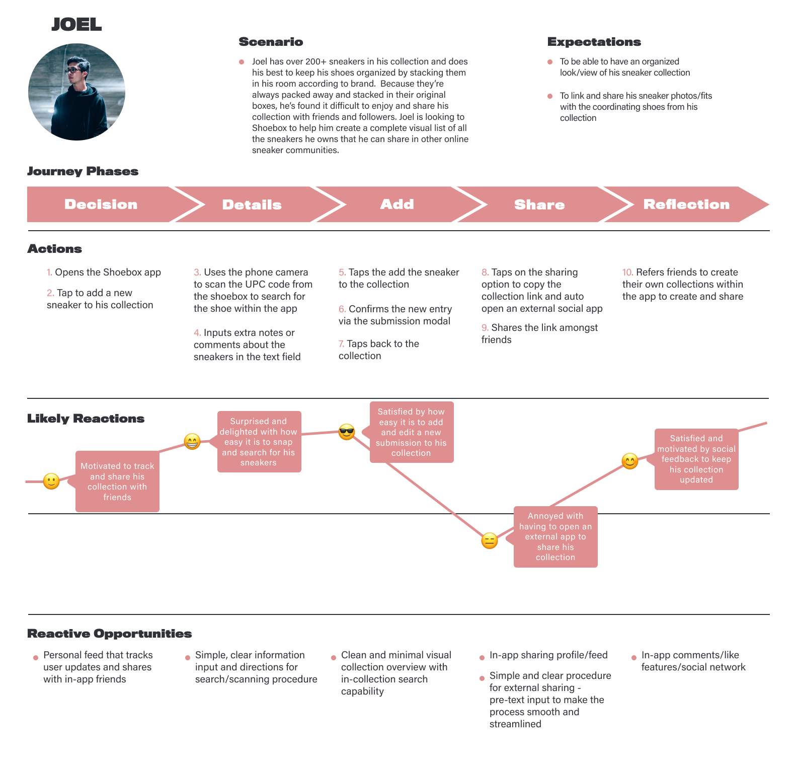
Using these interview findings and user needs/wants, I then set out to create a persona set that would reflect a snapshot of who a Shoebox user could be, formulate what features they would need and want, and then begin to chart out their user experience using the app. Three very different personas were born out of the collective research and interview takeaways and served as a jumping-off point to begin to start brainstorming their pathway to discovering the app, how they would integrate the features of the app with their current sharing and sneaker collecting systems, and what would be the best design solutions for them.
Meet Gina, Chris, and Joel...
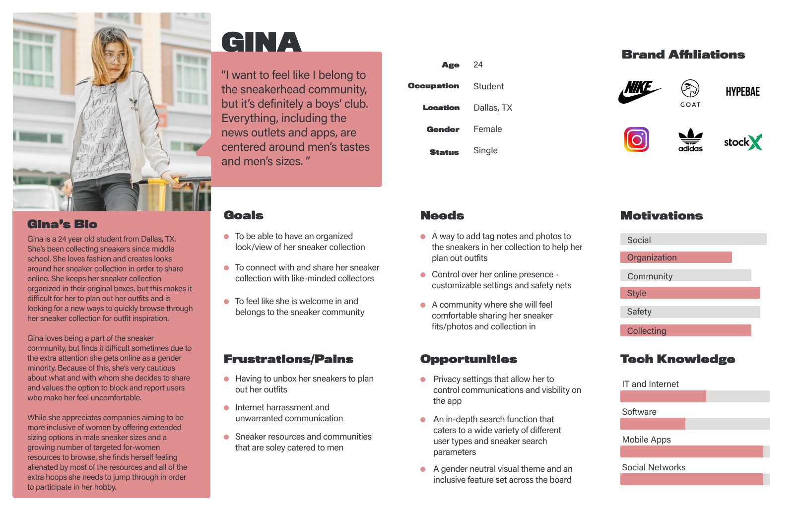
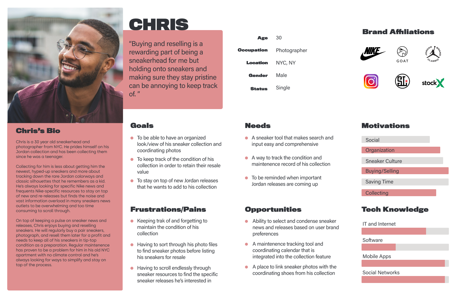
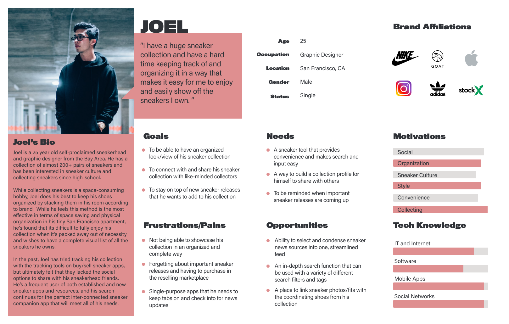
With the persona profiles laid out, I was able to chart out each persona's potential user journeys focused on each of their unique and specific pain points and opportunities that Shoebox would address and how they would navigate through the various features based on their personality profiles and personal goals. This gave me a sense of how I could begin to design the navigation, flow, and build out important features that would be integral for each persona's success and satisfaction with the app.
Building the Product
Sitemap | Sketching | Wireflows | Mid-Fidelity Wireframes
Once I was able to frame each persona's state of mind and determine their potential pathways in discovering and using the Shoebox app, I started to think about elements of information architecture for the app itself, the features that needed to be included, and what the sections of the app would look like from a structural standpoint and charted out a simple and logical sitemap that would help me begin to visualize the next steps in building the product.
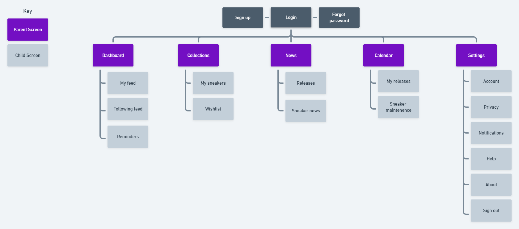
With features and information architecture charted out, I was able to begin to ideate potential layouts and build out content sections of the Shoebox app. I spent time experimenting with varying content arrangements and research-based features until I landed on layouts that were logical and visually compelling, made sense within the scope of Shoebox's goals and sneaker collecting conventions, and met the needs of and addressed the opportunities according to each persona.
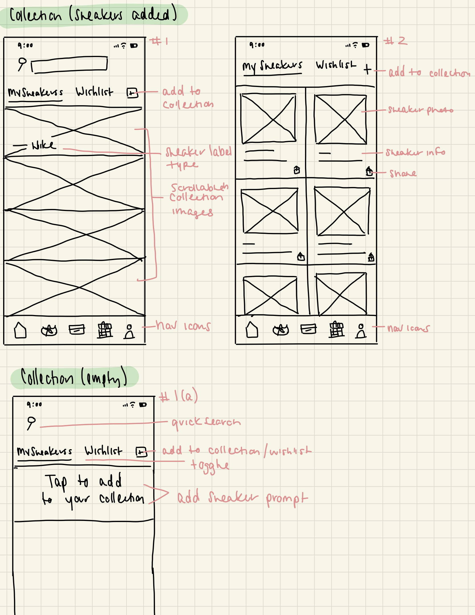
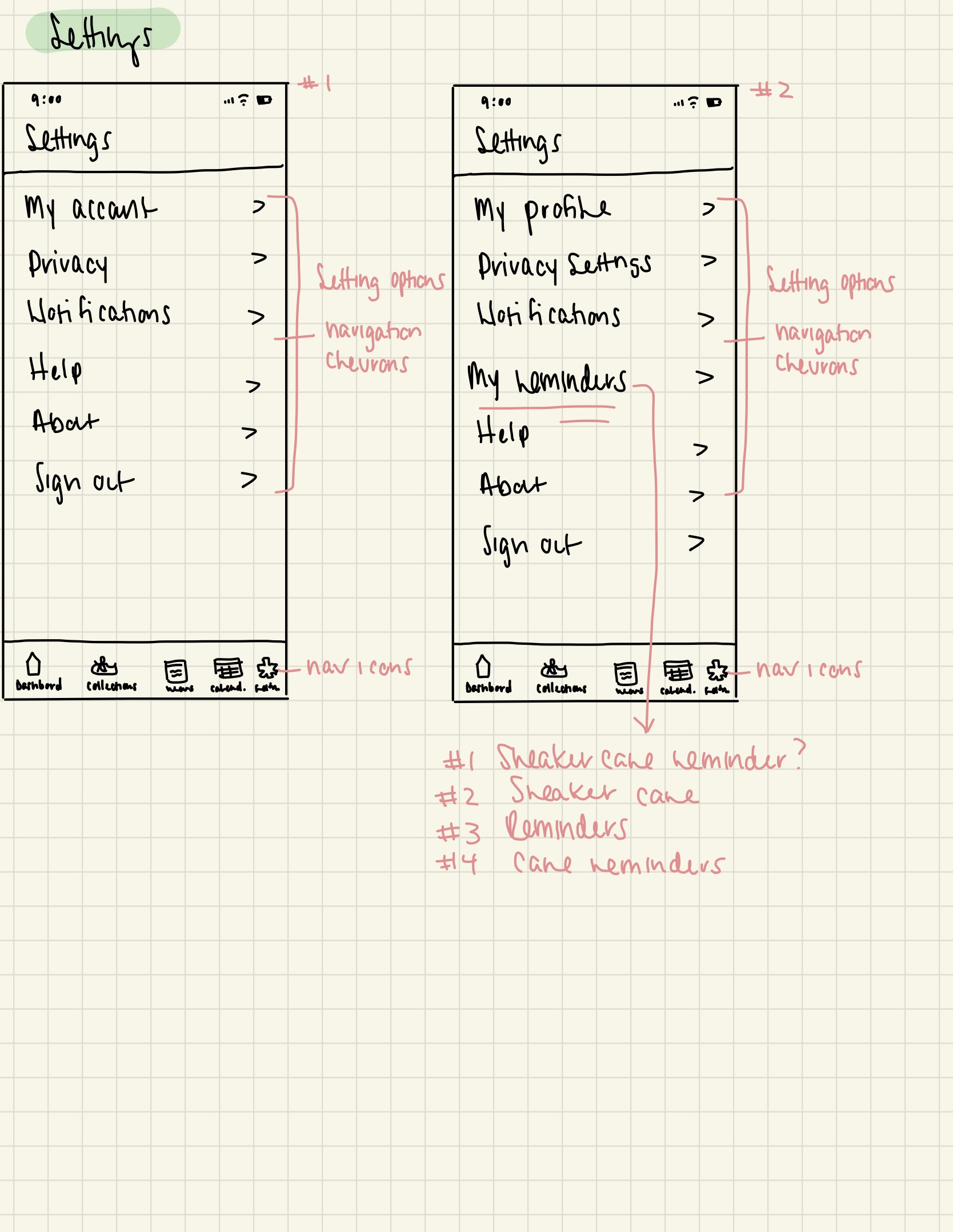
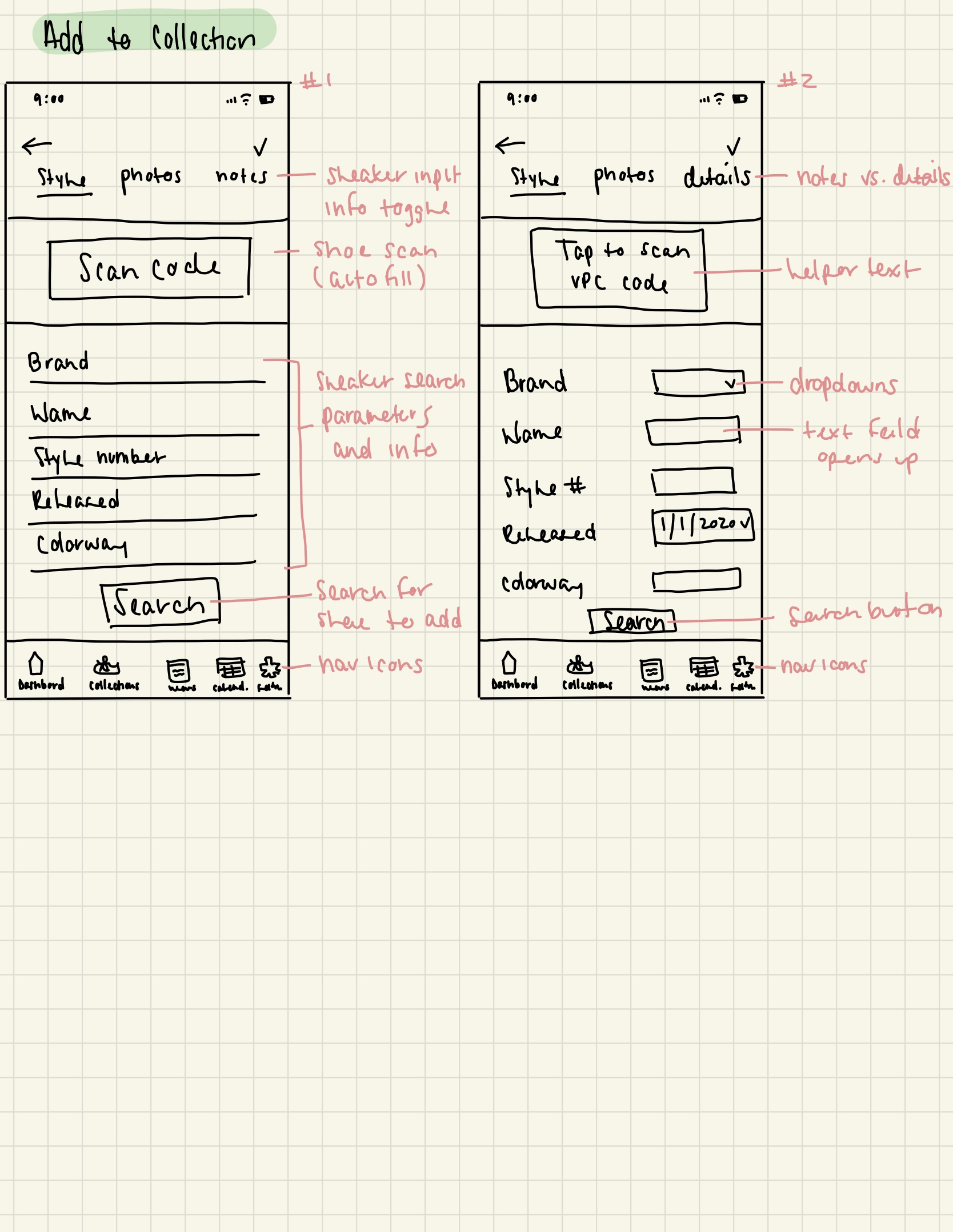
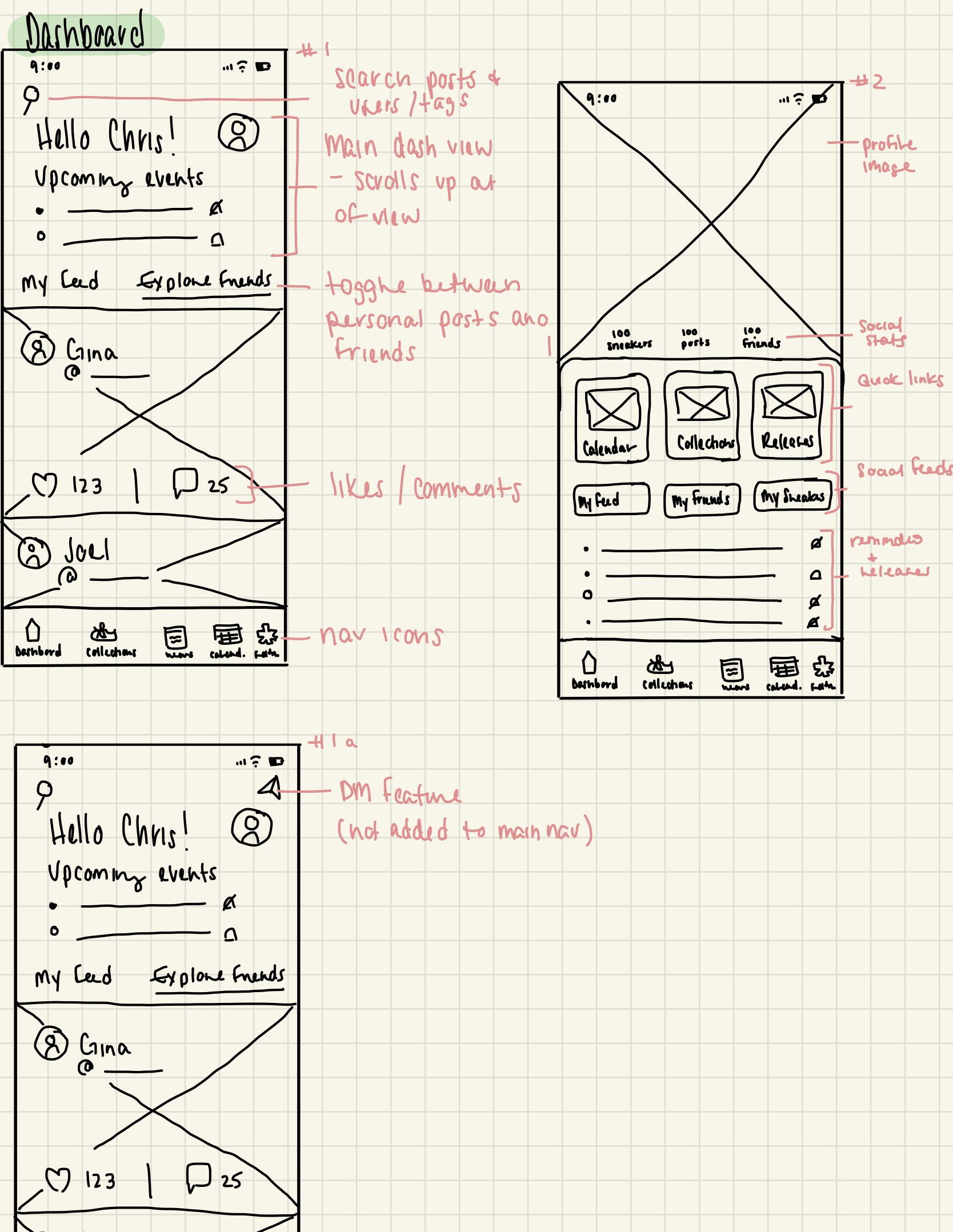
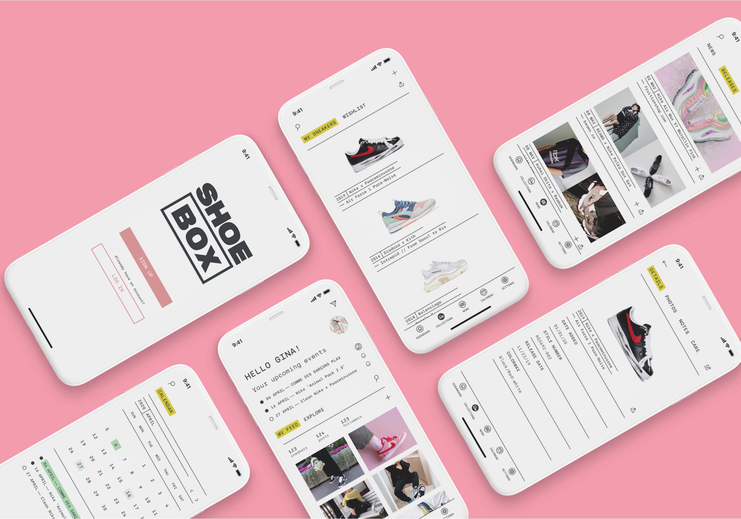
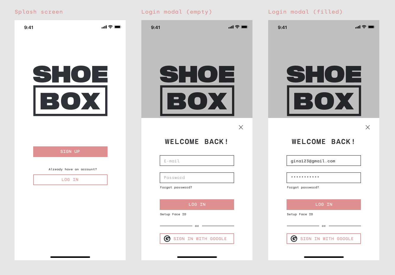
Using my sketches as a frame of reference, I then re-created them in Figma to create my mid-fidelity wireframes and annotated the content sections and features to describe their purpose and potential user interactions.
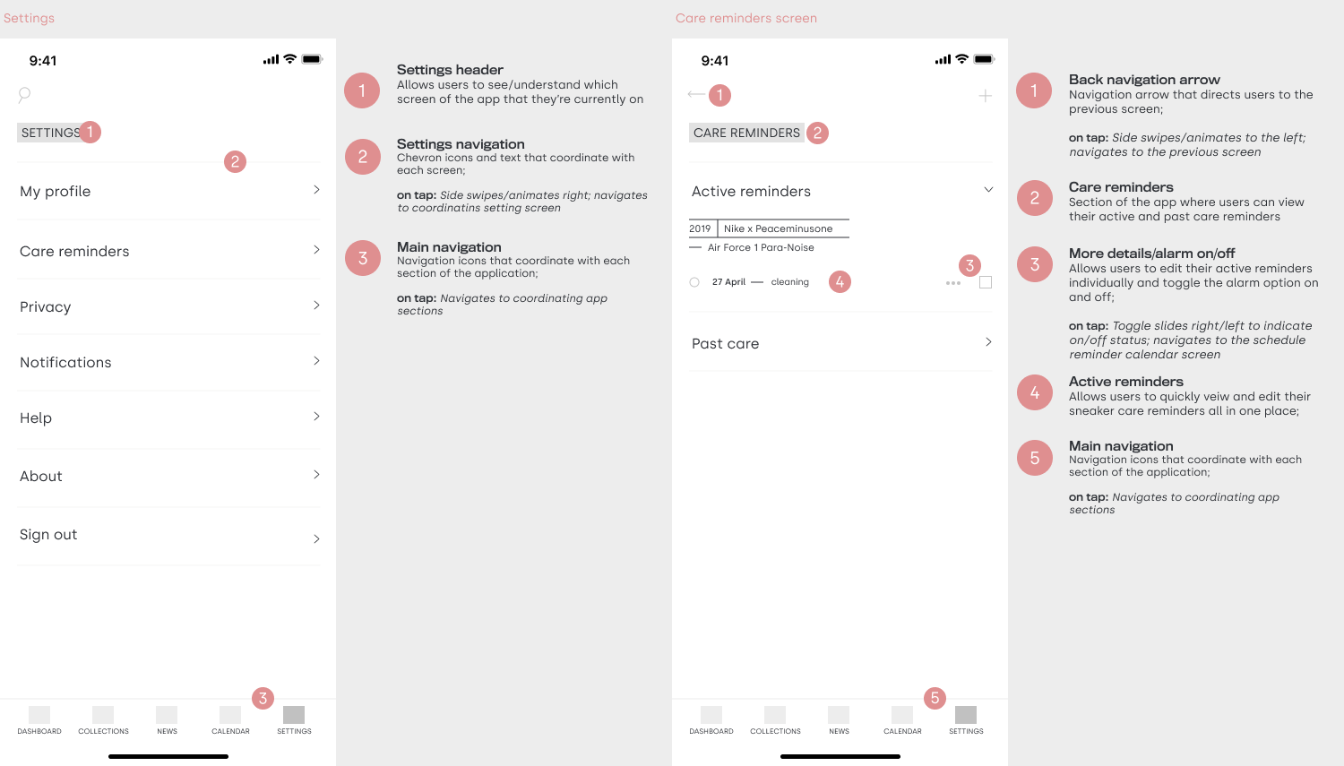
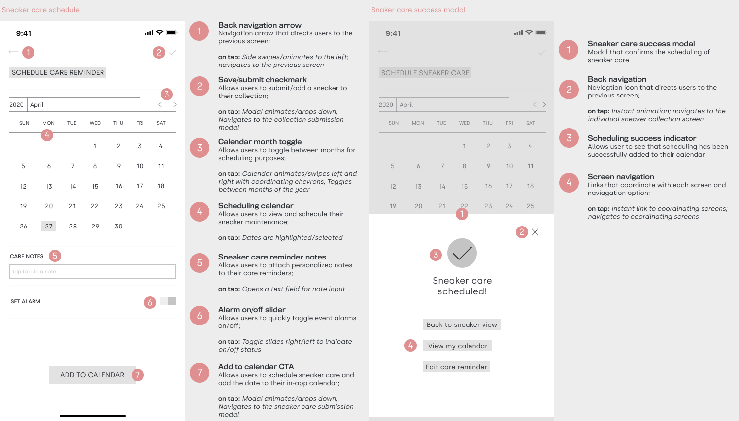
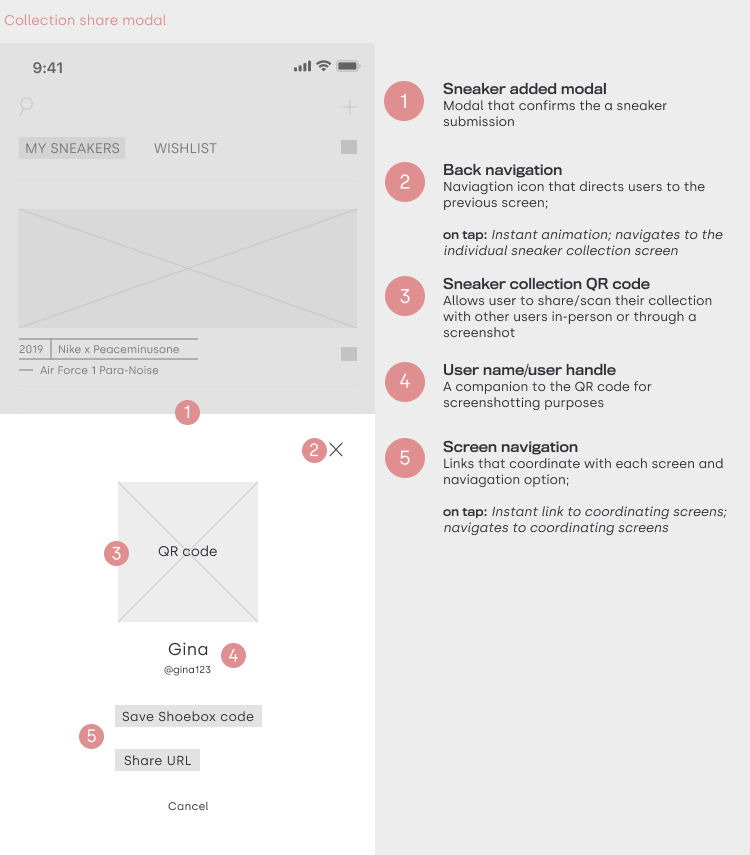
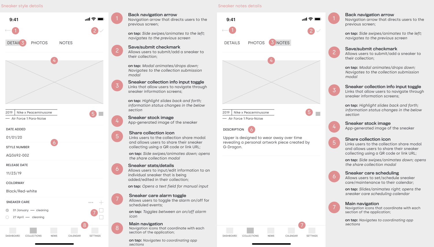
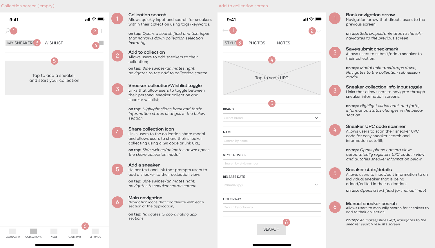
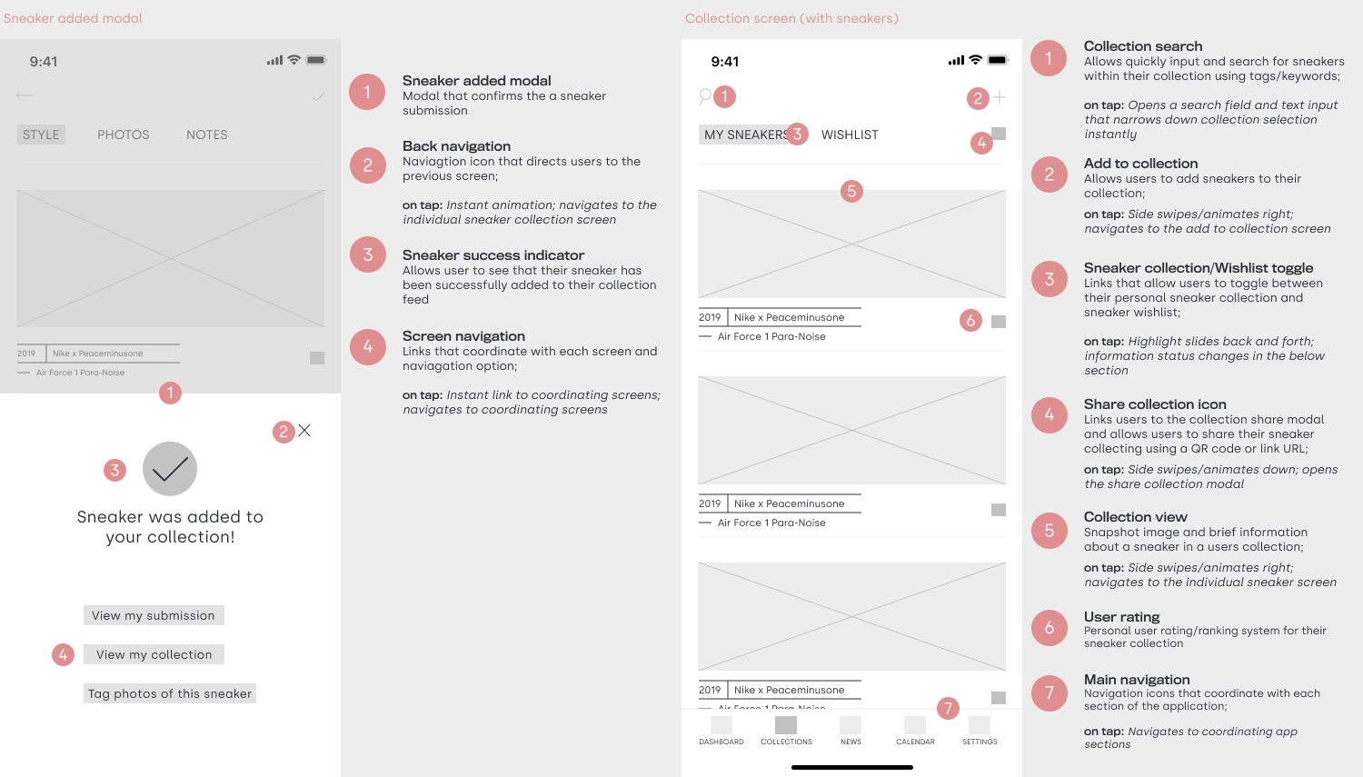
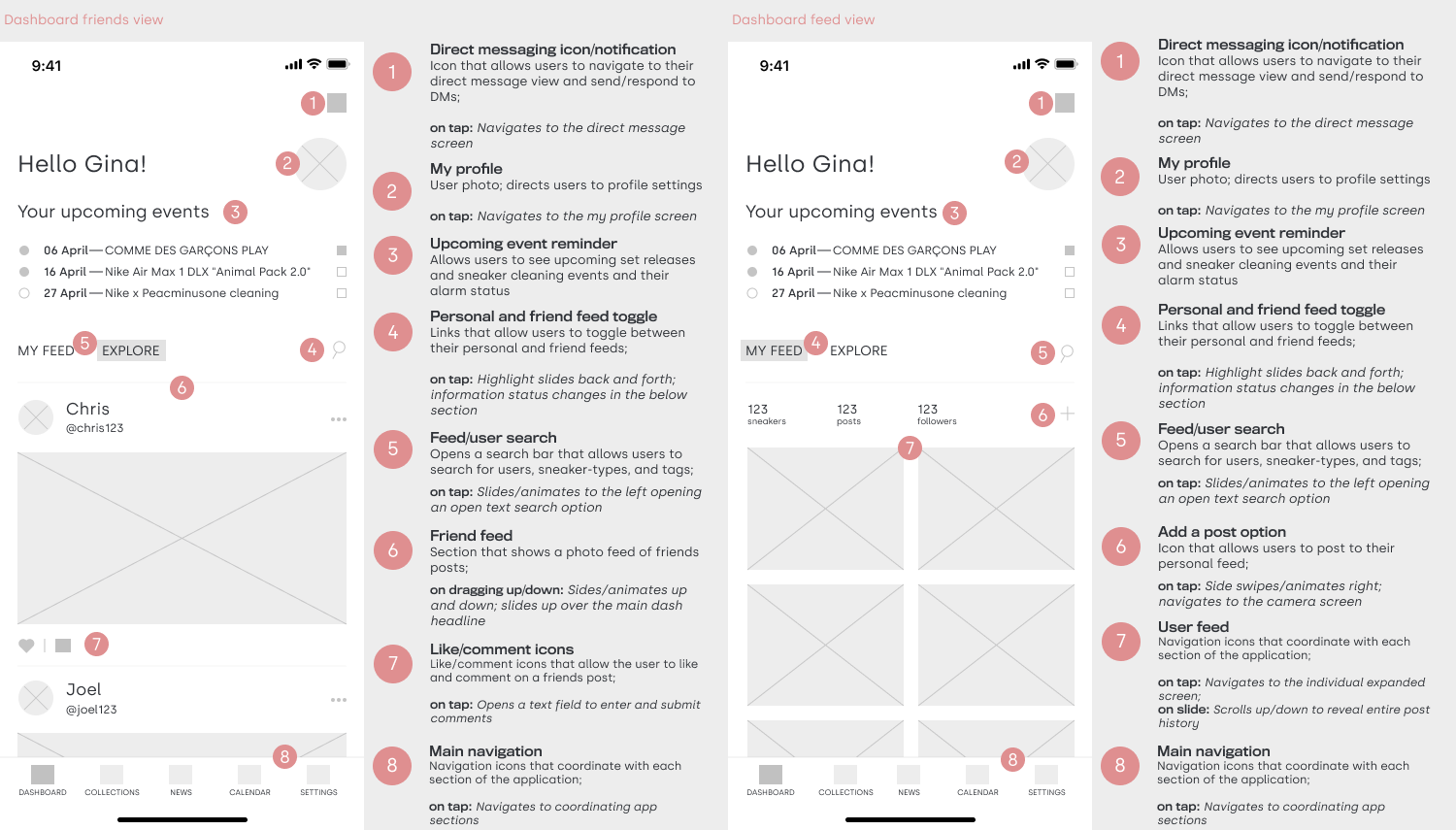
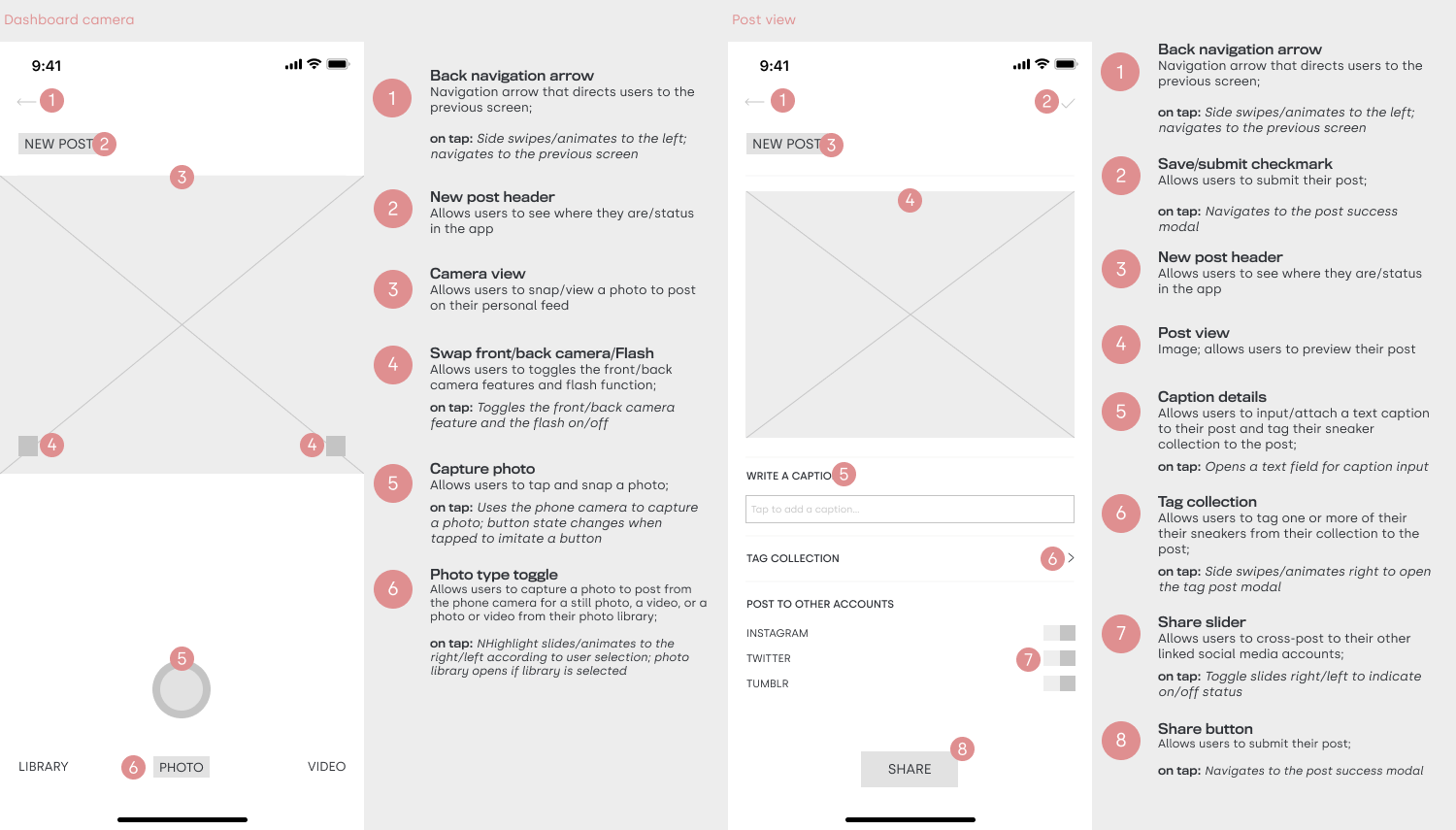
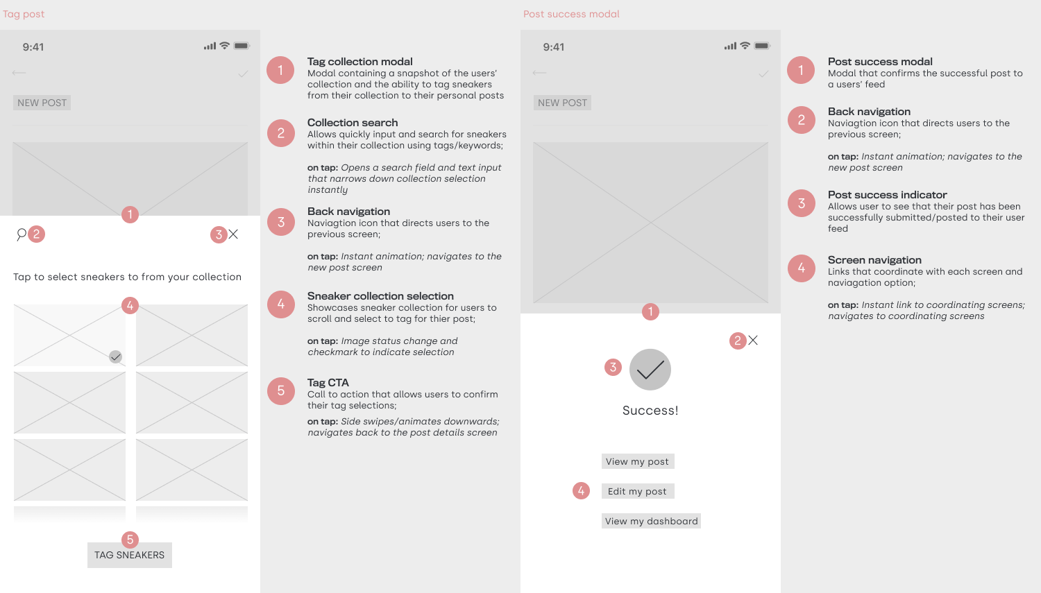
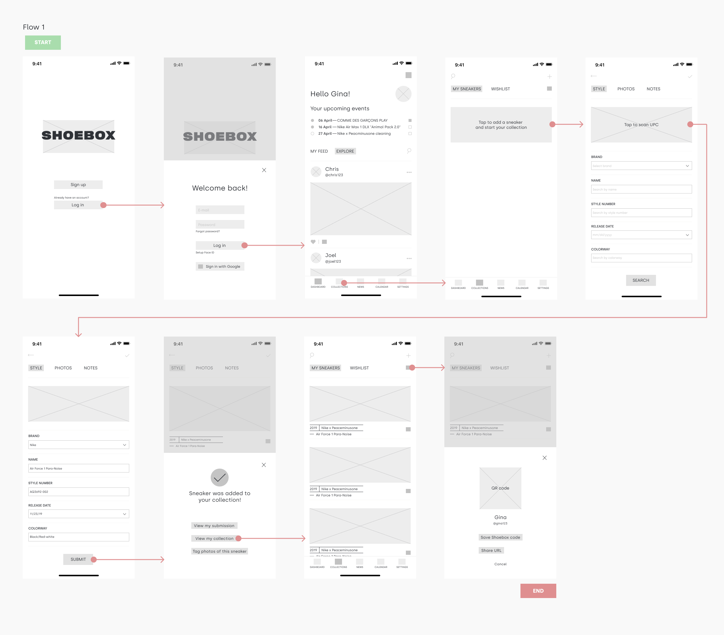
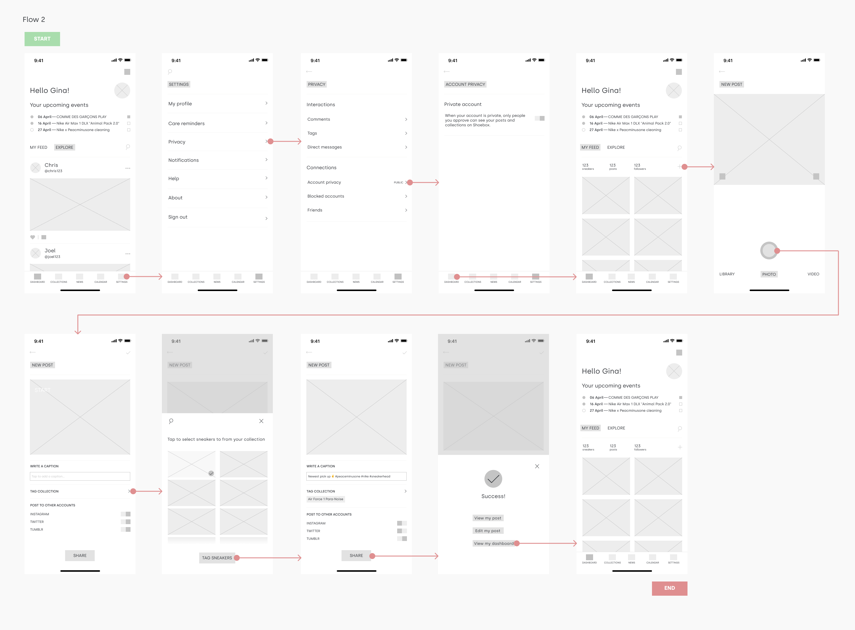
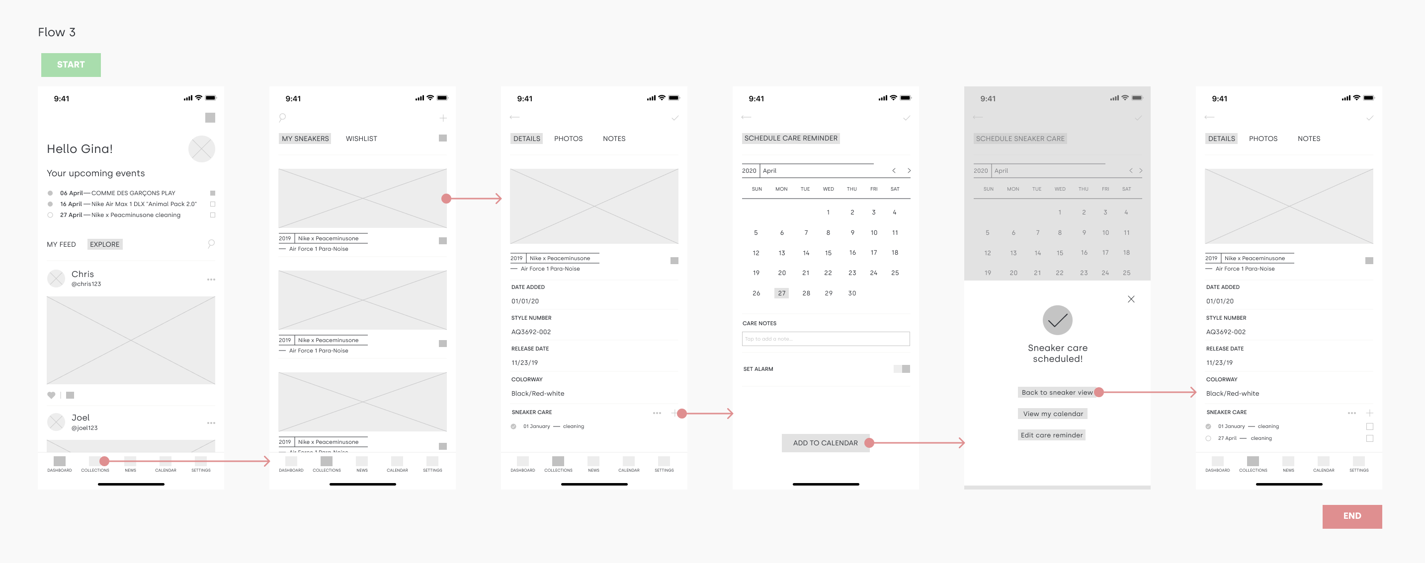
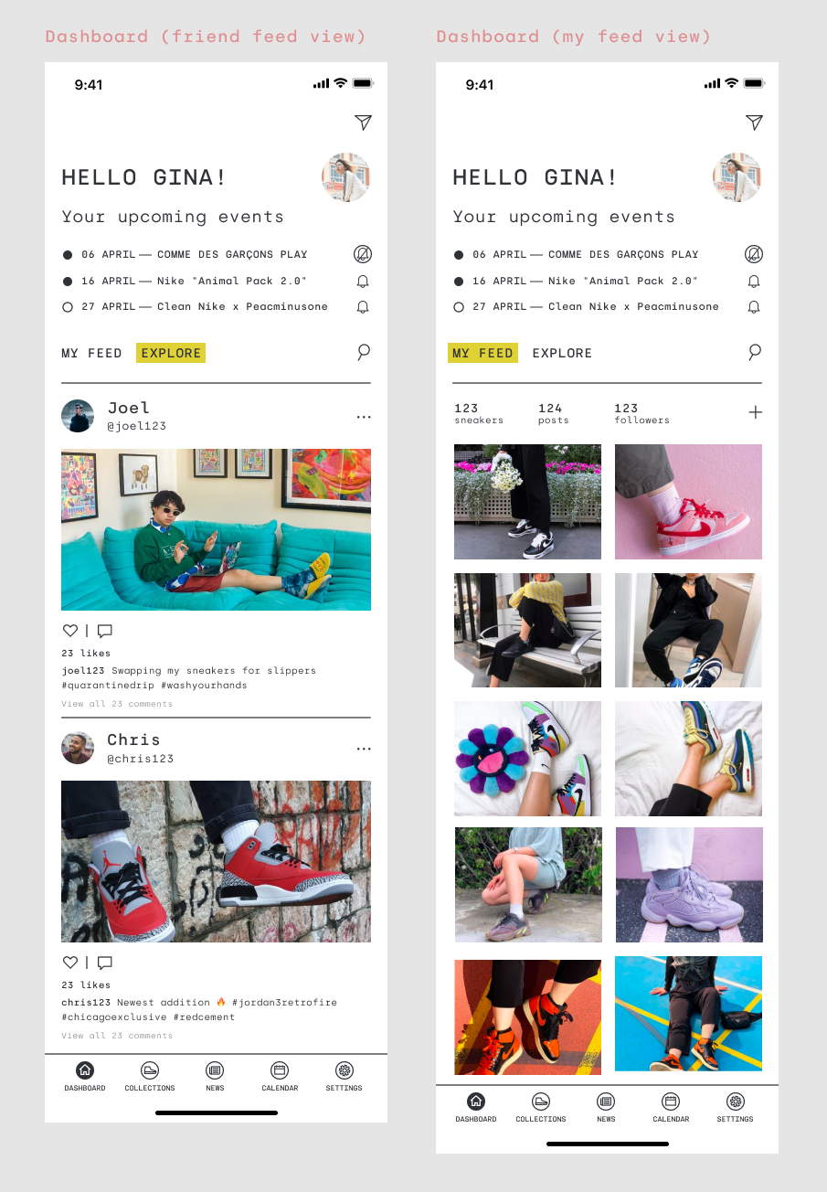
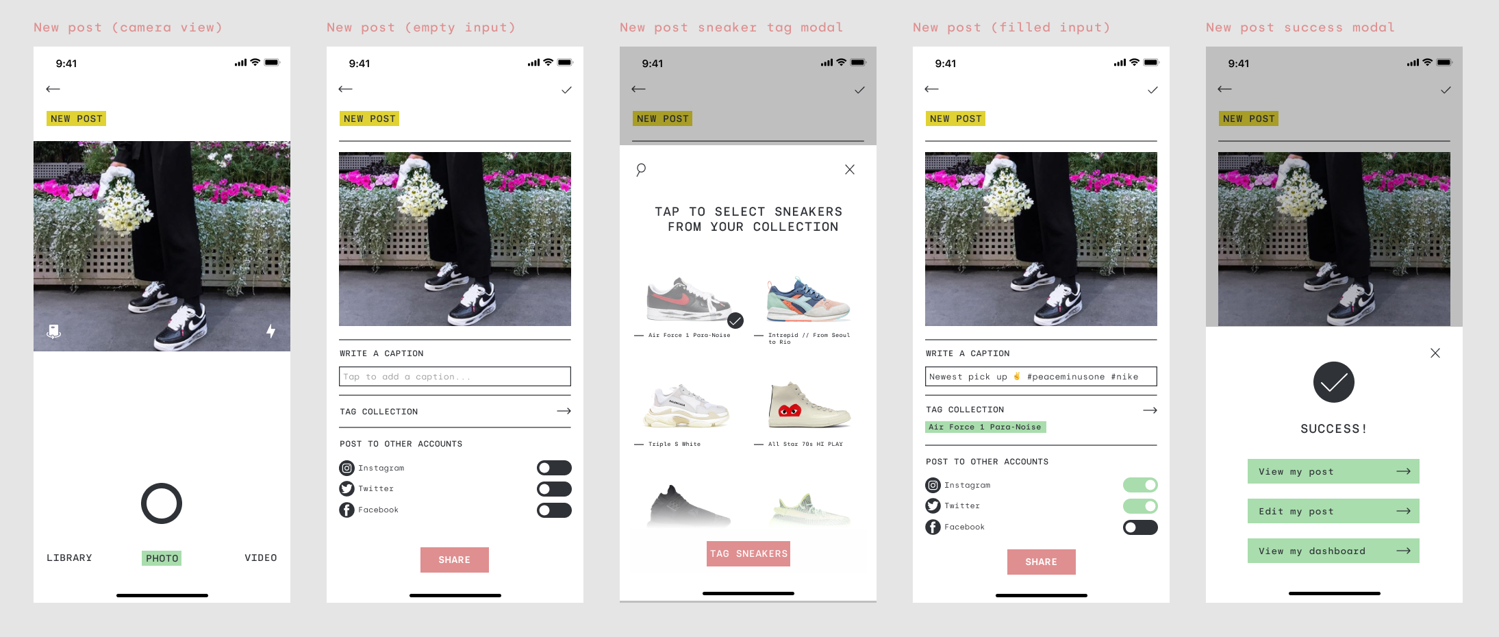
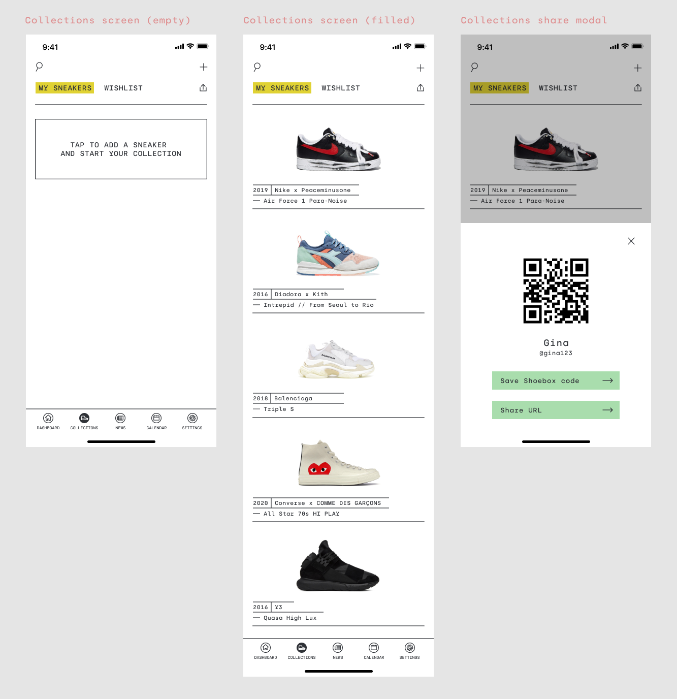
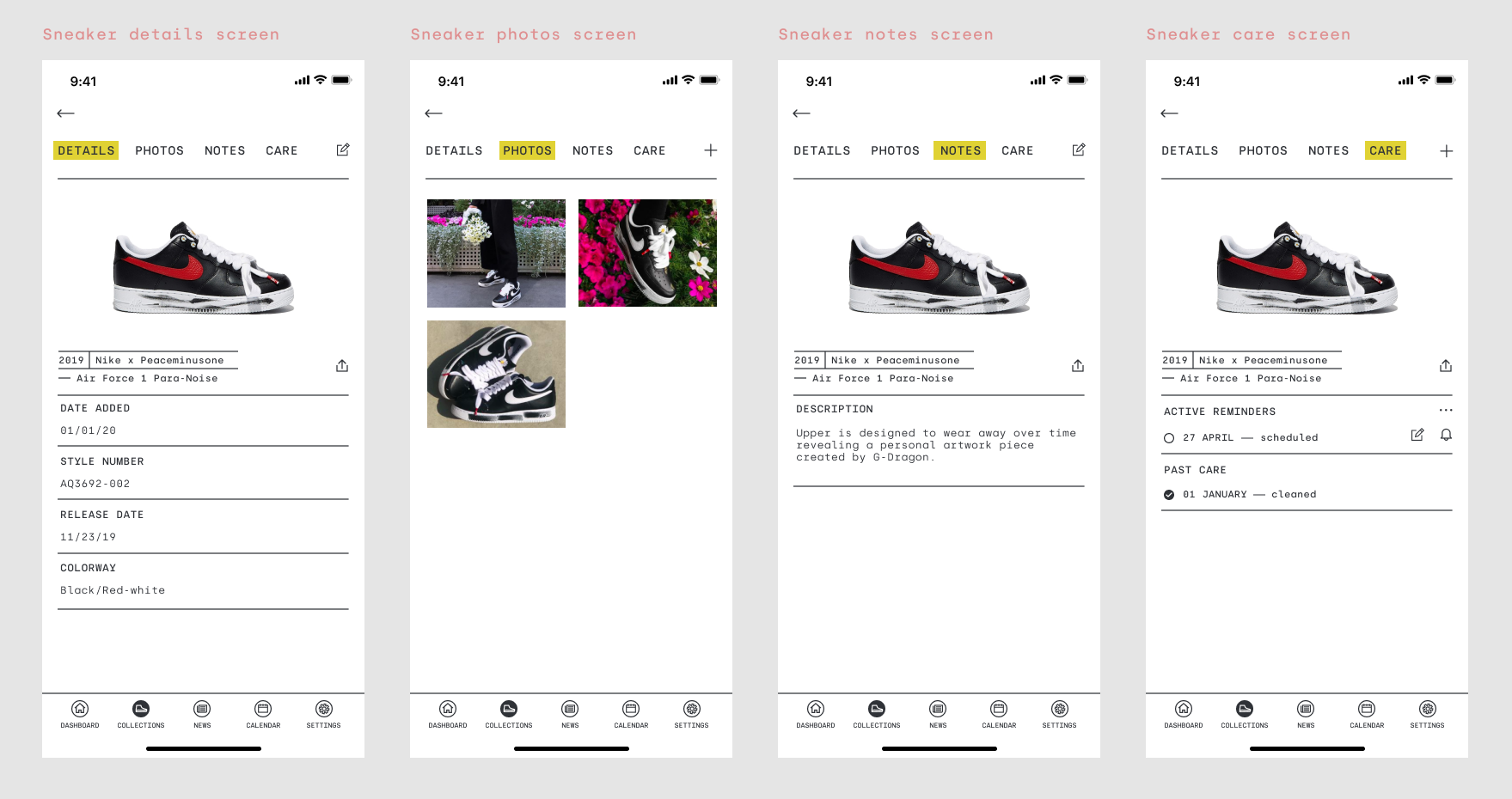
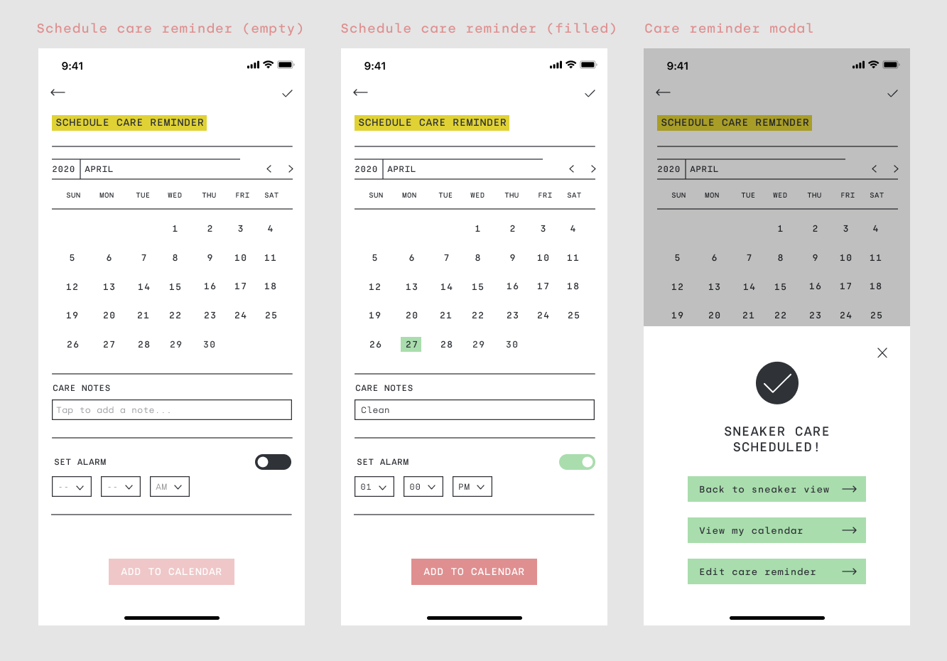
After mapping out a provisional user path and flow and creating the wireframes to showcase this, I was able to create three visual wireflows that would chart out the likely user pathways while using the app itself in preparation for usability testing. I focused on the user journeys and created flows for adding a sneaker to a collection, sharing a collection, adjusting profile settings, posting a photo to the dashboard feed, and scheduling sneaker care for a sneaker in the collection.
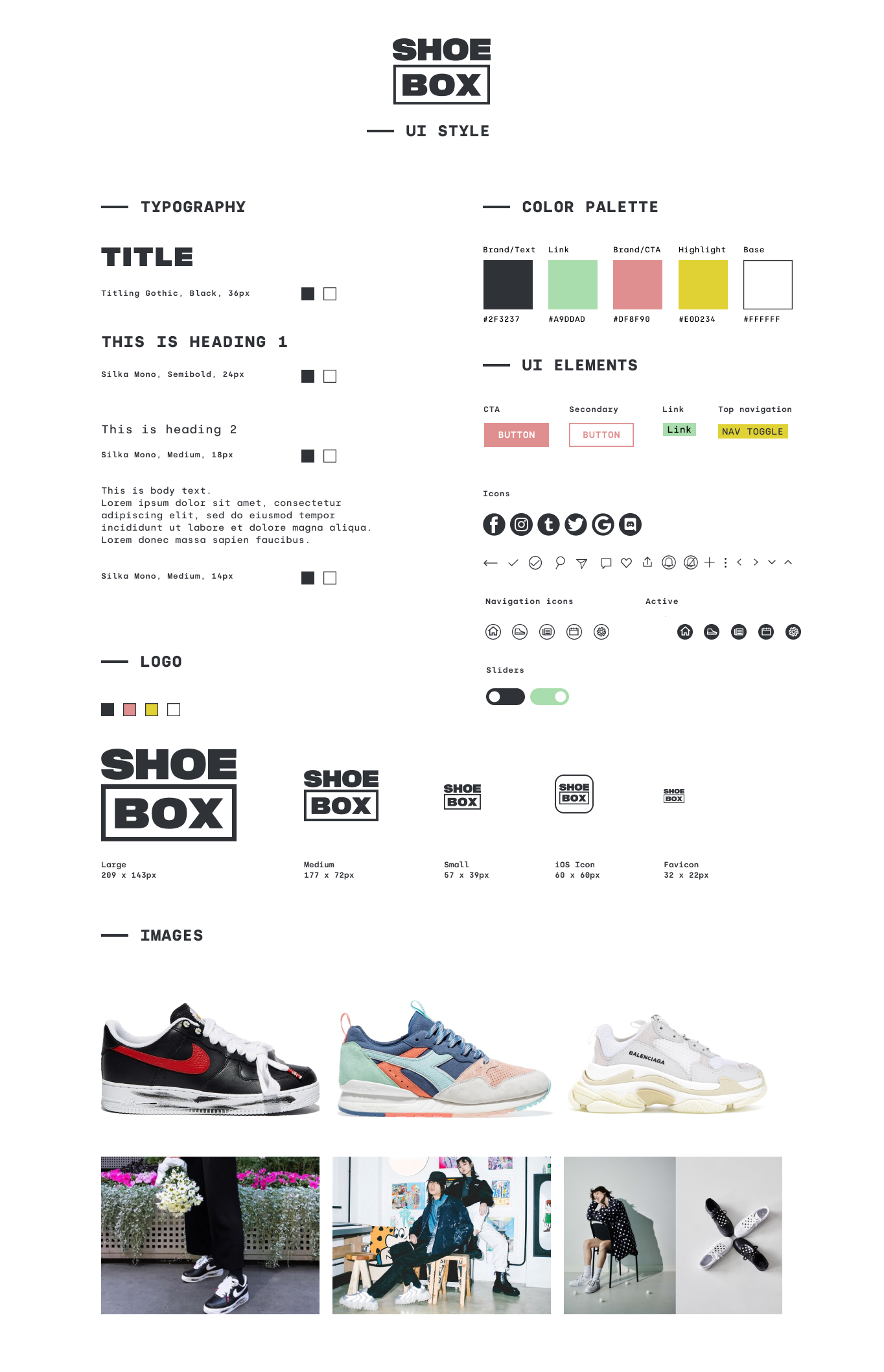
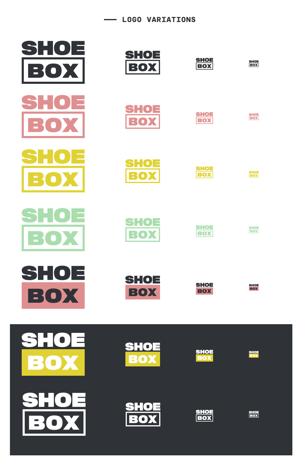
Deciding on a Visual Direction
Logo Ideation | UI Kit
With the mid-fidelity wireframes mapped out and ready to be stylized, I was able to start to think about the visual design direction of the Shoebox app and how I could create a brand message and tie the look and feel of what would feel inclusive for sneakerheads of all types with what would feel fresh and on-trend in the sneaker industry together to create a visual story that would be unique and set itself apart from its competitors.
I began by collecting imagery, color palettes, logo references, and type options to build a mood board and curated my choices until I was left with a cohesive and clear visual style to work with. The brand visuals that I landed on were curated and designed to meet a modern and minimal aesthetic with bold colors, geometric shapes, sharp UI elements, and mono type. The bold, uppercase box logo-type was inspired by fashion-forward trends and the box element offers a literal but still fun and versatile play on the brand name.
Usability Testing
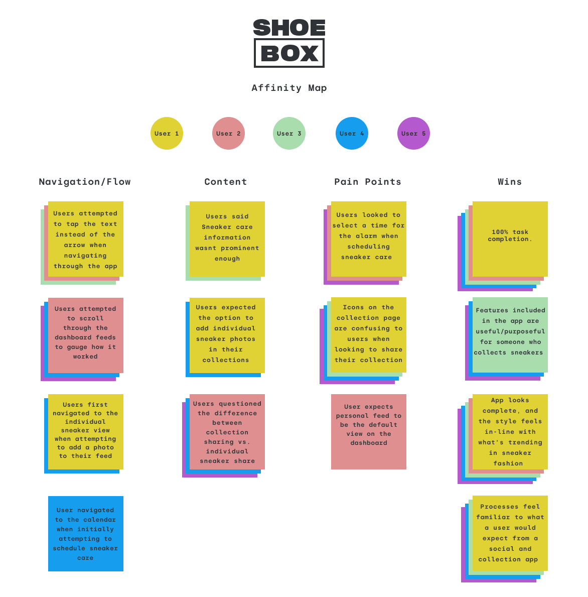
Test Synthesis | Affinity Map
Does the flow feel natural? What can we improve? With a semi-polished prototype and stylized wireframes, I was ready to dive in to test the effectiveness of these designs with real users in order to gauge whether or not I was moving in the right design direction across the board. I conducted a series of virtual one-on-one usability test sessions via Discord with 5 participants from a sneaker Discord server where they shared their screens and talked me through a series of scenarios and tasks using a high-fidelity Figma prototype of the Shoebox app.
Before setting out to test participants, I defined some objectives and an overall goal for the study to help me stay on track and really pinpoint what was working and what would need more attention as I moved forward with any priority revisions...
Goal
- To examine and evaluate the overall user flow of the Shoebox app. Specifically, find pain points and areas of opportunity in the navigation flow and IA.
Objectives
- Test how users input and manage their sneaker collections within the app
- Test how users will use a social format to post and share their sneaker photos and collections
After testing, I compiled all of my notes and began to look for patterns across how the test participants interacted with and what they were saying about the prototype. I specifically honed in on what was working and what fell flat in the process and visualized these patterns and findings in an affinity map to organize user trends and data into clear and digestible themes that I could begin to iron out and improve upon in the next iteration of the app.
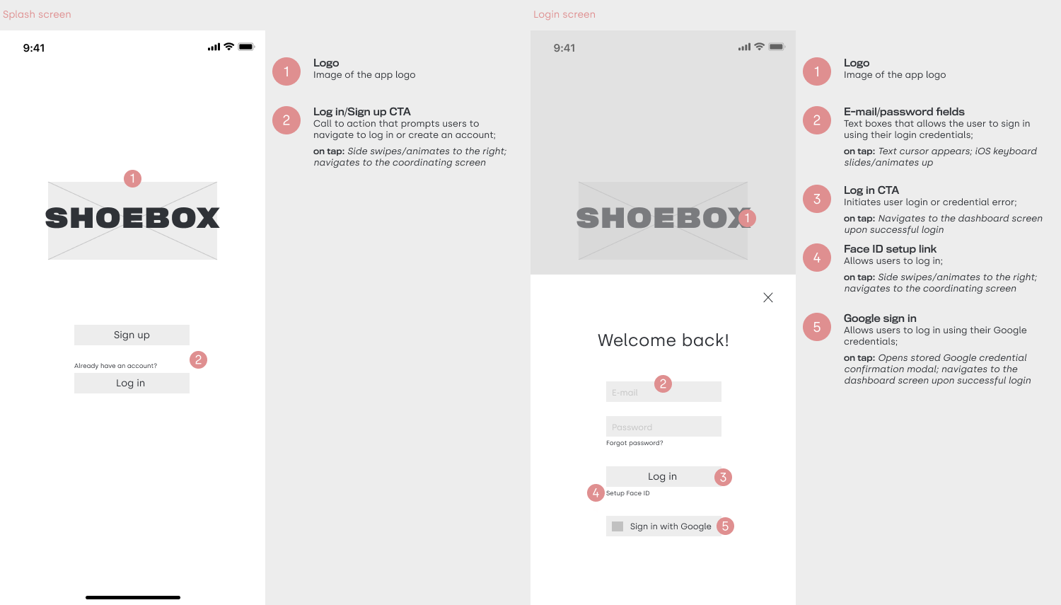
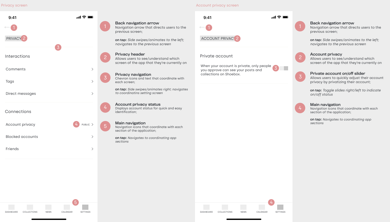
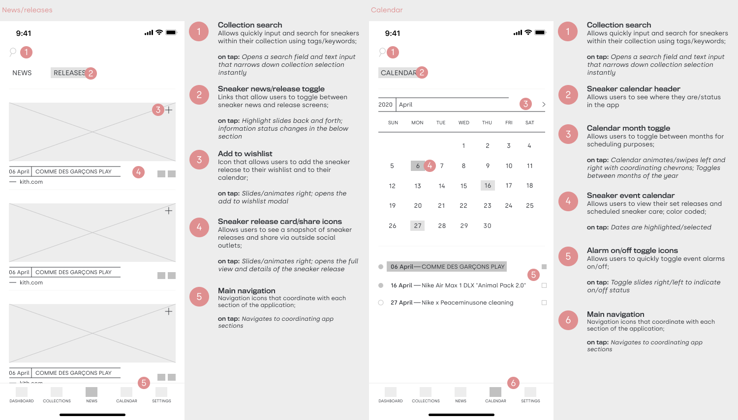
Final Solutions
High-Fidelity Wireframes | Figma Prototype
While task completion and praise for the visual design proved to be wins during this usability testing, there was some opportunity to build out alternative ways to complete some of the tasks, rethink the implementation of the alarm feature by adding a time schedule option, adjusting icon over usage, and consider new feature suggestions to implement in future iterations.
Some users experienced errors and confusion surrounding the multiple share icons on the collection screen and the placement of sneaker care scheduling at the bottom of the individual sneaker detail was lost amongst the rest of the sneaker details content on the screen. I addressed this by removing the individual sneaker share icons on the collection view and by pulling sneaker care from the detail view and creating its own tab under each individual sneaker in the collection view. Since some participants looked to first add their sneaker photos to their individual sneaker collection before adding it to their personal dashboard feed, I went ahead and built out that option to offer an alternative way and to compound the process of adding sneaker photos and posting to a users personal feed.
Reflections and Next Steps
What's next for Shoebox? Launching, learning, and iterating! As with any set of revisions in a project, I would look to schedule another round of usability testing to evaluate the effectiveness of the revisions and further refine and polish based on user feedback. Beyond small changes to flow and content architecture and building out more screens and task flows within the existing app, I would also start to consider more of the feature feedback and suggestions from user interviews, research, and usability testing.
Some users had expressed an interest in seeing a dark mode option for the app and I think it would be an interesting option to consider and research based on accessibility and current mobile and web trends. I would also look to research and implement a design system that would allow users to have even more control over their app settings, build out more integrated ways to share in conjunction with other apps they know and love, and find further ways personalize their news and sneaker release feeds with sneaker suggestions tied into their collections and wishlist.