
Food Glorious Food
UX/UI Design, Content Design, Branding
Role: UX/UI Designer, Content Designer
Tools: Figma | Adobe Illustrator | Photoshop
Who is Food Glorious Food?
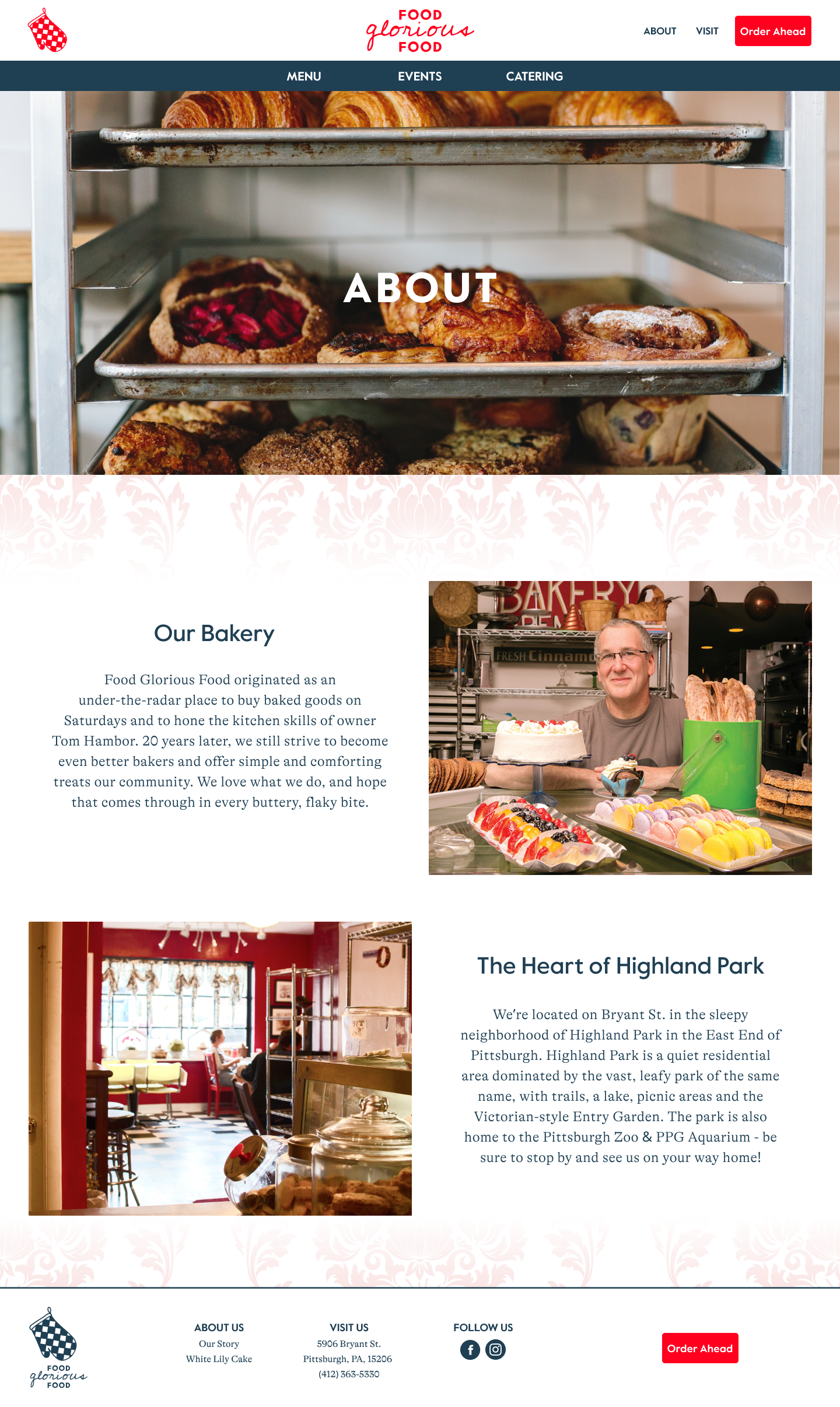
Food Glorious Food is a neighborhood bakery in the Highland Park neighborhood of Pittsburgh that offers a daily selection of sweet and savory treats. Established 20 years ago and continuing to produce all products from scratch, they hope to provide their community with the quality that they have come to expect. They’ve earned rave views for their famous White Lily cake and have a devoted customer base that visits their “Saturday Bakery” (as customers have affectionately nicknamed them due to their limited hours and goods) weekly.
The Challenge
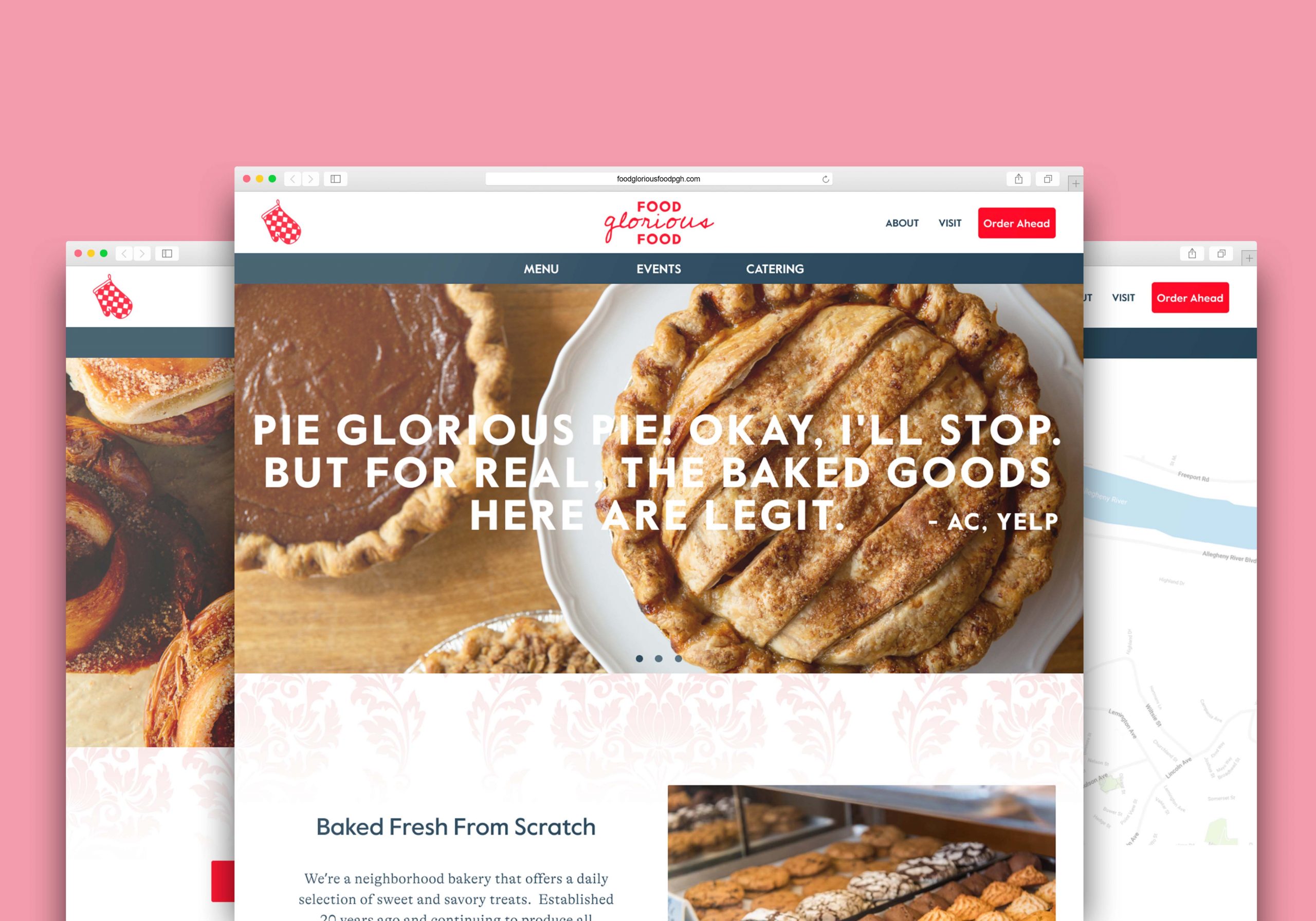
While Food Glorious Food does have a website, it’s outdated and they are in need of a new responsive website and fresh brand identity to keep them current and competitive with other local bakeries and attracting new waves of customers.
The Solution
I researched and designed a new website and built a visual brand that showcases the strengths and individuality of the bakery, their menu items, and services using research-based design methods to guide feature development, information architecture, and visual style.
The Research
Competitive Analysis | Market Research | Contextual Interviews
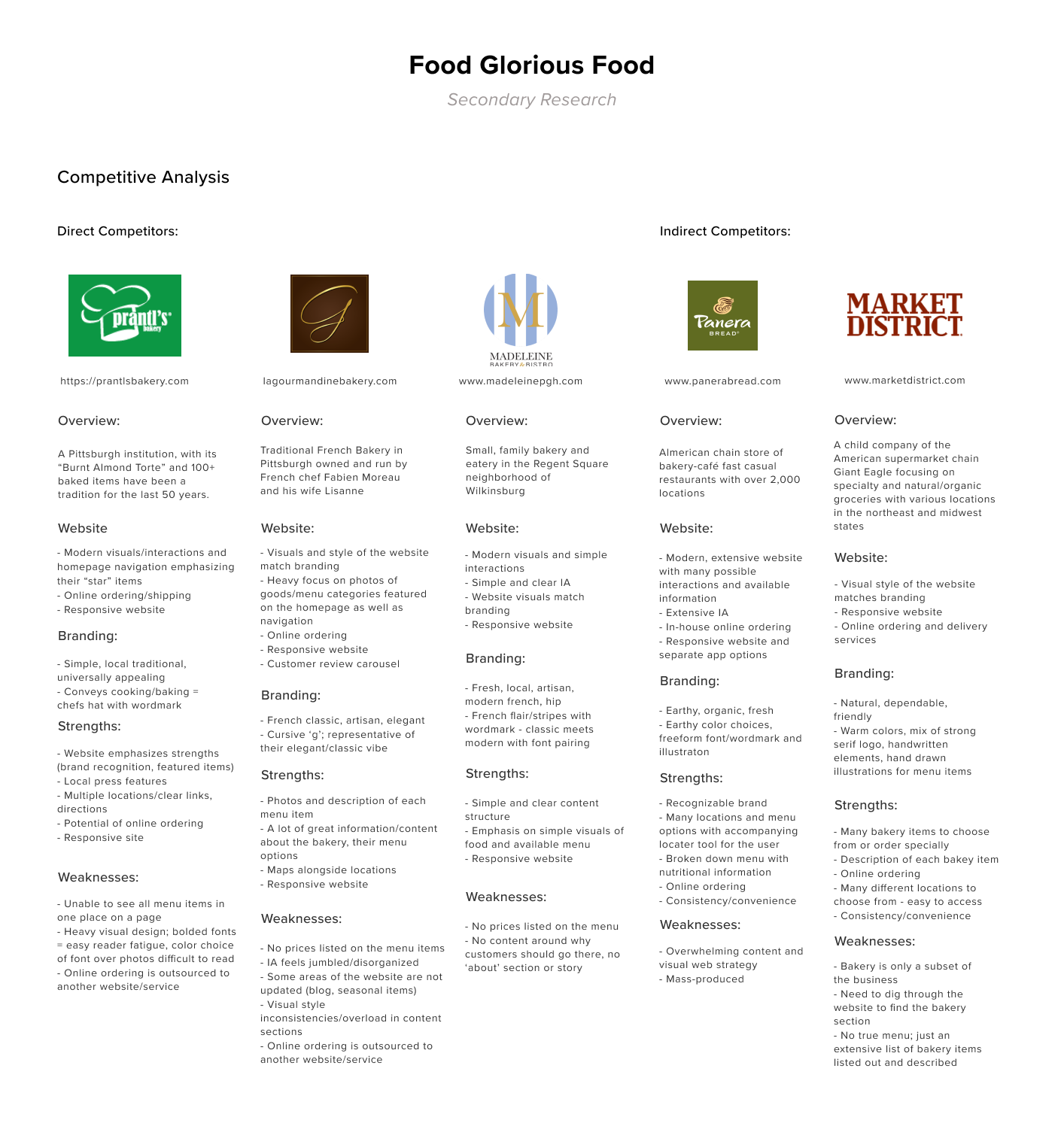
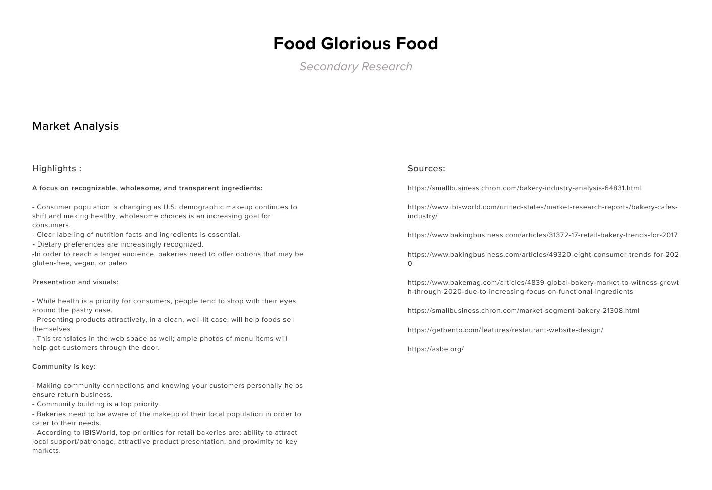
I began this project by identifying and mapping out the research goals and questions I would need to answer in order to determine what research methods I would be using to begin to build-out a design plan. The goals were aimed towards learning about user needs, desires, and frustrations around visiting the bakery and making informed purchases by analyzing market research and looking at competing bakeries to discover what the current web and branding trends and strategies were in the bakery industry.
To begin to meet these goals, I first conducted competitive and market analysis by digging into the local bakery scene in Pittsburgh to assess and analyze competing bakeries' strengths and weaknesses and also researched the current trends (web and brand) and potential opportunities in the bakery industry to see where we could work together to position Food Glorious Food from a branding and website feature standpoint. What I discovered was that there was a huge emphasis on presenting clear, bold bakery imagery and that visuals were key in order to entice customers to initially visit the bakery - menu images were the number one request from users. Another takeaway was the emphasis on community and local support - making community connections and knowing customers personally has been proven to help to ensure return business and bakeries need to be aware of the makeup of their local population in order to cater to their needs.
After taking a closer look at the ins-and-outs of the bakery industry and the local competition, I set out to conduct a set of contextual interviews to directly interview and observe bakery customers so I could begin to understand their needs, goals, and behaviors and design a website that would meet and anticipate their expectations. With a plan and questions in mind, I was able to spend several hours of time chatting with and observing 5 participants on-site at the Food Glorious Food bakery about their overall thoughts, experiences, needs, and behaviors about how they discover and decide to visit a new bakery/cafe and what brought them into the bakery that day. After jotting down notes and analyzing their behaviors and insights, I was able to boil down a list of takeaways that outlined what these users needed and wanted from a bakery website:
Bakery-goers let me know that they needed…
- A website that shows essential information: menu, opening hours, business location/directions, and photo examples of menu items
- A responsive option for users/customers who are researching the bakery on their phones or tablets
- A brand that reflects the business; the physical space and how customers/staff perceive it
- A space on the website that outlines other service offerings - events, catering, wedding cakes
and that they wanted...
- A website that shows menu prices
- An about page that tells the business story; history, “Saturday Bakery” past
- Alternative ordering options beyond calling on the phone
- An updated daily/weekly rotating special listed on the website
- A content section to talk about their famous “white lily cake”; press links, description
- An indication for when the website/menu was last updated
The User
User Persona | Sitemap | Wireflows
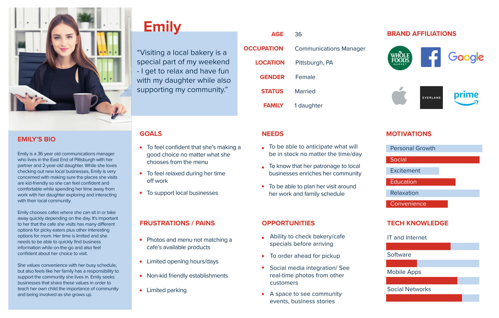
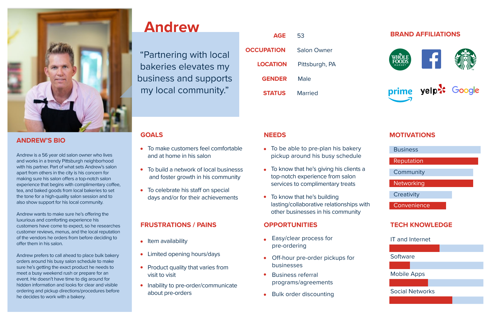
With the interviews fresh in mind, I was then able to create a set of personas that reflected a typical bakery-goer who would be likely to visit the Food Glorious Food website. With secondary research takeaways and interview data, I was able to put together two comprehensive persona profiles and formulate the collective needs, pain-points, and potential opportunities in mind for two different bakery-goers: Emily, a busy working mom who values supporting her local community and enjoying her off-time with some baked comfort food and Andrew, a local salon owner who is looking to partner with local businesses to celebrate his staff and deliver delicious baked goods to his salon patrons as part of his salon experience.
Meet Emily and Andrew...
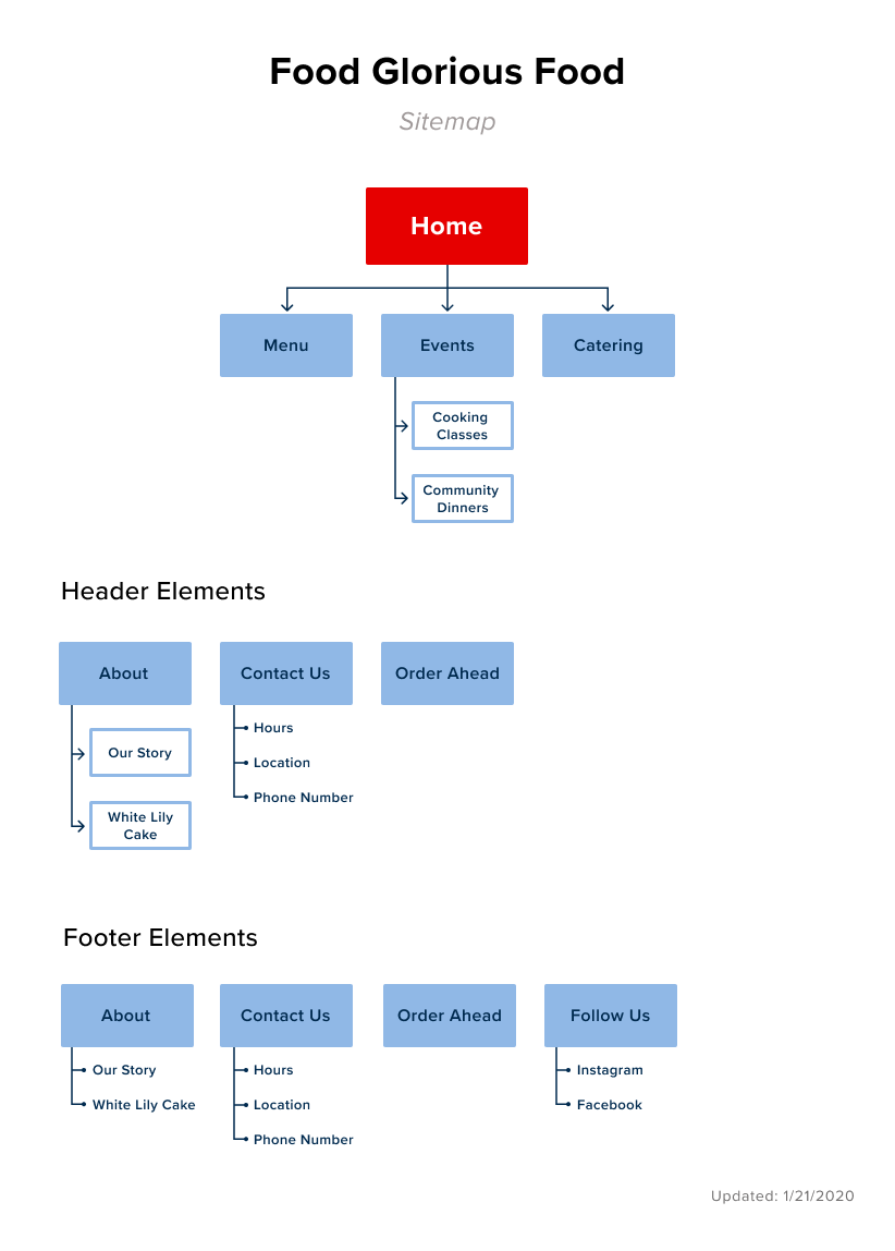
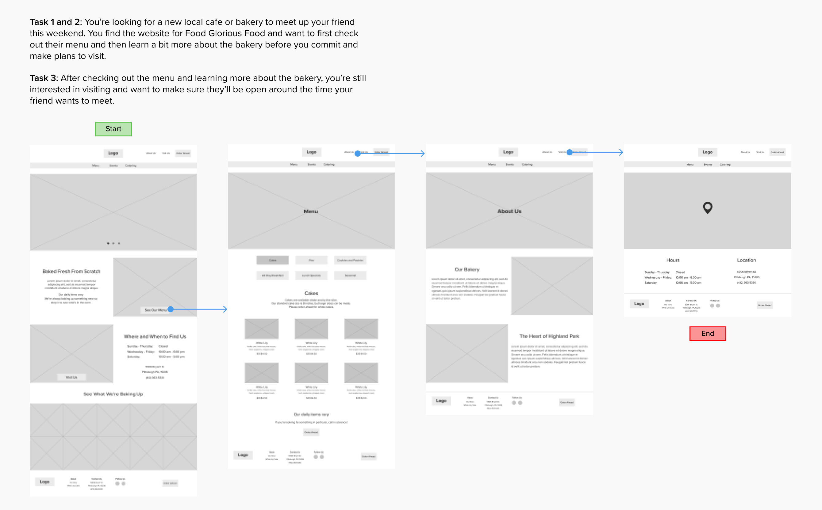
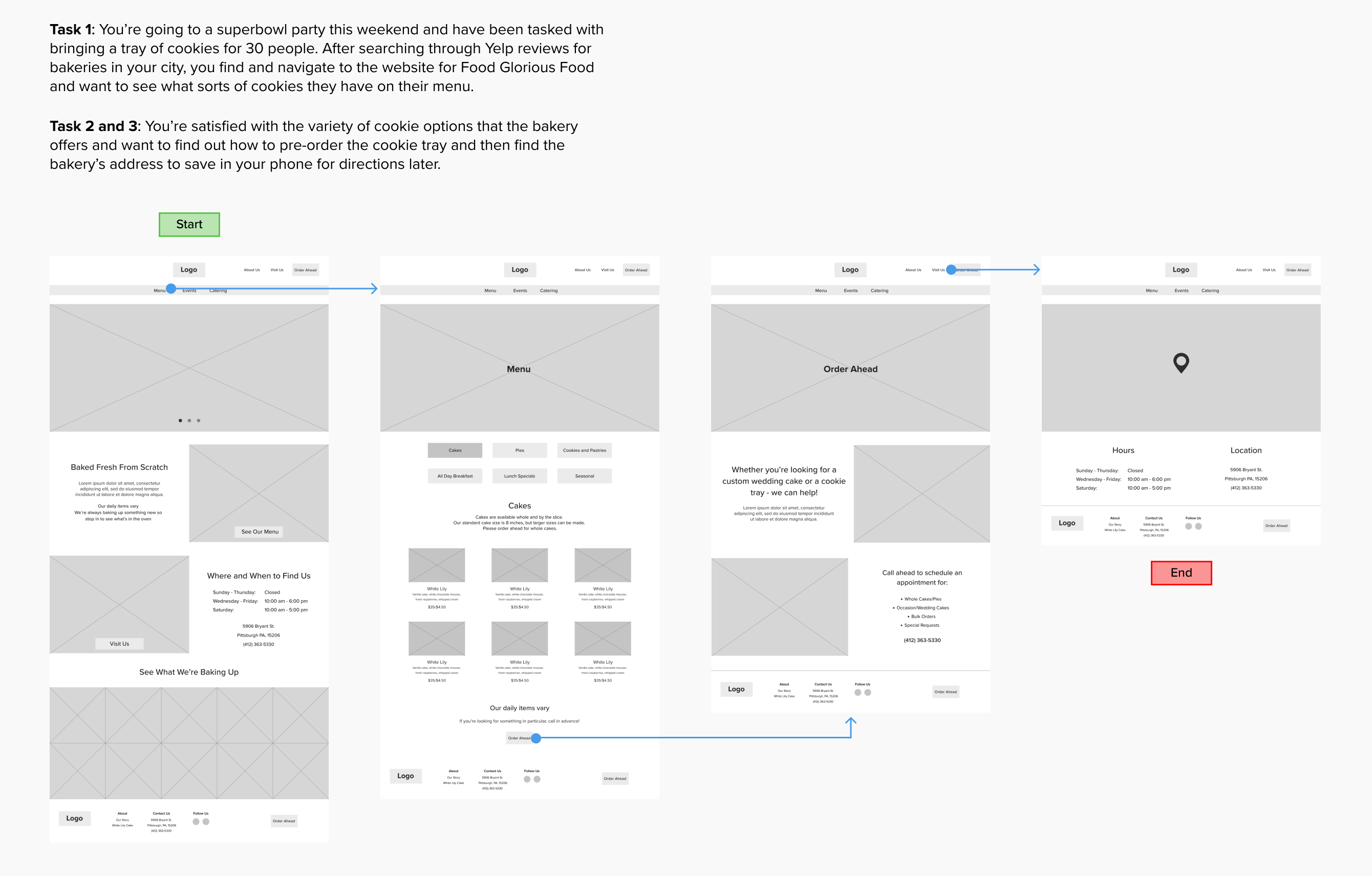
Once I was able to frame Emily and Andrew's state of mind and determine their potential pathways in discovering Food Glorious Food, I started to think about elements of information architecture for the website itself and what information would be the most important for them while navigating through the website. In doing this, I charted out a simple and logical sitemap and two user flows based on their persona traits and user goals.
Building the Product
Sketching | Mid-Fidelity Wireframes
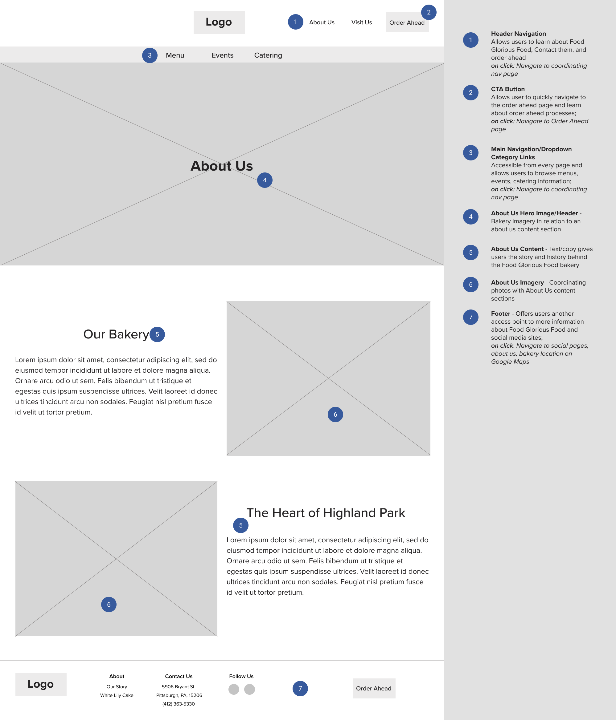
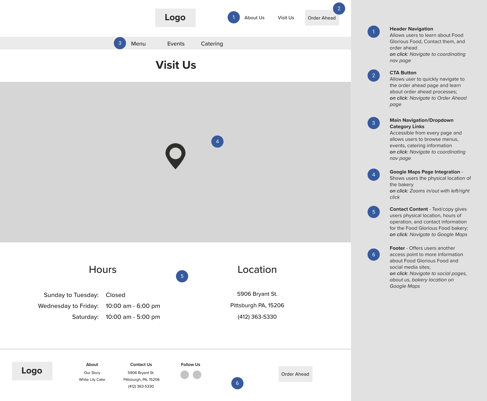
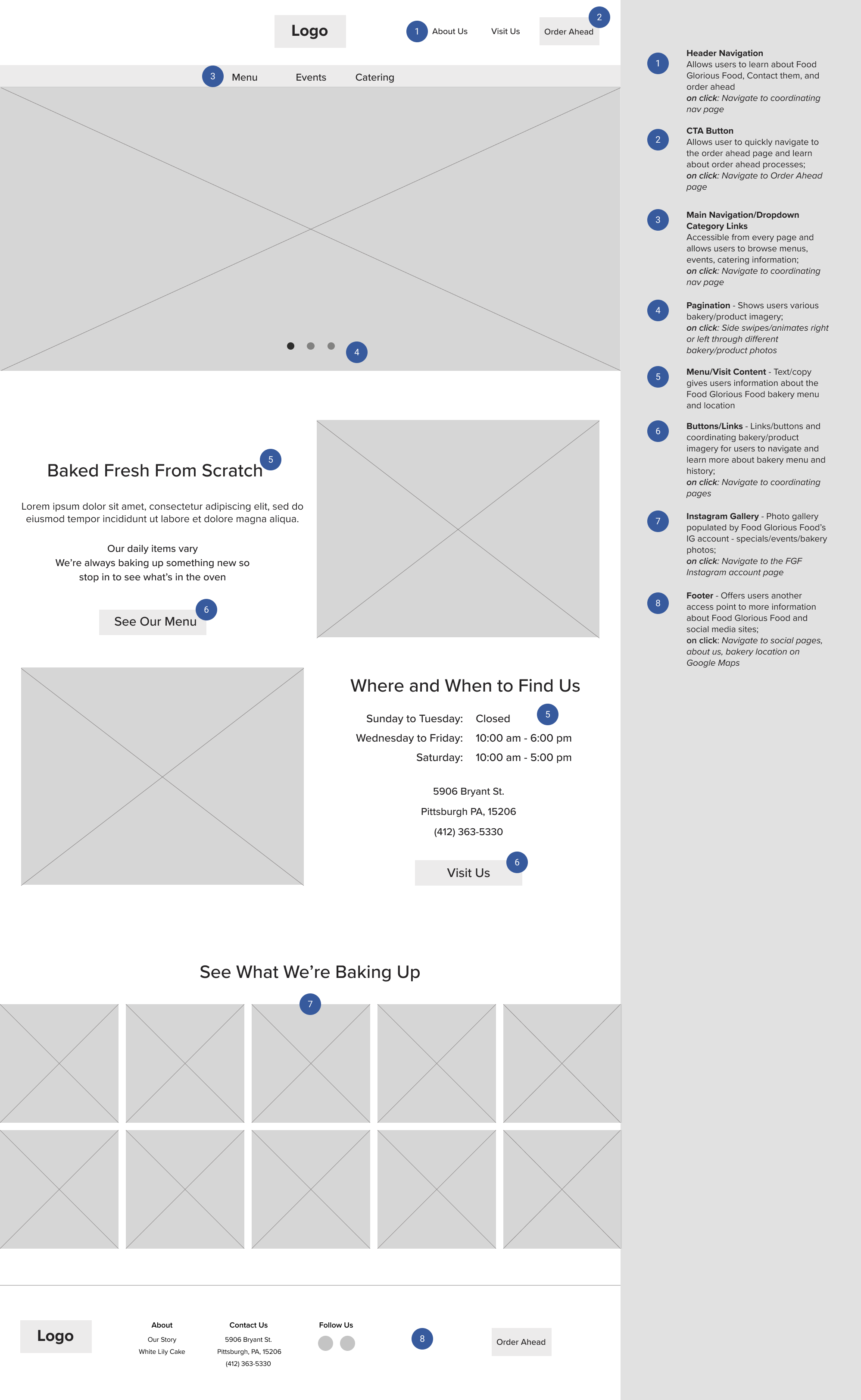
With wireflows and information architecture charted out, I was able to begin to ideate potential layouts and build out content sections of the Food Glorious Food website. I spent time experimenting with varying content arrangements and research-based features until I found a layout that made sense within the scope of Food Glorious Food's goals, bakery website conventions, and met the needs of and addressed the opportunities according to each persona.
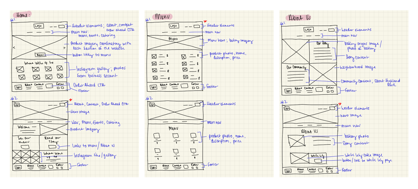
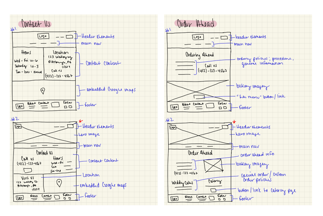
Using my sketches as a frame of reference, I then re-created them in Figma to create my mid-fidelity wireframes and annotated the content sections and features to describe their purpose and potential user interactions.
Deciding on a Visual Direction
Moodboard | Logo Ideation | UI Kit
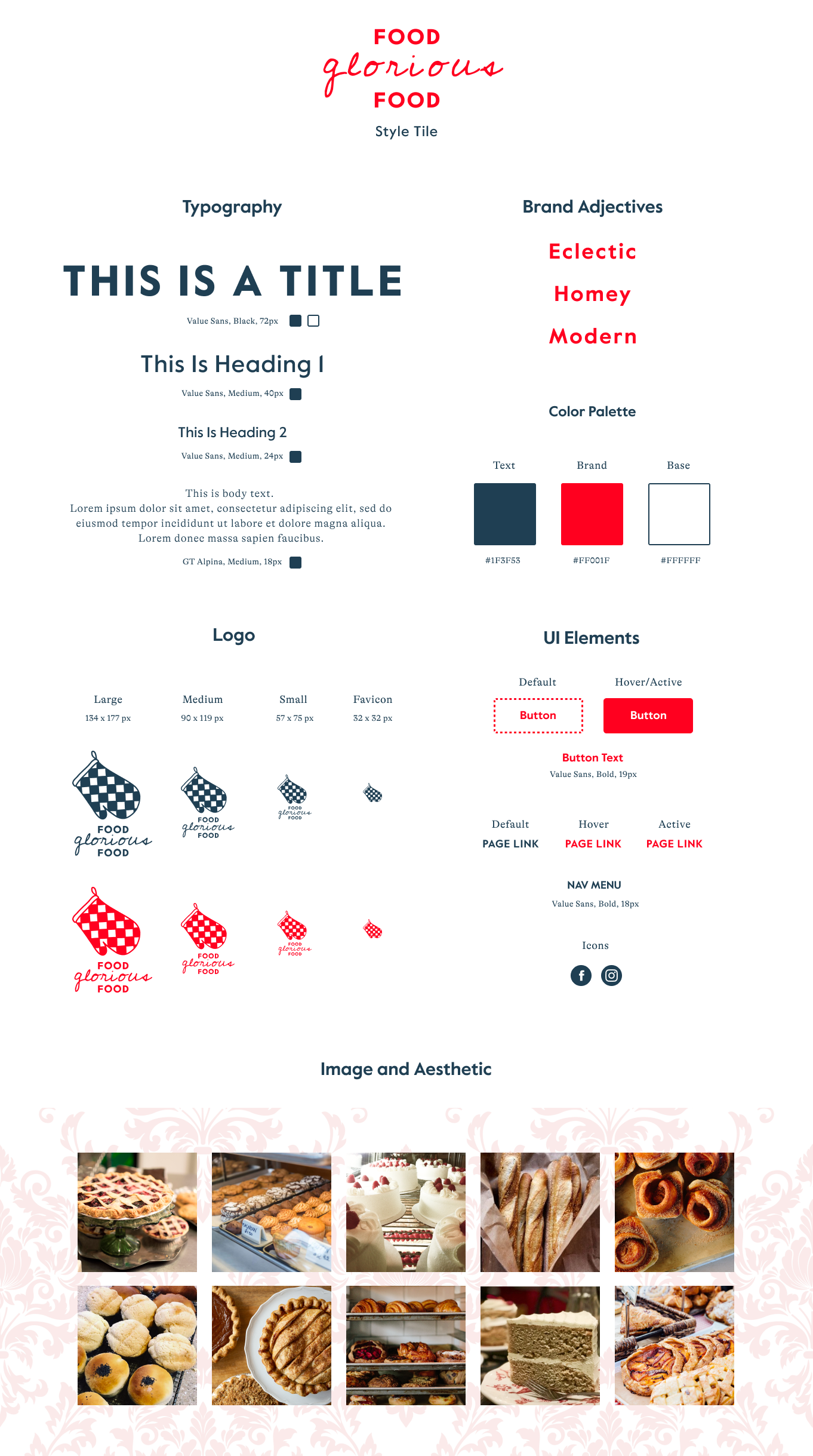
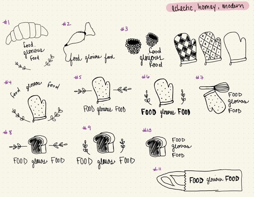
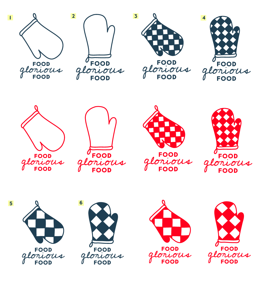
With the mid-fidelity wireframes mapped out and ready to be stylized, I was able to start to think about the visual design direction of Food Glorious Food and how I could create a brand message and tie the look and feel of their physical space together to create a website that reflected their business.
I began by collecting imagery, color palettes, logo references, and type options to build a mood board and curated my choices until I was left with a cohesive and clear visual style to work with. Since the bakery's physical space has a very distinctive homey and eclectic vibe, I wanted to draw those adjectives out and aimed to pull them together to create something clear, cohesive, and modern. Ultimately, I chose to meet homey and modern with the fun and eclectic style of the bakery space by choosing a hand-drawn oven mitt with a retro-inspired check pattern and a script-style wordmark that would be distinctive but still felt warm and inviting and kept the type and colors simple and modern - a navy blue, red, and white scheme to tie the hand-drawn elements and ornate damask visuals together.
Usability Testing
Test Synthesis | Affinity Map
It was finally time to test my work and the effectiveness of these designs with real users and an early version of my stylized wireframes in order to gauge whether or not I was moving in the right design direction. I conducted a series of in-person usability test sessions at a local coffee shop where 5 participants talked me through and completed a series of scenarios and tasks using a high-fidelity version of the Food Glorious Food desktop website using a Figma prototype.
Before setting out to test participants, I defined some objectives and an overall goal for the study to help me stay on track and really pinpoint what was working and what would need more attention as I moved forward with any priority revisions...
Goal
- To examine and evaluate the overall user flow of the Food Glorious Food website. Specifically, find pain points and areas of opportunity in navigation flow, menu layout, UI, and visual design.
Objectives
- Test how users navigate and search for information on a bakery/cafe website
- To learn about user needs, desires, and frustrations around visiting the bakery and making informed purchases
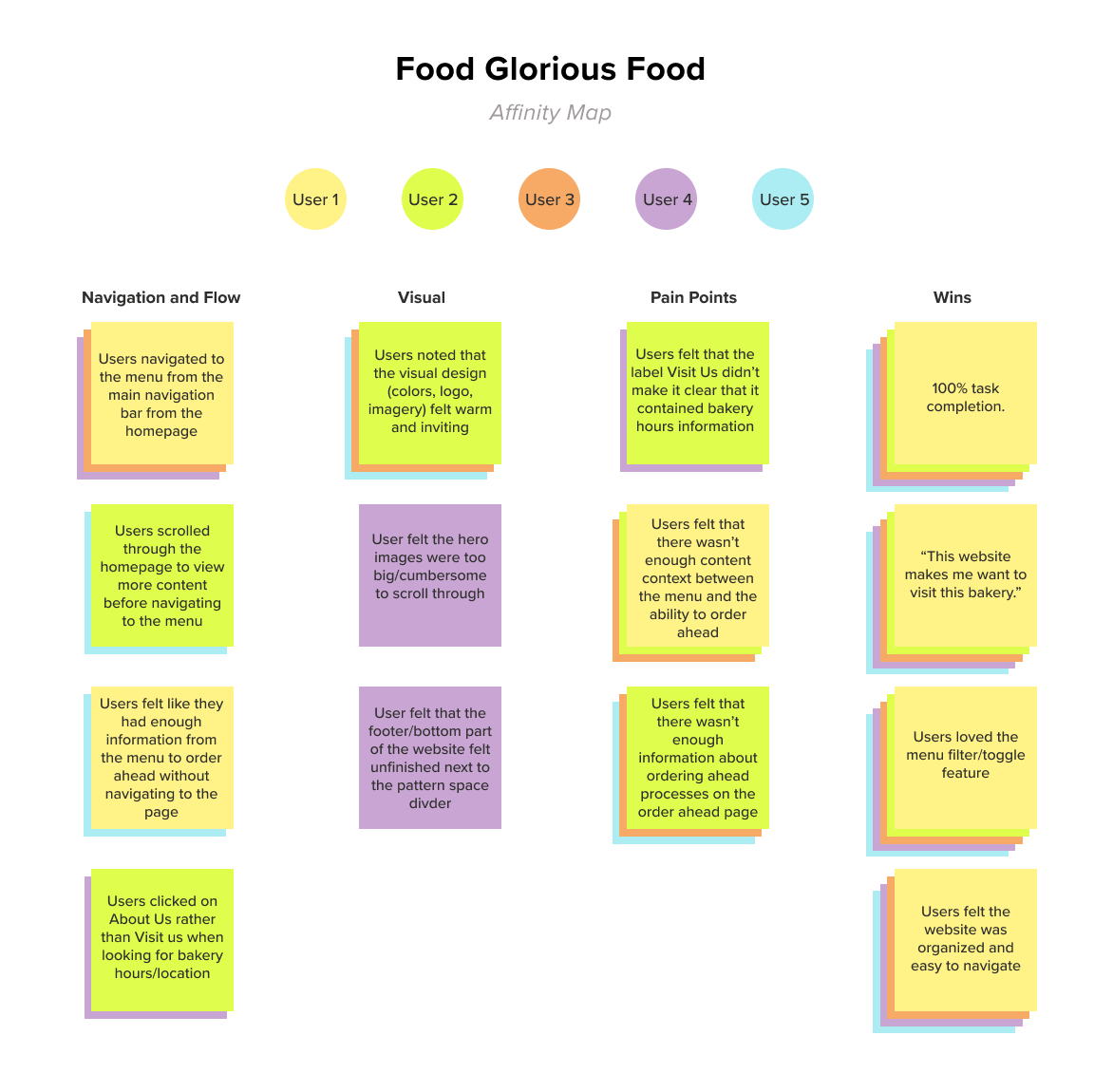
After testing, I compiled all of my notes and began to look for patterns across how the test participants interacted with and what they were saying about the prototype. I specifically honed in on what was working and what fell flat in the process and visualized these patterns and findings in an affinity map to organize trends and data into clear and digestible themes that I could begin to iron out in my priority revisions of the website.
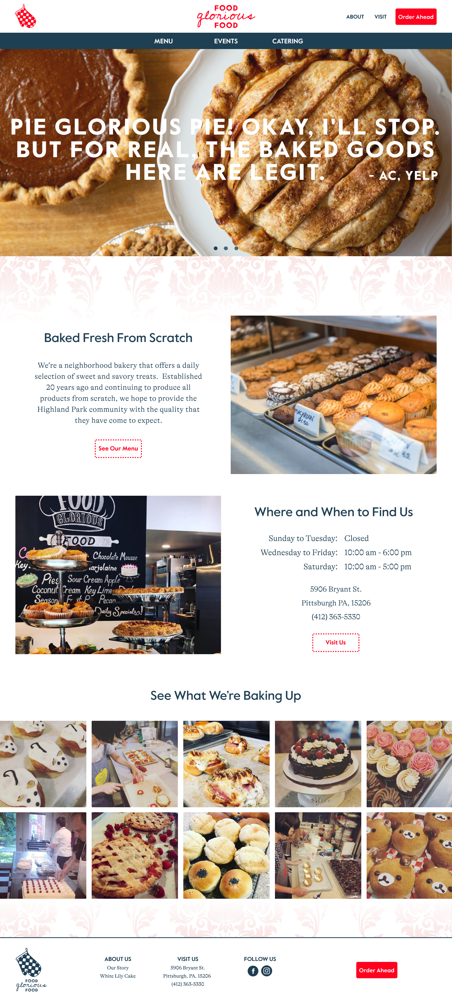
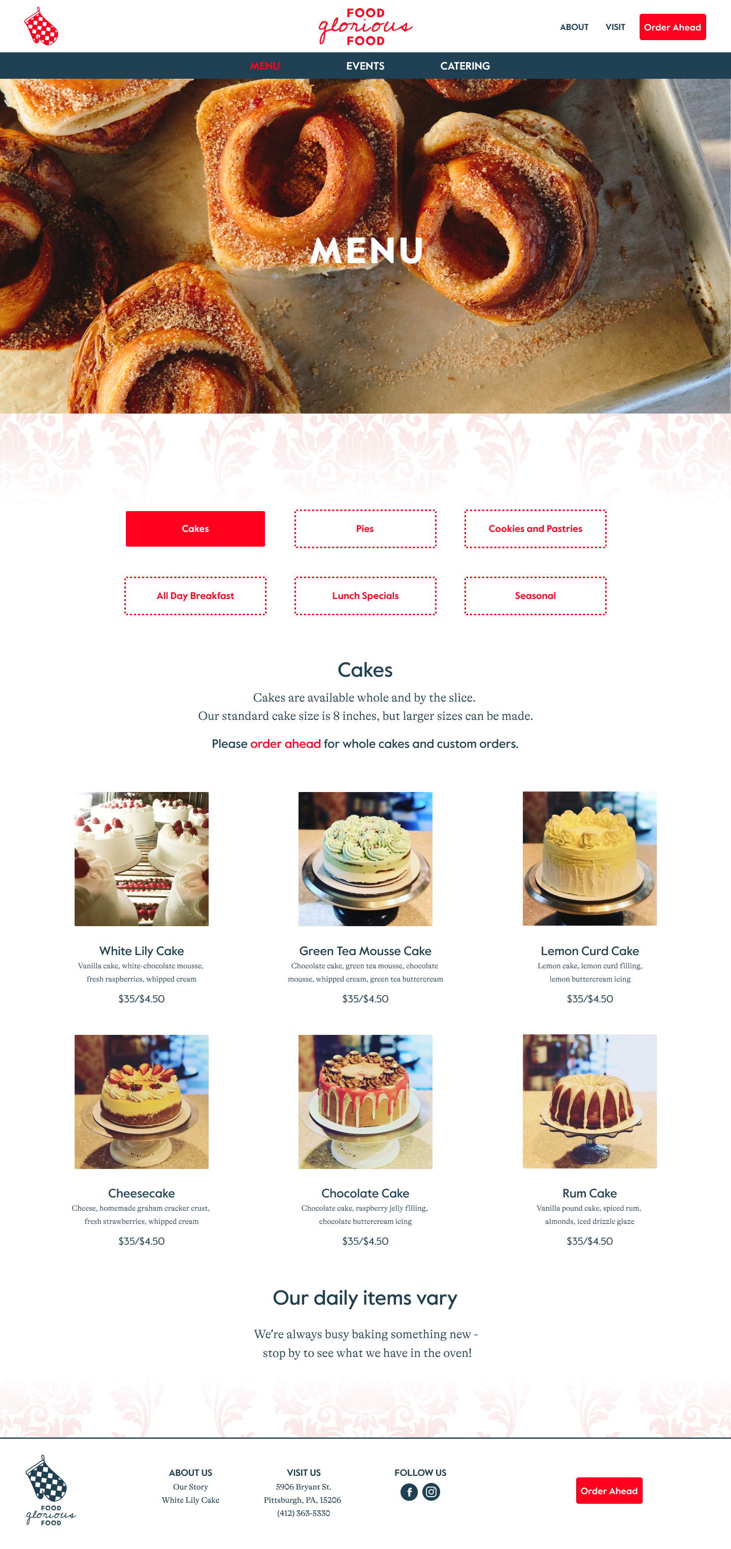
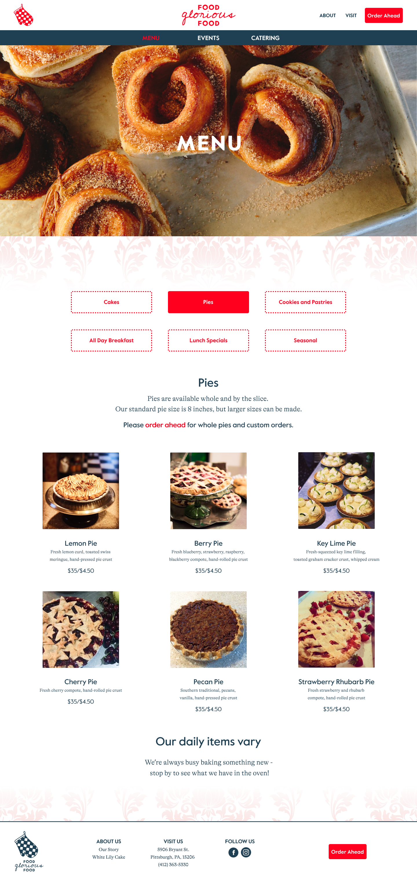
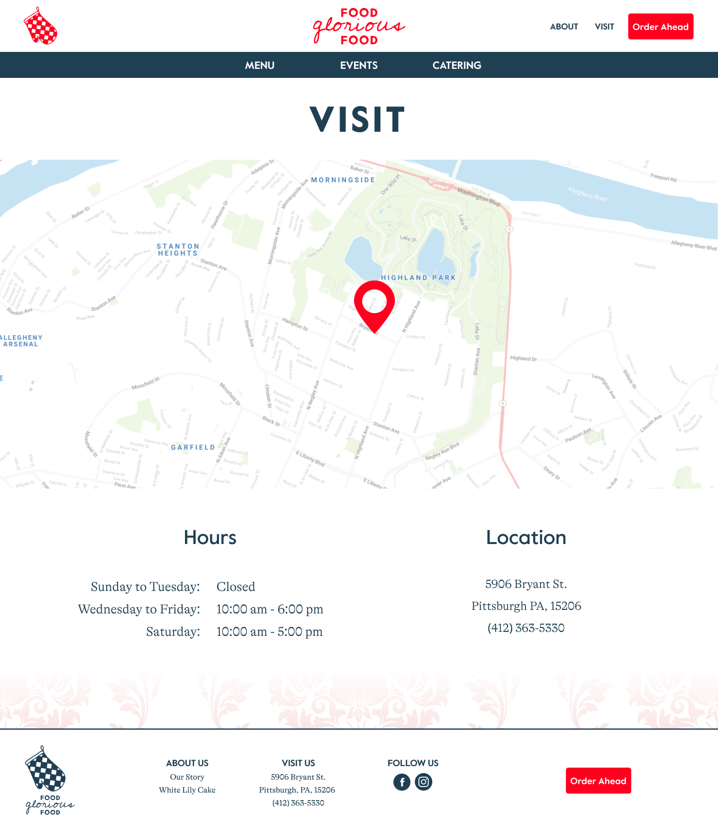
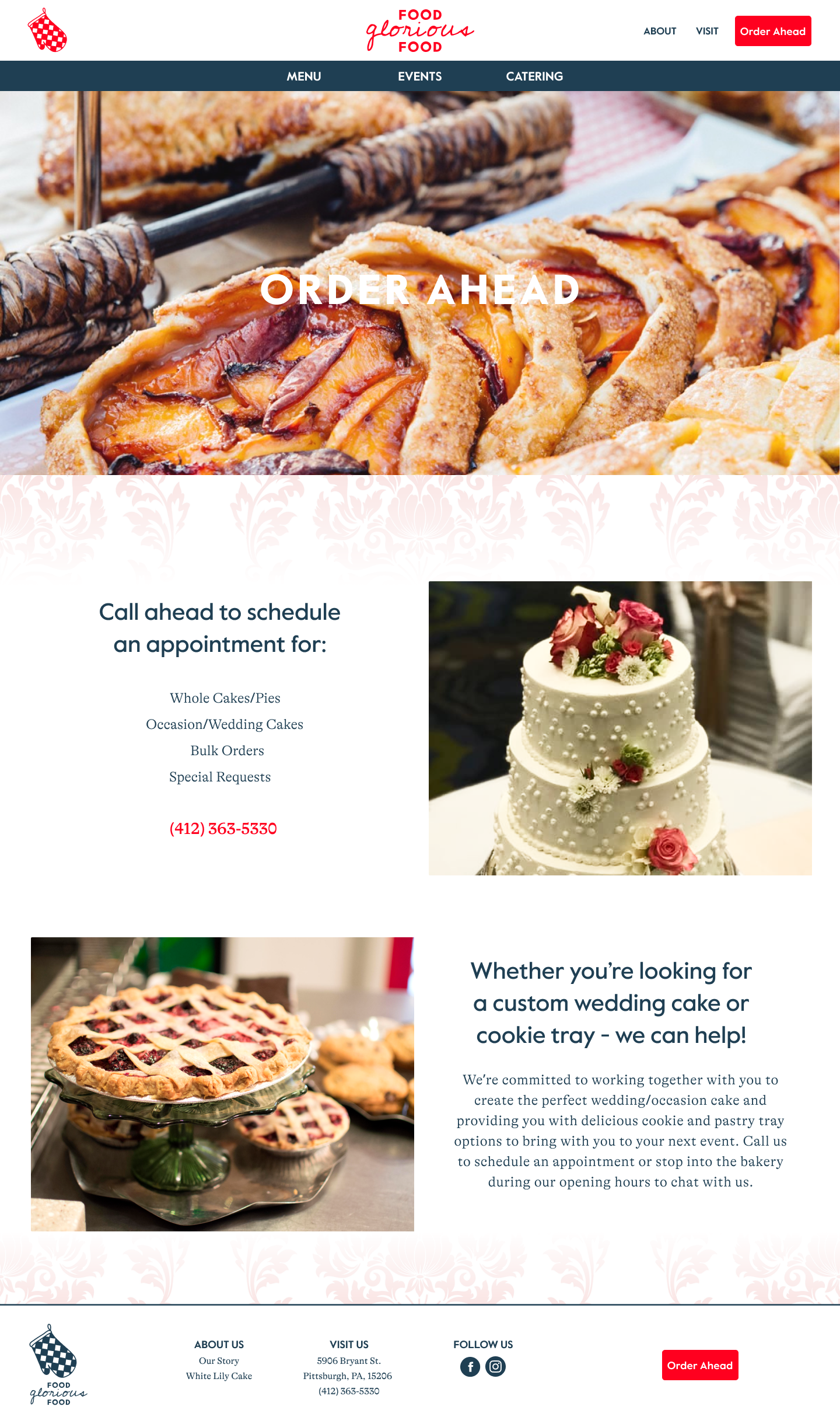
Final Solutions
High-Fidelity Wireframes | Figma Prototype
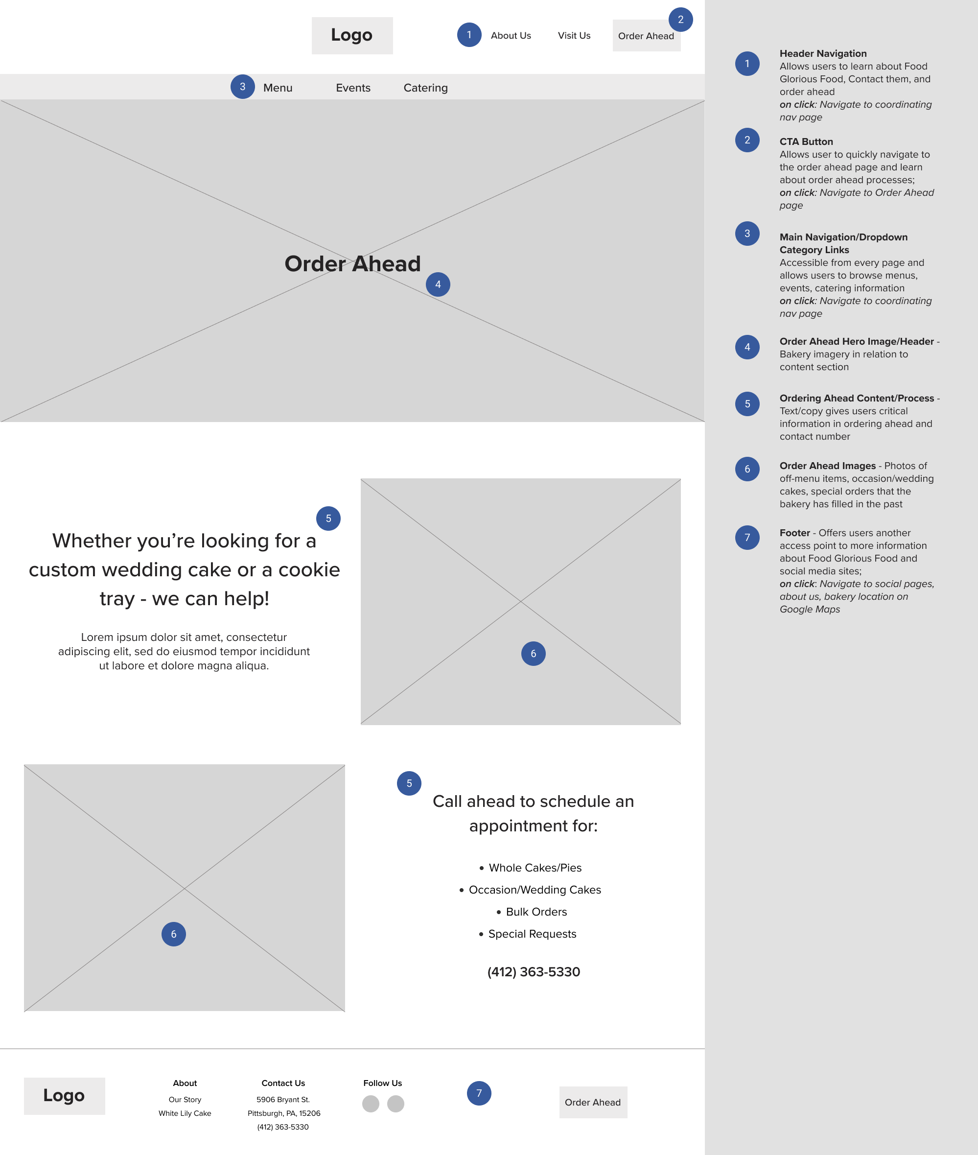
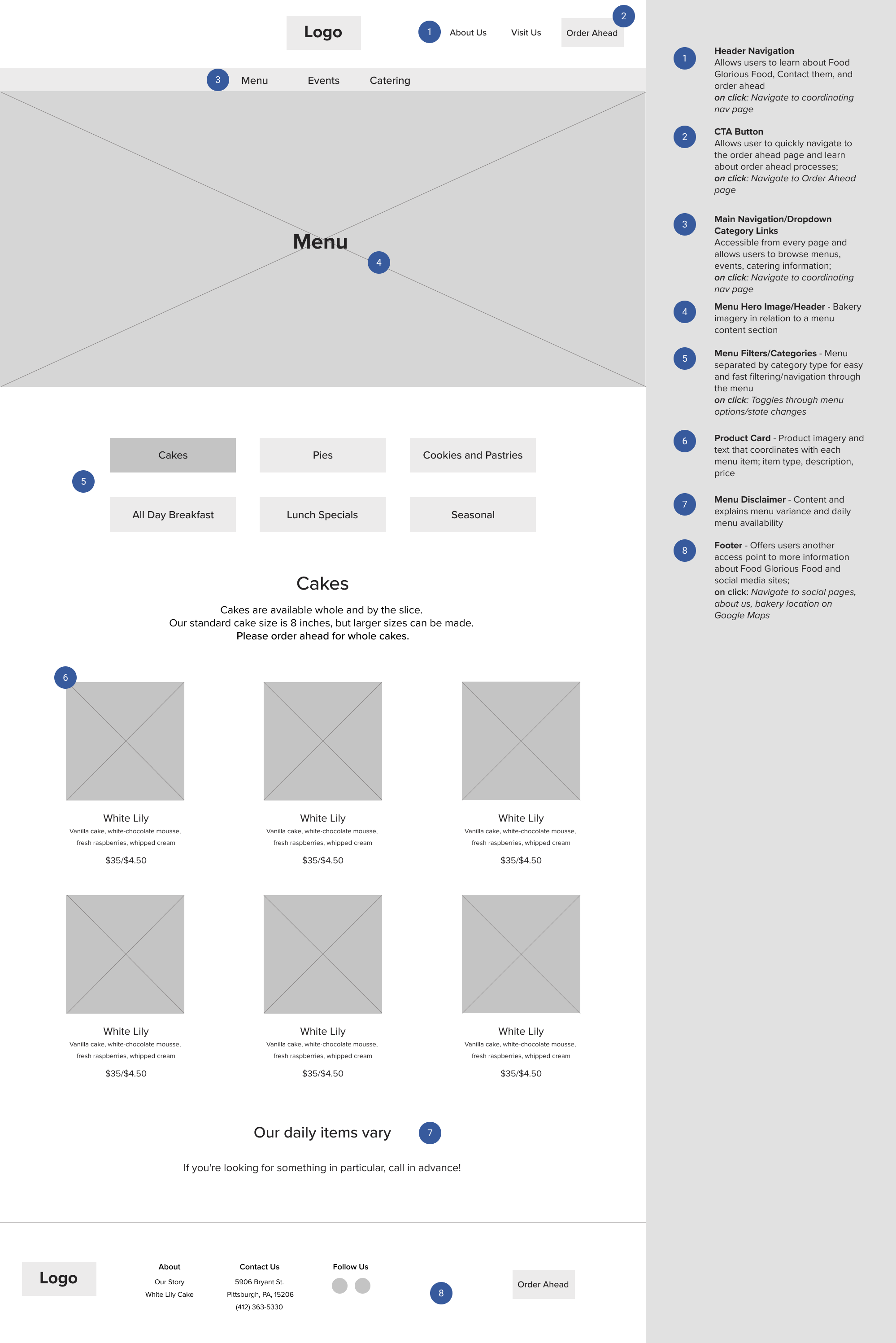
After usability testing, I was left with a list of wins, changes, and user suggestions to consider in the priority revision phase of this project for the Food Glorious Food website. One of the main user callouts I saw was focused around the 'Order Ahead' function, what that meant, and the context around the how and why which led me to revisit the business needs and structure that Food Glorious Food was prepared to take on in ordering ahead. I reworked the Menu content sections to clarify when and how the user should navigate to the Order Ahead page and worked out the content sections on the page itself to be more pointed and clear. Users also called out that the Visit Us/About Us navigation labels proved to be confusing when looking for bakery hours and location information and would need to be rethought and worked out to minimize confusion.
Reflections and Next Steps
What's next? Launch and iterate! In further iterations of the Food Glorious Food website, I would plan on another round of usability testing to check my work and see if the changes that were made during priority revisions were effective and if more adjustments and revisions were needed. I would also look to build out the menu page with a more detailed view of each item with ingredient lists. The Order Ahead option would also be another place I would want to revisit and build a system around - potentially a system where a user could click and add items from the menu to a list to save or submit to the bakery to order ahead of time and a form where users could contact the bakery to schedule appointments, make inquiries, or submit general comments.
This project and overall process allowed me to gain a wealth of real-world experience working on a website redesign for a real-life bakery and communicating throughout the design process with a real client. Introspectively, this allowed me to gain more insight into understanding more about the business side of design - the constraints and obstacles of communicating and scheduling time with and around clients and working within and designing around an established business model.
All in all, I'm looking forward to the redesign launch and hope for the opportunity to work again with the Food Glorious Food bakery to further build out their web experience with even more user-centered features.